Frequency diagrams, like waterfall diagrams, provide a way of visualizing Bayes' Rule. For example, if 20% of the patients in the screening patient are sick (red) and 80% are healthy (blue); and 90% of the sick patients get positive test results; and 30% of the healthy patients get positive test results, we could visualize the probabilities as proportions of a large population, as in the following frequency diagram:
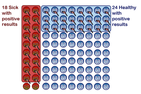
See Frequency diagrams: A first look at Bayes for a walkthrough of the diagram.
Parents: