The simple answer is that micromort exposure is not independent of age: in expectation, a larger proportion of 80-year-old Americans will die within the next day than of 30-year-old Americans.
Based on 1, a 30-year-old is ~6 micromorts/day, rising to ~180 by age 80! On the other hand I'm a little suspicious of their numbers, because the female death rate is lower than male in literally every age group, and by eyeball it seems too much to explain by surviving longer into the 85-and-over group. 2 is a nice overview of life expectancy dynamics, including a section on age-specific mortality.
I figured it had something to do with different ages. At some level it still felt like if the micromort-based estimate of lifespan is 124 years, then someone group should have a life expectancy that long. But based on your comments, maybe the real issue is that, say, a baby that dies on the first day experiences 1 million micromorts per day, while someone who lives to be 100 experiences (1 million)/(365.25 days per year x 100 years) = 27 micromorts per day.
Wait, something still doesn't make sense, because even at age 100, 27 per day on average is more than the 24 per day that we get from using deaths in a year.
There are a lot of young people who have not yet reached the point in their life where their micromort count increases dramatically. The expected average per person per lifetime being off does not matter; we do not include the risk that the young people will have when they are older, probably much higher than they have now, in our calculation.
I think that if the US population was in a stable state - the number of people in each age bracket staying constant over time - then these numbers would have to converge. But of course the US population is not in a stable state, it is growing, and so there are more young people with lower mortality pulling the average micromorts down.
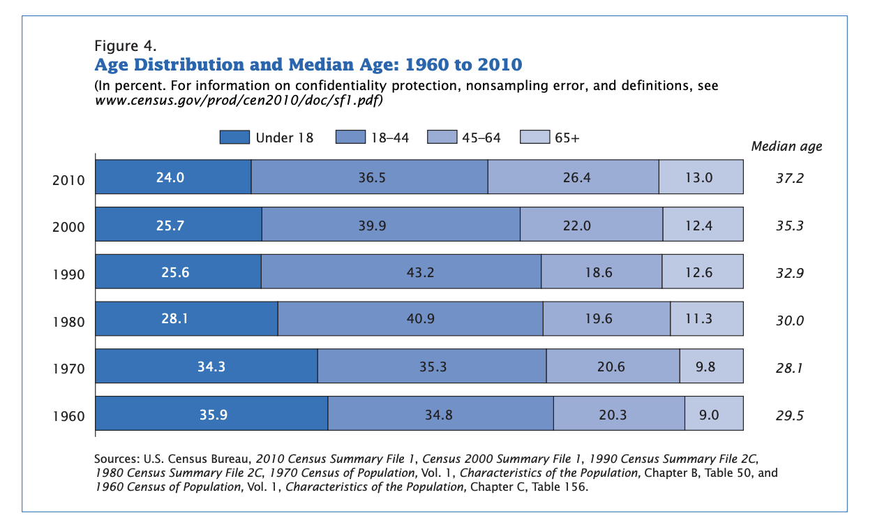
But the population is actually skewing older (see below) as it grows, I think in part because much of the population increase is coming from immigration and increased life expectancy. Source: https://www.census.gov/prod/cen2010/briefs/c2010br-03.pdf
I am trying to get a solid grip on how micromorts work (quick intro for those not familiar with the concept at https://en.wikipedia.org/wiki/Micromort). I have been doing some calculations, and there is one result I am seeing that I haven't been able to resolve or explain.
I attempted to reconstruct the "22 micromorts per day" value for deaths from all causes in the U.S. for 2010 (as listed on the Wikipedia page), and was able to do that, so I updated using 2019 data to get an estimate of 24 micromorts per day. I got this as follows: if you take the total number of deaths from 2019 in the U.S. (2,854,838) divided by the population of the U.S. in 2019 (328,239,523), that estimates the probability that someone dies in a year in the U.S. Divide by the number of days (365.25) to get a probability of death per day, and then multiply by 1 million to get 24 micromorts per day for deaths from all causes in the U.S. in 2019. So far, so good.
Then I decided to look at the number a different way: if the risk of death is 24 micromorts per day, we should be able to convert that to an estimated lifespan, because on average we get 1 million micromorts total per person (obviously some people get fewer and some get more, but by definition it has to average out). But if we take 1 million micromorts divided by 24 micromorts per day, we get 45,454 days, or 124 years. That is significantly longer than the 2018 CDC estimated human lifespan in the U.S. of 78.7 years (although at least it is within an order of magnitude).
Can anyone explain why there is a difference between the two estimates for human lifespan? I feel like there is a simple explanation lurking somewhere, but I haven't been able to figure out what it is yet. Thanks for your help!