This is super cool. I’d have thought this was a great post if it was just the content of the video, so the additional analysis is, like, super great.
I've shared the draft of the next post with you, in case you want to look at it.
For anyone else reading this, my supervisors don't want this public until the idea has been submitted to a conference. (Plagerism concerns) But DM me and if your profile shows you can come up with your own ideas, I'll let you in.
I'm a PhD student. My supervisors like getting reports on what I've been doing. Lesswrong has a good user interface. The comments I get on lesswrong have so far been about as insightful as my supervisors comments.
The only slight problem is my supervisors want to discourage plagiarists from reading and copying my work by getting me to write in incomprehensible formaliese in pay per view journals. After all, without self appointed corporate gatekeepers, how would anyone know if my work was any good? By looking at it?
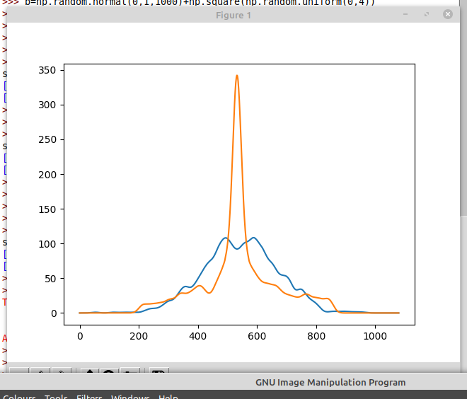
Probability density functions of loss
I might plot the CDF instead. That way you don't need to smooth.
The surprising thing shown is the significant positive correlation between log loss of a network, and log loss of the reverse. This means if you take a pruned network that scores well, and reverse it, turning on all the nodes that were off, and turning off all the nodes that were on, the result is usually still a well scoring network.
I suspect that this is only because you have a single hidden layer.
I might plot the CDF instead. That way you don't need to smooth.
Only by applying a very smoothing transformation, namely integration. I think its harder to see what is going on in CDF plots, because its easy to see a line falling by 5%, but hard to notice a line getting 5% less steep.
For example, which of these plots is easier to read
Or
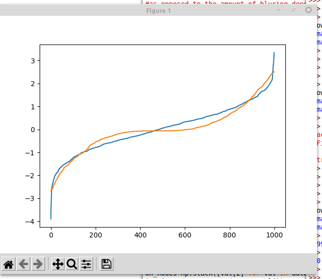
Plotting the CDF has turned a very obvious massive spike into a slightly flatter section. One of these curves is from normally distributed data. You can tell at a glance which it is from the top plot. The bottom plot makes it less obvious.
Yep. Testing this on bigger networks is on my todo list.
Perhaps it's just me - I find the latter substantially more informative than the former. (For instance, the tail behaviour is rather more visible.)
(Also, your scale is off on the latter chart. It should be between 0-1, by definition.)
Introduction
This post is a long and graph heavy exploration of a tiny toy neural network.
Suppose you have some very small neural network. For some inexplicable reason, you want to make it even smaller. Can we understand how the network behaviour changes when some nodes are deleted?
Training code
The network, and how it was trained.
Video of interactive heatmap
Given that the model only has 2 inputs, we can plot the model to get a good idea of what it is doing. The network was only trained on inputs within the [−1,1] square, but out of distribution behaviour can be interesting, so it is visualized on the [−2,2] square. The circle which the network is trained to approximate is shown. In the upper plot, yellow represents the networks certainty that the point is inside the circle, and navy blue, as certainty that a point is outside the circle. The colour scheme shown was chosen by whoever chose the defaults on the matplotlip.pyplot.imshow library.
Key takeaways:
Plotting the Loss
Lets analyse the loss (as measured by sparse categorical cross-entropy)
We can let each node exist independently with a probability p , and plot the probability density function of the resulting.
Generating the data
The following code runs the network with a random subset of the nodes removed, and saves the losses to file.
Probability density functions of loss
And then the result is loaded and plotted to create the plot below. Note that the lines are smoothed using a Gaussian kernel of width 0.03. This value is enough to make sure the graph isn't unreadably squiggly, but leaves the structure of the PDF.
Some small wiggles remain.
Notes:
Probability density functions of log loss
To consider the hypothesis that the loss is log-normally distributed, lets see the same data, but with the logarithm of the loss.
If the data was perfectly log-normally distributed, the plot above would be a bell curve. The bell curves of best fit are shown for comparison. I would say that these curves look to be pretty close to bell curves, and the variation could well be written off as noise.
Here is a table of the means and standard deviations of those bell curves.
Even if the small deviations from the (dotted line) bell curves isn't noise, it looks like assuming a log-normal distribution is a reasonably good approximation, so I will be doing that going forward.
Gradients of the loss
These nodes are being turned on or off by multiplying each node by b1,..bn∈{0,1} .
The multiplication happens after the Relu activation function, not that this is any different to the multiplication happening before the activation function.
birelu(x0w0+x1w1)=relu(bi(x0w0+x1w1))Why? Well these gradients can be easily computed by back propagation, and they could give insight into the structure of the network.
We can see that the gradients tend to be more pointy topped and heavy tailed than their bell curves predict.
The table of means and standard deviations
Note that the means are slightly negative, indicating that on average, the score is better with more nodes. On average, the 0.75 samples should contain about 10 nodes more than the 0.25 samples. Taking the mean loss gradient at 0.5, and scaling it by a factor of 10, we get -0.4751453. The mean loss at 0.75 minus the mean loss at 0.25 is 0.584365-1.0277158=-0.4433508. These numbers are reasonably close, which seems like a good sanity check.
In the previous section, we considered that log loss had a nicer distribution. What is the gradient of log loss doing?
∂∂kilogl=∂l∂ki1lThis means we can find ∂loss∂bi just by dividing the gradient of the loss by the loss.
The only really surprising thing about the above graph is the consistent trough at 0.
Is that node on
One hypothesis we might form is that we are observing the sum of 2 different distributions, each with a single peak.
Lets take the data for Prob=0.5. Each neuron is equally likely to be present or removed.
If f is a function that takes a list of 1's and 0's, representing the presence or absence of each neuron, and returns the log loss, then the i th component of the gradient is
limϵ→0f(b1,b2,...bi+ϵ,...bn)−f(b1,b2,...bi,...bn)ϵAn obvious distinction to make here is if bi is 0 or 1.
bi=0 corresponds to looking at a node operating at 0% (ie turned off) and asking if the network would do better if the node was at 1% instead.
bi=1 corresponds to looking at a node operating at 100% (ie turned on) and asking if the network would do better if the node was at 101% instead.
Ok. That wasn't quite what I expected. Lets split this up by neuron and see how that affects the picture.
At a glance, some of these plots look smoother, and others look more jagged. For example, neuron 11 has smooth looking curves, and neuron 4 has more jagged curves. Actually, both curves are still being smoothed by a Gaussian kernel of width 0.03. Inspecting the axis, we see that the gradients on neuron 11 are actually much smaller. Some neurons just don't make as much of a difference.
How much does N flips matter
Consider taking a random starting position (independent Bernoulli, p=0.5) and a random permutation of the neurons. Flip each neuron in the random order until every neuron that was on is now off, and every neuron that was off is now on.
We can visualize this process.
Here is a cube with edges labelled with coordinates. Each corner of the cube has a list of 1's and 0's which represents a way some nodes could be missing. (Of course, the network being visualized has 20 nodes, not just 3, so imagine this cube, but 20 dimensional.) We start by picking a random corner, and drawing the red line, which goes once in each direction.
There are N=20 red arrows, meaning 21 values for the loss at the endpoints.
The distribution over paths is symmetric about reversal.
The heat map show the covariance matrix between log losses along the paths.
The turquoise line on the graph beneath shows the covariance between the log loss at start of the path, and the log loss along the path. (In distance from start).
The pink line shows the covariance of log loss at the end of the path, and log loss along the path, measured in distance from the end.
These should be identical under symmetry by path reversal. And indeed the lines look close enough that any difference can reasonably be attributed to sampling error.
This graph shows that it takes around 5 or 6 node-flip operations before the correlations decay into insignificance.
The surprising thing shown is the significant positive correlation between log loss of a network, and log loss of the reverse. This means if you take a pruned network that scores well, and reverse it, turning on all the nodes that were off, and turning off all the nodes that were on, the result is usually still a well scoring network.
I suspect that a pruned network scores well when its nodes balance out, their being equally many nodes focussing on the top, bottom, left and right of the network.
As the full network is well balanced, this makes the nodes of the reversal also well balanced.
Heatmap of Gradient
So far, all considerations of the gradients are averaged over a test sample. But the gradient of the loss is well defined at every point.
Here is a heatmap of gradient of loss for each node. (Without pruning)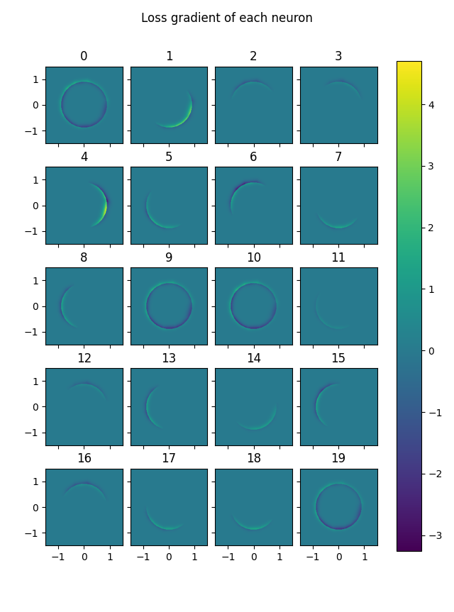
Blue represents a part of the solution space where a node is lowering the loss. If the network is confidant in its predictions one way or the other, then a marginal change to the neurons has a negligible effect on loss. The places where the network is uncertain are the annulus around the boundary circle. Thus the mid blue/green of 0 is seen away from the boundary circle.
Nodes 0, 9, 10 and 19 are acting as a bias. They ignore their input, assigning all points to within the circle. Hence blue (improved predictions) inside the circle, and yellow (worse predictions) just outside the circle. The other nodes slice a part of the space away at the edges, saying that every point sufficiently far in some direction is outside the circle. Slicing off an edge makes the part outside the circle bluer, and the part inside that gets caught on this edge somewhat yellow.
Here is a plot of the loss, showing most of the predictive loss occurs around the edge of the circle.