This is a linkpost for https://optimizationprocess.com/calibration-cdf/
New Comment
- I like the idea, but with n>100 points a histogram seems better, and for few points it's hard to draw conclusions. e.g., I can't work out an interpretation of the stdev lines that I find helpful.
- I'd make the starting point p=0.5, and use logits for the x-axis; that's a more natural representation of probability to me. Optionally reflect p<0.5 about the y-axis to represent the symmetry of predicting likely things will happen vs unlikely things won't.
I like the idea, but with n>100 points a histogram seems better, and for few points it's hard to draw conclusions. e.g., I can't work out an interpretation of the stdev lines that I find helpful.
Nyeeeh, I see your point. I'm a sucker for mathematical elegance, and maybe in this case the emphasis is on "sucker."
I'd make the starting point p=0.5, and use logits for the x-axis; that's a more natural representation of probability to me. Optionally reflect p<0.5 about the y-axis to represent the symmetry of predicting likely things will happen vs unlikely things won't.
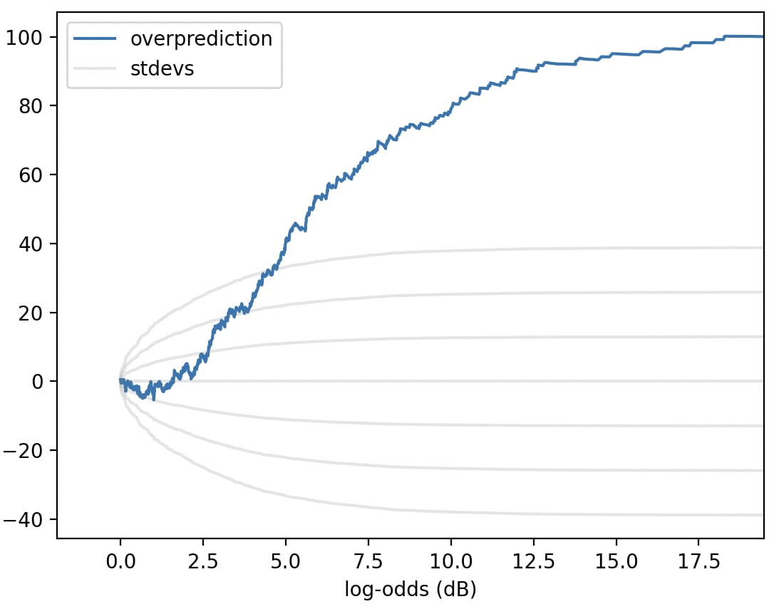
(same predictions from my last graph, but reflected, and logitified)
Hmm. This unflattering illuminates a deficiency of the "cumsum(prob - actual)" plot: in this plot, most of the rise happens in the 2-7dB range, not because that's where the predictor is most overconfident, but because that's where most of the predictions are. A problem that a normal calibration plot wouldn't share!
(A somewhat sloppy normal calibration plot for those predictions:
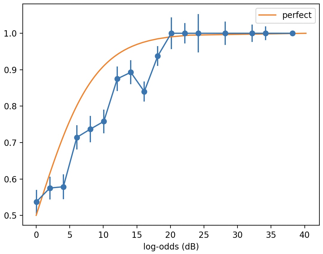
Perhaps the y-axis should be be in logits too; but I wasn't willing to figure out how to twiddle the error bars and deal with buckets where all/none of the predictions came true.)
I think something's off in the log-odds plot here? It shouldn't be bounded below by 0, log-odds go from -inf to +inf.
Ah-- I took every prediction with p<0.50 and flipped 'em, so that every prediction had p>=0.50, since I liked the suggestion "to represent the symmetry of predicting likely things will happen vs unlikely things won't."
Thanks for the close attention!
(Hmm. Come to think of it, if the y-axis were in logits, the error bars might be ill-defined, since "all the predictions come true" would correspond to +inf logits.)
forall p from 0 to 1, E[ Loss(p-hat(Y | X),p*(Y | X)) | X, p*(Y | X) = p]
p-hat is your predictor outputting a probability, p* is the true conditional distribution. It's expected loss for the predicted vs true probability for every X w/ a given true class probability given by p, plotted against p. Expected loss could be anything reasonable, e.g. absolute value difference, squared loss, whatever is appropriate for the end goal.
It sounds like you're assuming you have access to some "true" probability for each event; do I misunderstand? How would I determine the "true" probability of e.g. Harris winning the 2028 US presidency? Is it 0/1 depending on the ultimate outcome?
As you know, histograms are decent visualizations for PDFs with lots of samples...
...but if there are only a few samples, the histogram-binning choices can matter a lot:
The binning (a) discards information, and worse, (b) is mathematically un-aesthetic.
But a CDF doesn't have this problem!
If you make a bunch of predictions, and you want to know how well they're calibrated, classically you make a graph like this:
But, as with a histogram, this depends on how you bin your predictions.
Is there some CDF-like equivalent here? Some visualization with no free parameters?
I asked that question to several people at Arbor Summer Camp. I got three answers:
If we make a "CDF" for the above 100 predictions by applying these three insights, we get:
I find this a little harder to read than the calibration plots above, which I choose to interpret as a good sign, since CDFs are a little harder to read than histograms. The thing to keep in mind, I think, is: when the curve is going up, it's a sign your probabilities are too high; when it's going down, it's a sign your probabilities are too low.
(Are there any better visualizations? Maybe. I looked into this a couple years ago, but looking back at it, I think this simple "sum(expected-actual predictions with p<x)" graph is at least as compelling as anything I found.)