Huh, this looks somewhat different from our own analytic graphs we've compiled recently, which look like this (the karma graph in the first below is mostly just inflation caused by the new karma system, so that doesn't really mean much):
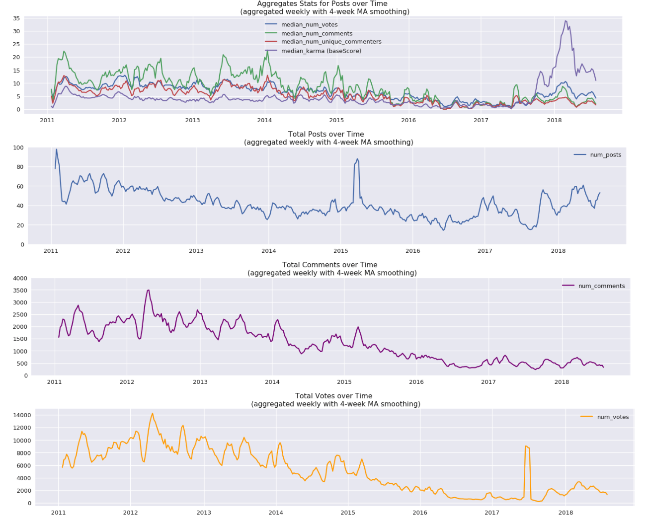
In particular, the post over time graph looks different for Said's stuff, which is somewhat confusing, though I guess it kinda lines up. I notice that you do have some stuff in 2008, and it's aggregated weekly instead of monthly. We filtered out a bunch of stuff marked as spam on our side, but that shouldn't have even reached your side.
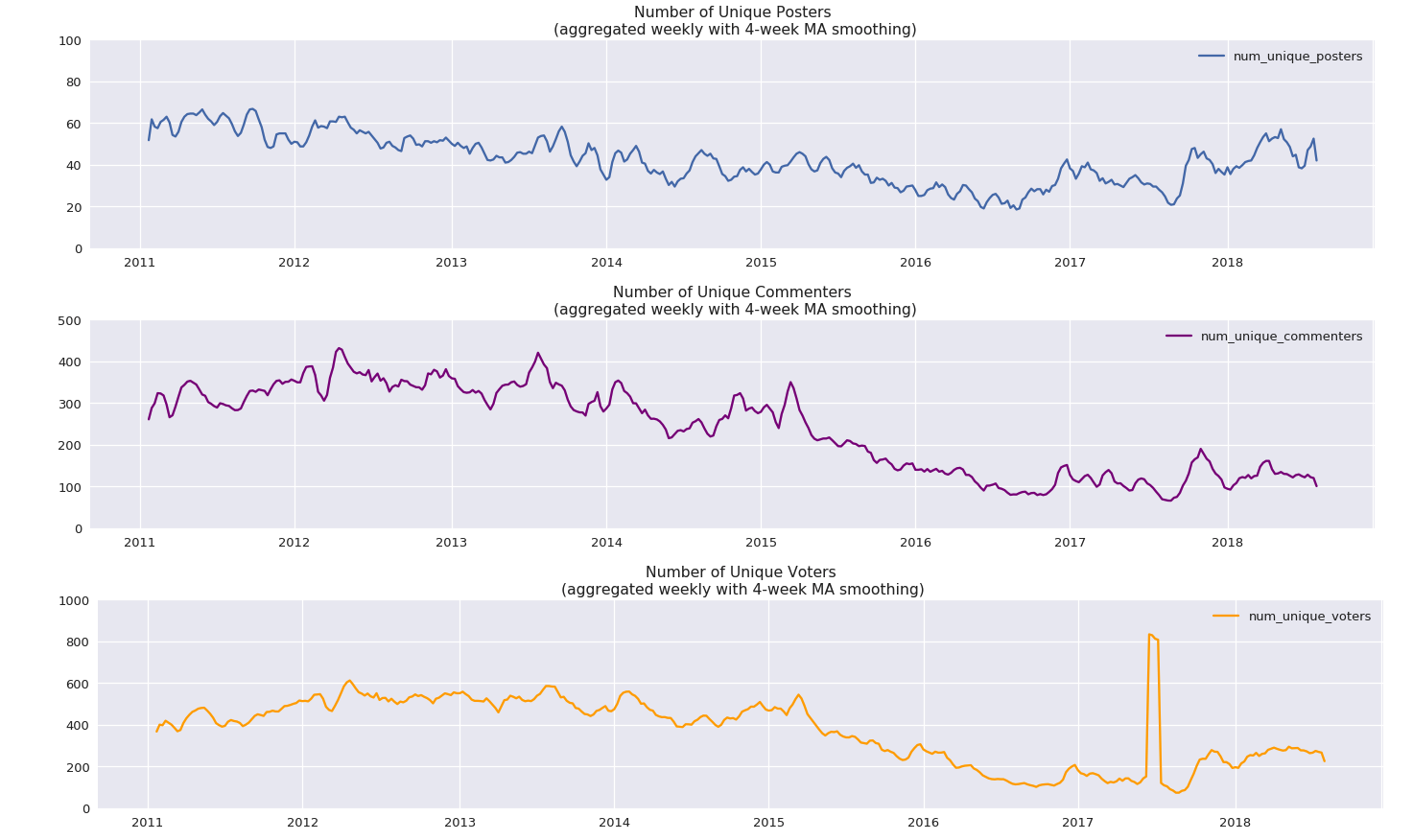
Here are also some graphs for number of unique commenters and posters (the vote spike is caused by some data import shenanigans, ignore that one):
I actually appear twice on the list of most prolific authors - Casebash and Chris Leong are both me. Hopefully, I can get my two accounts combined at some point.
Said, thanks for doing this, and also for running GW!
It looks like #posts/day is propped up by attention seeking, so it stays stable; while #comments/post is a more genuine indicator of health, and shows a slow decline. Also it's curious that the relaunch of LW didn't affect metrics much. Wonder what the mods would say about this.
I miss the days when there were hundreds of comments per day and I had to write my own Javascript code to scrape and display all the recent comments (which I called LessWrong Power Reader) to keep up. It seems really strange that even the AI alignment posts these days are getting so few comments compared to for example the decision theory posts back then, even though there must be a lot more people working on or interested in AI alignment today than decision theory back then?
Thanks for running GW ought properly to go to clone of saturn, who both wrote the server code (e.g.) and administers the server. I’m just the front-end guy! :)
As for the graphs/data—you’re quite welcome! (And, by the way, if you, or anyone, have suggestions on what other relationships or patterns might be interesting to extract from this data and make a chart of, let me know and I’ll add it to the post.)
Median number of comments/post seems to have gone up a bit since the relaunch, at least according to the graphs I posted below. Average number probably has probably stayed roughly the same, which I think is mostly the cause of Scott moving to his own blog, and his posts continuing to create infinite amounts of comments.
Overall, I think the launch shows up relatively clearly on a bunch of the metrics I posted below, and it's too hard to eye-ball scatter plots to judge on the plots above, though I agree that the overall effect of the relaunch on number of comments is relatively minor.
Maybe? I think the user habits are pretty different on the site now compared to then. But I agree that more comments would be better :)
Thanks to Betawolf on IRC for this graph, which plots ratio of karma to comment count vs. time, and shows some interesting statistics:
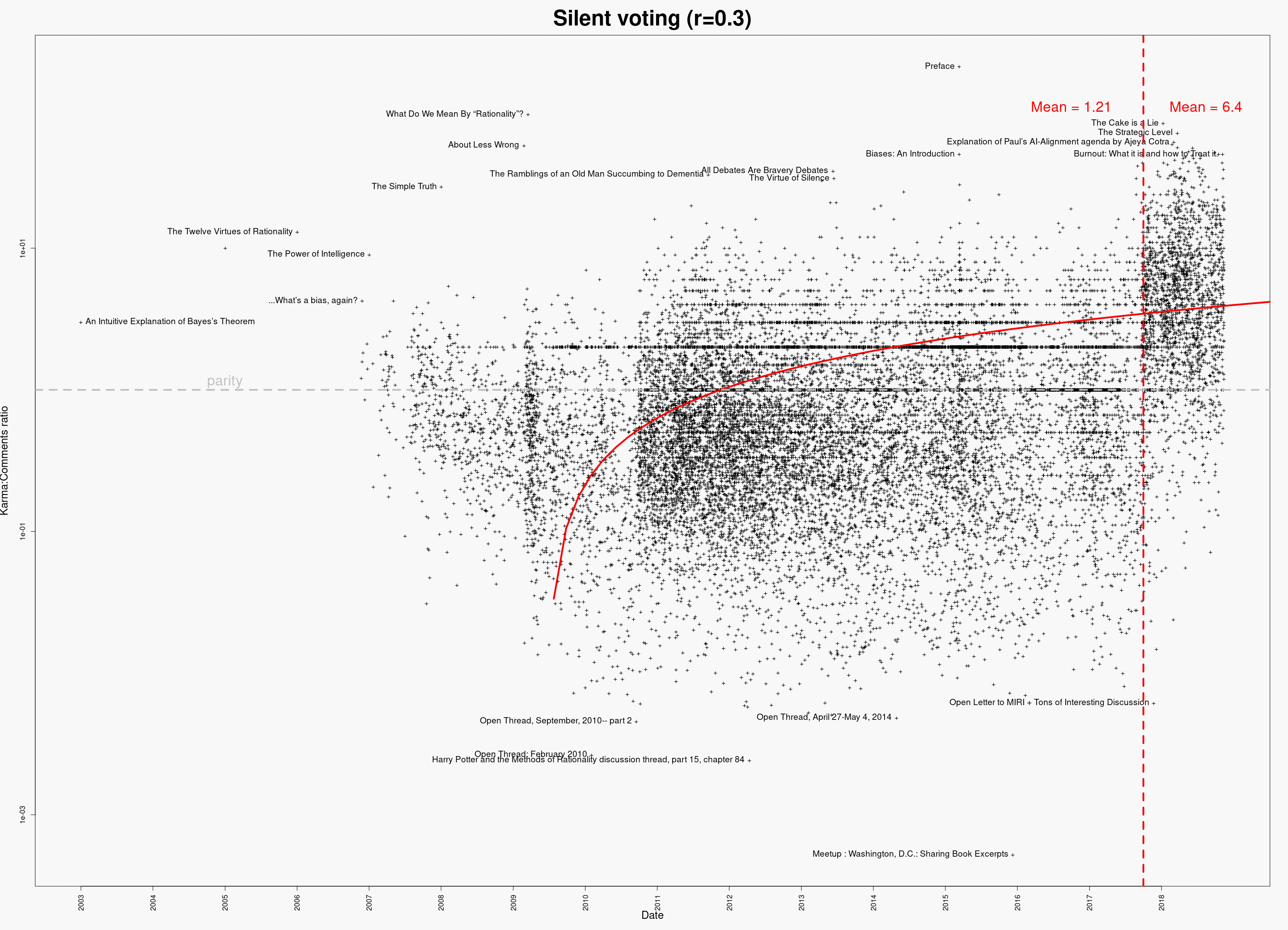
That fitted curve looks pretty dubious in its earlier parts. (Maybe I'm misunderstanding and it isn't a fitted curve at all?)
If it's a computed trend-line rather than something someone eyeballed then in my book that is a fitted curve. Anyway, that makes sense; presumably it goes below zero somewhere a little to the left of where it stops. Given the obvious discontinuity, it might have made more sense to plot separate lines for before and after...
It’s computed, yes. And I defer to your grasp of the terminology!
And yes, separate trend-lines for before and after the red vertical line might have been good; if the graph’s creator makes such a version, I will post it.
Update: Here is is another graph (also from Betawolf on IRC) that may address your questions/concerns:
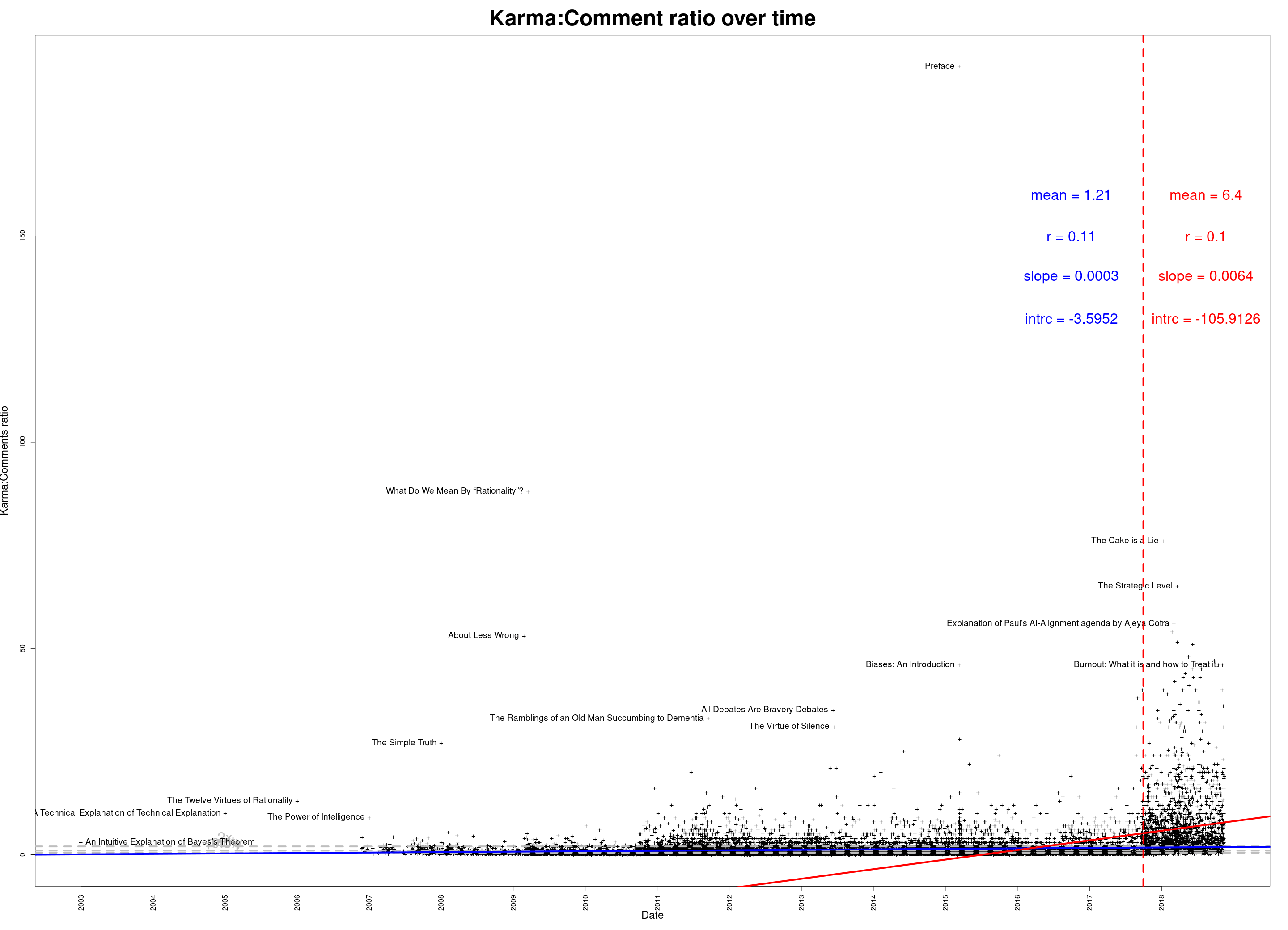
And the same thing on a log scale:
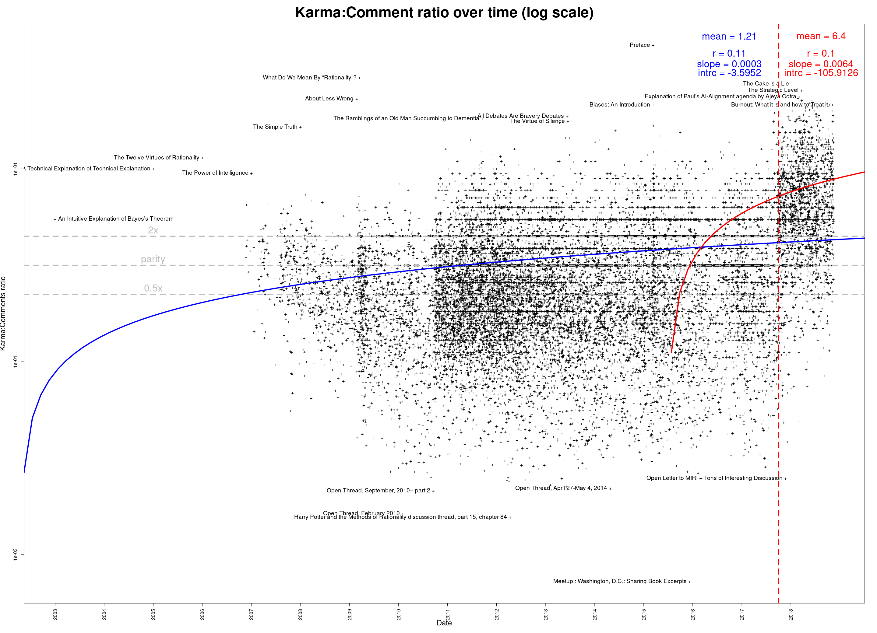
Hmm, the shift there seems mostly the cause of the changes to self-upvoting, as well as the increase in average karma weight. I think you might be able to adjust for that a bit by just using the vote count field (though obviously that ignores the difference between upvotes and downvotes). You could also resolve every individual anonymized vote and then count the upvotes to properly adjust for this, but that might be a bit of a pain.
Some graphs showing posting activity on LessWrong through the years.
NOTE: If you’re reading this post on GreaterWrong, you can click on the images to enlarge, zoom in, and click through them all as a slideshow.
Comments per post:
The same thing, on a log scale:
Posts per month:
The 100 most prolific authors over LessWrong’s lifespan:
The same thing, on a log scale:
Whose posts have generated the most total discussion?
As above, but on a log scale:
Data available in a Google Docs spreadsheet. (Or download in CSV format.)
You can also download an Excel spreadsheet, which contains the above graphs and some intermediate processed data.
Edit 2018-11-16: Updated data; corrected some minor abnormalities caused by data retrieval issue. (If you’ve downloaded the data already, please re-download the corrected versions—the links are the same.)