This is a special post for quick takes by Paweł Sysiak. Only they can create top-level comments. Comments here also appear on the Quick Takes page and All Posts page.
I just created Dig Text, a new writing standard, which allows you to read the shortest version first, and dig deeper only where it interests you. I thought about dig about ten years ago, lol, and now, with the help of Claude Code, I spent two weeks thinking it through and coding it. It’s still in BETA, so I’m gathering feedback, but I would love if you try it and let me know what works and what doesn’t. https://digtext.github.io
I had a similar thought for math proofs, where you should be able to see an overall proof sketch first, then expand on any point to see the intuition/longer proof in a hierarchical way.
Related:
- https://vlad.roam.garden/How-do-I-read-things-on-the-internet (LW crosspost). This is bullets points style, default expanded. I don't like the indentations though, I think it is a bad idea.
Feedback:
- IMO there should be a variant of text expansion where the original text gets replaced by the longer version.
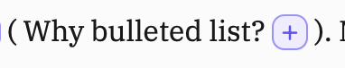
- The "Plus" icon is an improvement over having a new paragraph / indentation, but still too distracting, especially the purple color.
- Keyboard navigation is a bit clunky.
- Pressing Enter should move focus somewhere sensible, rather than eating the focus. Probably to the ending parenthesis for expansion, and to the original + icon for collapsion.
- Maybe just me, I expect ArrowRight on the Plus icon to expand the text too.
- Let me use ctrl+z ctrl+y to undo / redo
- Would be nice to have a "default expand n layers deep" button.
- Please show me an example of
((text))and:::dig:::tags in the demo. - Double parentheses syntax
- I like it
- You are not allowing double parentheses to be escaped, try \((a))
- Your parser is wrong, try ((a((b))c))
- btw the selection of text in your demo is fucked (Firefox; Windows if that matters), it is selecting text one line lower than where my cursor is.
- I am slightly annoyed that the Plus icon is not centered properly. It is a little bit too low.
- The way your examples are structured with one sentence expansions seems bad. I don't want to spend a few seconds clicking the button just to read one more sentence
- It makes me want to have some sort of preview (full preview or how many levels / characters hidden)
Marginally related on the "dig deeper" part:
These pages uses side panels for Obsidian-style page linking. (via)
Thanks for your patience, I am back from my time off.
- You listed a lot of bugs, visual problems that I want to fix. Thank you.
- I agree that just text color for pluses may be a better choice here.
- I agree that the best use is when digs don’t hold a small amount of text, but this is up to the writer
- "Pressing Enter should move focus somewhere sensible, rather than eating the focus. Probably to the ending parenthesis for expansion, and to the original + icon for collapsion". I think this is very interesting. I have been thinking how to approach this. I think there are tradeoffs here, mostly simplicity. There is a way, actually, to have preview text (see dig example and text in parenthesis). I will think if there is a sensible way to bake it in more universally into the dig format eg.: • {{preview text}} or similar.
What do you mean by preview text? Do you mean Here is some text that is shown ((and some text that is hidden))? I don't consider that as preview text, I am imagining text showing up on hover (unsure about exact design). If you mean something else, I don't understand.
Also I still have no idea how the :::dig syntax work.
- I meant this bit on https://digtext.github.io (see image)
- hover don't work on mobile so its not a viable solution IMO
- how would do u feel about the solution from the image?
- I didn't fully thought :::dig syntax through but I imagined adding a script on top of the site and inside dig tags all bulleted lists would render as dig text. Am I missing something in this solution?
I like the idea, though I also already really like classical options such as footnotes, and don't even mind footnotes on footnotes.
One UI feedback point: when expanding an item, it is currently shown exactly like the main text. I'd have preferred some form of highlighting, maybe slightly different font colours or background colour for each level, to show where the expansion starts and ends. I found when expanding an item, I wanted to read the addition but couldn't quickly identify where it ended, which made it more difficult for my brain to selectively read just the expanded part.
I used such three level bullet points style in https://www.lesswrong.com/posts/iBg6AAG72wqyosxAk/the-badness-of-death-in-different-metaethical-theories
I'm trying to find the best user experience for progressively expanded reading. Footnotes, for example, are only one indentation level and honestly most of them online are a pretty terrible experience to click on.
Footnotes on sidebars are good for most simple cases but insufficient for more elaborate structures, but you can in fact put a footnote in a footnote to get more than one indentation level.
I like the idea of footnotes on footnotes. I can see an interesting exploration in this space where footnotes (and footnotes of footnotes) appear as a bottom bar/appearing over the text. Sidebars don't work IMO as on smaller screens there is not enough horizontal space, and mobile is where a lot of text is read.