This is a linkpost for https://radfordneal.wordpress.com/2020/04/23/the-puzzling-linearity-of-covid-19/
New Comment
https://www.medrxiv.org/content/10.1101/2020.05.22.20110403v1
"Why are most COVID-19 infection curves linear?
Many countries have passed their first COVID-19 epidemic peak. Traditional epidemiological models describe this as a result of non-pharmaceutical interventions that pushed the growth rate below the recovery rate. In this new phase of the pandemic many countries show an almost linear growth of confirmed cases for extended time-periods. This new containment regime is hard to explain by traditional models where infection numbers either grow explosively until herd immunity is reached, or the epidemic is completely suppressed (zero new cases). Here we offer an explanation of this puzzling observation based on the structure of contact networks. We show that for any given transmission rate there exists a critical number of social contacts, Dc, below which linear growth and low infection prevalence must occur. Above Dc traditional epidemiological dynamics takes place, as e.g. in SIR-type models. When calibrating our corresponding model to empirical estimates of the transmission rate and the number of days being contagious, we find Dc ~ 7.2. Assuming realistic contact networks with a degree of about 5, and assuming that lockdown measures would reduce that to household-size (about 2.5), we reproduce actual infection curves with a remarkable precision, without fitting or fine-tuning of parameters. In particular we compare the US and Austria, as examples for one country that initially did not impose measures and one that responded with a severe lockdown early on. Our findings question the applicability of standard compartmental models to describe the COVID-19 containment phase. The probability to observe linear growth in these is practically zero."
Yes, an R0 (or maybe Rt is the term to use) of one would give linear growth. But why should it be close to one in so many countries? (I think 0.85 isn't close enough.) There seems to be no reason for the effect of the interventions that have been made to hit one this closely, other than shear coincidence.
One of the arguments I've heard against "flattening the curve" is that to keep infections below health care capacity you have to get Rt so close to one that you might as well do a bit more and get it well below one. (And anyway you'd have to aim for that to be sure that it doesn't stay well above one.) It's hard to believe that we'd hit one so precisely when nobody knows what the effect of the interventions really is.
(I think 0.85 isn't close enough.)
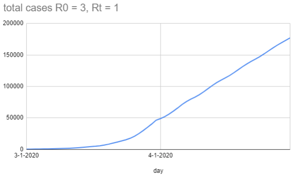
In a dumb model where people aren't infectious on day 1-5, and then on day 6-8 infect one person each day under normal conditions and a third of a person each day under lockdown conditions, you get this graph (with the lockdown starting on 4-1):
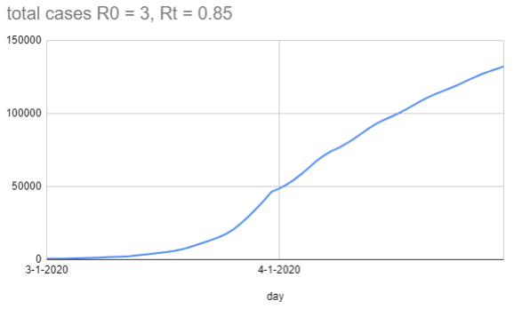
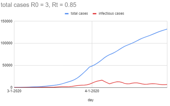
When I change Rt to be 0.85 (so on each infectious day it's 0.28 people), you get this graph:
One thing you'll notice about the graph is the waviness of the total cases line. Even though the new infections plummet on 4-1 because the rate dropped, there's still 8 days of 'infectious case' growth until it starts to drop, because those people were infected before the lockdown (but didn't become infectious until later), and the same effect happens for each bulge. In a more realistic setting, you'd expect Rt to drop as smoothly as people gradually raise their defenses, which is probably less sudden than a step change.
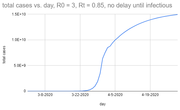
In case you're wondering, I think the magic here is mostly being done by the serial interval. This is what it looks like if people are infectious for three days, but those are instead days 1, 2, and 3:
There seems to be no reason for the effect of the interventions that have been made to hit one this closely, other than shear coincidence.
Sure; proximity to 1 is surprising, but I didn't predict what Rt would be, I observed it, and so unless you have a really strong prior here it makes sense that my posterior is mostly peaked on the observation.
I agree it is moderately surprising that the measures people have employed so far have only gotten the Rt down to 1, instead of lower, but perhaps this is because they aren't using masks or confining cats or whatever turns out to have been important.
Thanks for the interesting graphs!
Rt=0.85 with serial interval of 6-8 does look almost like a straight line for the relevant time period. Given that the actual data is noisy (probably beyond simple Poisson variation, with various reporting effects), it may be compatible with that explanation (without, for instance, needing to hypothesize stranger reporting artifacts that would systematically keep the reported deaths nearly constant). Though the linear plots of world case and death counts at https://www.worldometers.info/coronavirus/ do still look very straight to me.
As a more general point, it's not entirely satisfactory to say that you made an observation and got Rt approximately one, so that's just what it is. The simple model would be that initially R0 was something greater than one (otherwise we'd never have heard of this virus) as a result of viral characteristics, human behaviour, weather, etc. - it could be 1.3, could be 4.7, etc. - and then we changed our behaviour, and so Rt became something smaller than R0 - maybe a lot smaller, maybe a little smaller, hard to tell. There's no reason in this model that it should end up really close to one, except by chance. If it seems to be really close to one, then alternative models become more plausible - such as a model in which testing or hospital limits somehow lead to reported cases or deaths saturating at some upper limit (regardless of the real numbers), or in which the transmission mechanism is something completely different from what we think - since in these models there may be a good reason why the apparent Rt should be close to one.
As a more general point, it's not entirely satisfactory to say that you made an observation and got Rt approximately one, so that's just what it is.
I suspect we agree. That is, there's both a general obligation to consider other causal models that would generate your observations ("do we only observe this because of a selection effect?"), and a specific obligation that R0=1 in particular has a compelling alternate generator ("fixed testing capacity would also look like this").
Where I think we disagree is that in this case, it looks to me like we can retire those alternative models by looking at other data (like deaths), and be mildly confident that the current R0 is approximately 1, and then there's not a 'puzzle' left. It's still surprising that it's 0.85 (or whatever) in particular, but in the boring way that any specific number would be shocking in its specificity; to the extent that many countries have a R0 of approximately 1, it's because they're behaving in sufficiently similar ways that they get sufficiently similar results.
Isn't "flattening the curve" one of those concepts that shape-shifted without us being aware of it?
Originally, it was to mean that the disease would run its course, infect 20-70% of the population, we'd just slow it down so the healthcare system wouldn't get overwhelmed.
Today, "flattening the curve" apparently means: suppress ASAP and keep R0 below 1. Which means we'll continue to live in a susceptible, tinderbox world. At least if and until a vaccine is found.
Or am I missing something here?
I think different people have used it to mean different things, which is an easy way for concepts to shapeshift.
The percentage of the population infected at the 'herd immunity' stage is dependent on R0, the transmission rate; each newly infected person has to, on average, hit less than one not-yet-immune person. And so if 80% of the population has already had it, you can afford to roll against up to 5 individuals; if 50% of the population has already had it, you can afford to roll against up to 2 individuals. Then the number of new infections is a shrinking number, and eventually you get no new infections (while some fraction of the population never got the disease).
I think early on people were mostly worried about access to ventilators; it's 'fine' if people get the disease, so long as sufficiently few of them get it at any particular time. Drop the R0 to 1, and a manageable infection stays manageable (and an unmanageable one stays unmanageable).
I think most internet commentators were overly optimistic about how effective minor adjustments would be, and empirically it's taken the 'social distancing' / 'shelter in place' / 'lockdown' state that most of the world is currently in to get the R0 below 1, rather than just people being more diligent about washing their hands.
There are only a few ways out of this mess, and they all involve the number of active cases going (functionally) to 0. Suppression (whatever measures it takes to get R0 sufficiently close to 0, instead of 1), herd immunity (enough people getting it and recovering that future social interactions don't cause explosions), or a vaccine (which gets you herd immunity, hopefully with lower costs).
Maybe this is not the type of explanation you're looking for but logistic curves (and other S-curves) look linear for surprisingly long.
I could see that as the explanation if the curve has stopped going up exponentially because we are approaching herd immunity, but that isn't what's commonly believed... Instead, we'd expect the number of new deaths each day to have shifted to a different exponential curve as a result of control measures, and only by coincidence would this exponential have a coefficient near zero (hence nearly constant deaths).
[Though as Vaniver points out, it's a bit more complicated when you account for the serial interval (the time lag for an infected person to infect another).]
A constant level of testing, leading to a constant number of confirmed cases some of which die?
I discuss that possibility in the post. It seems more plausible as an explanation for linear growth in confirmed COVID-19 cases than for linear growth in deaths attributed to COVID-19. For the latter, the situation would have to be something like... there's no tendency to use tests on the most serious cases (many of whom die), and instead they test a fixed number chosen at random of those who come to medical attention (of whom the most serious are a small, fixed fraction), and only attribute a death to COVID-19 if it was of someone who tested positive.
My guess is that most people aren't infecting many others because of a number of factors, mainly awareness of the issue and social distancing measures. Most people are being extra careful compared to usual, especially about things that would have a high probability of transmission. I'm not sure how good the testing is...even if it is much better than it was, are they really anywhere close to catching all new cases, especially very mild ones? They are probably undercounting. But it doesn't surprise me that right now it's not taking off like crazy, especially if so many people are working from home and kids aren't at school/don't even really spread it. Initial spread would have been more extensive because of lack of awareness. People weren't taking precautions because they didn't know to do so, or didn't understand the most effective ways to reduce risk, which was really unfortunate for groups of vulnerable people, such as nursing homes and multi-generational homes. If everything was open and no one was aware again, you'd probably start seeing huge super spreader events that could go exponential.
[ I posted this on Radford's blog but not sure if it posted. Will post here as well:]
Might I suggest another hypothesis: that in the metro areas of major cities in most countries that have been hit hard (i.e. those with linear growth rates in deaths), the infection rate among the frail WHO WERE GOING TO DIE OF OLD AGE ANYWAYS reaches saturation point. Then, all the old age deaths (that would have happened anyways), start being classified as covid deaths. In reality, they are probably best considered covid deaths+other causes. It would be fair to say covid expedited the death, but then so did every other infection and disease that they had at the time.
Then, what you get is the death rates are just representing the baseline natural causes death rate, where all those deaths are covid deaths now.
It would also be sufficient to explain the linear deaths if there was some set property of countries that made the “percent of the frail who get covid” being a constant. This to me also seems feasible. Each country will have a set “percentage of the elderly who live in nursing homes.” Not all do, but let’s suppose close to 100 percent of those in nursing homes contract covid. Their body will be fighting covid from now until the day they die (their immune system is weak, after all). Now, they won’t die from it right away; but they will die eventually soon anyways. The key point is that if we assume baseline old age death rates stay roughly constant, then the linearity can be explained by “a saturated percentage of old folks who die all having covid.”
Note then that this would have nothing to do with the mitigation measures done outside of nursing homes in each country. The death rates per day will simply be proportional to the percent of old folks near life’s end who have covid. This is likely just related to the percent of old folks whose living situation isolates them from the virus or not. This would be a constant per country.
That seems like a plausible explanation. I wonder how one could confirm it? If there were two sets of covid death counts based on strict and on loose criteria, one could see if there is a divergence in their rates of increase.
Your comment didn't show up at my blog. Not sure why...
Fuirst, I don't think looking at "number of cases identified" is useful at all for this analysis. Mainly because this is too much a function of how much testing you do that it's not very meaningful.
Let's write down the hypothesis: "the linearity observed is primarily due to the arrival of "deaths door" for those approaching end of life. A fixed fraction of these deaths have covid in any country because a fixed fraction are in living situations that give them some minimal exposure."
So what are some consequences of this hypothesis?
We could look at the death rates of young folks, say those under 50. We'd assume that for that set, their death would not be caused by frailty with covid. If they die with covid and covid-related symptoms, this would not be a death due to frailty. We know that among those under 50 only a small percentage have complications, so this absolute number should be very small. However we know it is not 0.
What we should see is that THAT number should go up exponentially (though remain small) as reopenings begin. However, since that number will STILL be small even at full infection rates, this shouldn't effect the totals too much because that will be dominated by the linear arrival of "imperfectly isolated frail folks dying with covid."
As well, the test cases too look at would be cities and regions that have not seen major infection rates or death rates. We might expect that in a place like NYC (where serological tests are suggesting up to 20 percent infection rates), that the young folks who were going to die of this may have already died.
But perhaps the interior US will allow us to test this hypothesis.
My bet would be: a small absolute number of young folks dying of the disease, but that that absolute number will go up exponentially in regions with very small numbers of covid right now.
I think that this is explained by the testing capacity. The nearly constant new test cases are determined by the number of tests. This applies to the death too. There might be more deaths due to the virus. But they are not counted into the death due to the virus because they did not get the virus test too. Perhaps we should look at the number of deaths minus the expected deaths in 2019 to see actually how many deaths are due to the virus.
I'll guess that some of it is because within-home transmission was a surprisingly high fraction of Rt in late March and the first few days of April. That will involve Rt close to 1 for transmission to adults in a typical household, until immunity effects inhibit a good deal of within-home transmission. I'm also guessing that infections are mostly going undetected in children.
Limits on test availability could affect reporting of COVID-19 deaths. I expect that some hospital deaths in March weren't tested for COVID-19. Maybe also some were swabbed, and testing of those swabs was given low priority, with the result that some deaths are being reported with significant delays. There's been some recent confusion over Pennsylvania's reported deaths which suggests that standards have been changing for how deaths are counted, and that seems to be adding a few more reported deaths now than would have been reported a month ago.
Those are both good points.
It does seem likely that the measures that have been taken do a lot more to inhibit between-household transmission than within-household transmission, so there could be a lag while within-household transmission works itself out before an exponential decline in new cases/deaths becomes evident.
And if there's a testing backlog, and deaths are only recorded as COVID-19 deaths once a sample is finally tested, that would also introduce a lag. This seems like it must vary a lot with locale, though...
Infections start among people at the river’s mouth, and expand exponentially amongst them, until most of them are infected. It also spreads up the river, but only by local contagion, so the number of deaths (and cases) grows linearly according to how far up-river it has spread. This scenario, however, seems nothing like what we would expect in almost all countries.
That doesn't seem implausible to me, if the epidemic spreads fastest (and therefore first) in densely-connected areas of the social network graph of in-person contacts and mitigation affects those areas of the graph fastest/most. That plus lag from the implementation of mitigation to the results showing up in the case numbers might make growth look approximately linear for a while. Especially when plotted on a linear plot scaled to previous much-faster growth.
Why, recently, for many countries (and the world), are total cases and total deaths increasing in nearly a straight line, on a linear plot? Please post a comment here or there if you have a clue about this puzzle.