Many of you have read Slime Mold Time Mold’s series on the hypothesis that environmental contaminants are driving weight gain. I haven’t done a deep dive on their work, but their lit review is certainly suggestive.
I think this is as good a place as any to point out that the SMTM authors have been repeatedly misleading about their evidence and unwilling to correct their mistakes, both on A Chemical Hunger and elsewhere. Here are a few examples that come to my mind at the moment:
- They claim that Texas “tends to be more obese along its border with Lousiana [sic], which is also where the highest levels of lithium were reported,” but their own source says that lower levels of lithium, not higher, are found along Texas's border with Louisiana. A commenter on their post has pointed out that error, as have I on a Twitter thread, but the authors have not edited their post or addressed this in any other way. (Incidentally, the correlation between drinking water lithium levels and obesity rates across Texas counties is negative).
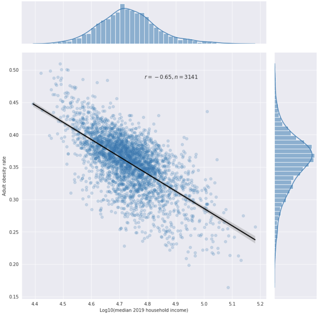
- They claimed on Twitter that geospatial associations between drinking water contaminants and obesity rates in the US are probably not confounded by SES, because “SES isn't really associated with obesity rates.” However, the correlation between obesity and ln(income) across n = 3110 U.S. counties was −0.486 in 2013, and my own analysis of 2019 data suggests the correlation was -0.65 in that year (using median household income data). [1] [2] [3] (Their response to the 2013 data [4] is pretty much just “this correlation didn’t exist 30 years ago,” but I don’t see how that supports their statement that “SES isn't really associated with obesity rates,” since that's a statement in the present tense rather than the past tense.)
- They claim that hypoxia probably cannot explain the effect of altitude on obesity, saying that “exercise in a low-oxygen environment does seem to reduce weight more than exercise in normal atmospheric conditions, but not by much.” However, when you read the abstract they linked to, you see that what they are calling “not by much” is a 60% increase in weight loss.
- In several posts, they claim that wild animals have been getting more obese, citing Klimentidis et al. (2010). However, that paper does not make that claim; it doesn’t even examine body weight data from wild animals at all. When confronted about this on Twitter, they provided evidence that some white-tailed deer populations under increased predation from humans have been getting heavier over the past several decades, but there’s archeological evidence that they are simply returning to their normal historic body size after being smaller than normal for a while due to a temporary decrease in predation by humans (which increased their population density and thus competition for food). For sources and more details, see this Twitter thread.
- (Unrelated to obesity) there's a post in which they claim that “Sicilian lemons really ARE more like polar bear meat than they are like West Indian limes, at least for the purposes of treating scurvy” (implying that Sicilian lemons have lower vitamin C content than West Indian limes and polar bear meat). I investigated this and found that West Indian limes have ~60% of the vitamin C concentration of lemons, and that polar bear meat has much less vitamin C than either (but that all three of those can still prevent scurvy if eaten regularly at not-extremely-large portions, and lemons and limes both have enough to treat it).[5] They have been contacted about this, and their response was that we don't know whether historical Sicilian limes had enough vitamin C to treat scurvy or not. Clearly, that is different from asserting (as they do in the post) that we know they don't have enough vitamin C. But they have not edited their post.
ETA: What I initially said on point 5 was wrong (specifically, I embarrassingly confused lemons with limes at some point), and I have now fixed it.
- ^
- ^
Individual-level data yield a much weaker correlation (in my own analysis of NHANES 2017-2020 data, the correlation is -0.14 for white women in their 30s and 40s, and -0.05 for white men of the same age). But NHANES only records income levels in multiples of the poverty line up to 5, and individual-level data is known to be noisier than county-level data, so that probably explains the discrepancy. Moreover, in that specific context (figuring out whether geospatial associations between drinking water contaminants and obesity rates are confounded by SES or not) county-level data are more relevant than the individual-level data.
- ^
For comparison, my own analysis suggests that the correlation between altitude and obesity rates across US counties (which the SMTM authors think is a big deal) is -0.35. The altitude value I used for each county in my analysis was the average altitude of the centroids of its census tracts, which gives you the closest thing to a population-weighted average altitude by county that you can get with cheap and fast computation. I haven't published the details of this analysis yet, but you can ask me for the Google Colab notebook and I'll share it with you.
- ^
They address the 2013 data in the paragraph starting with “The studies that do find a relationship between income and obesity tend to qualify it pretty heavily.”
- ^
Livers tend to be more vitamin C-rich than other tissues in the animal body, so I looked for data for them too, and found that, for several animals, their vitamin C content ranged from lower than that of West Indian limes to higher than that of lemons. So West Indian limes did not stand out in my data as being unusually lacking in vitamin C.
This seems fine to be here but I expect a lot of people will miss it due to my terminally uninteresting title and it's worth a top level post.
Yesterday I learned that the CDC actually provides zip code-level (well, technically, Zip Code Tabulation Area-level) obesity rate estimates on their website. Using them, these are the correlations I found, for contaminants with >10,000 entries:
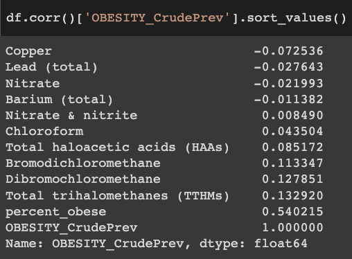
Unfortunately, you can see that there is a very low correlation between the obesity rates in this ZCTA-level dataset ("OBESITY_CrudePrev") and the "percent_obese" column in your dataset (0.54). As far as I know, all of these small area obesity rate estimates are created with fancy statistical modeling and interpolation to deal with missing data and small sample sizes, so this probably reflects differences in statistical methodology.
I don't know which dataset is better. And, to make matters worse, when looking into this I found county-level obesity rate estimates on the CDC website (from the Diabetes Surveillance System) that have very low correlations with both of these!
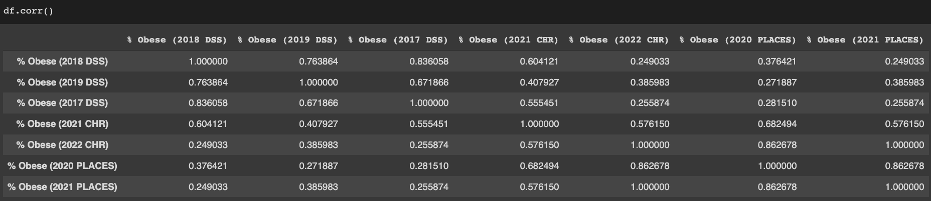
("DSS" stands for Diabetes Surveillance System, "PLACES" is the CDC project that created ZCTA-level estimates and also has its own county-level estimates, and "CHR" refers to the County Health Rankings. Elizabeth's dataset uses data from the 2021 edition of the CHR. The 2022 edition uses a dataset identical to the 2021 release of PLACES.)
Here are a few differences between the datasets that I've noticed:
- The PLACES and 2021 CHR estimates substantially negatively correlate with median household income and % Asian, but the DSS estimates barely do at all. (N = almost all counties).
- The PLACES estimates weakly positively correlate with log(groundwater lithium concentration).[1] By contrast, lithium and log(lithium) are both weakly negatively correlated with the DSS and 2021 CHR obesity estimates. (N = approximately 1/10 of all counties).
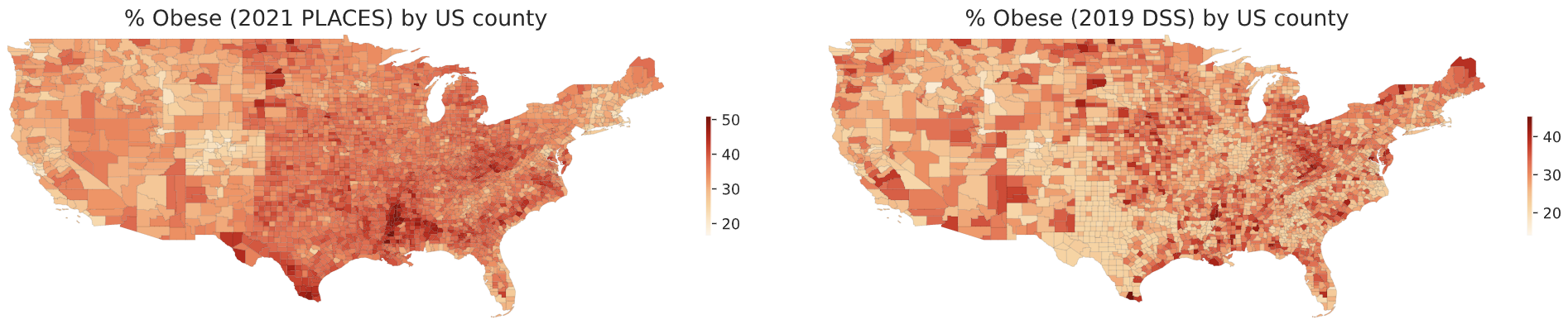
- The DSS estimates have sharp state boundaries: Texas and Georgia, for example, look a lot less obese than surrounding states. Those sharp borders do not exist in the 2021 CHR or 2021 PLACES estimates:
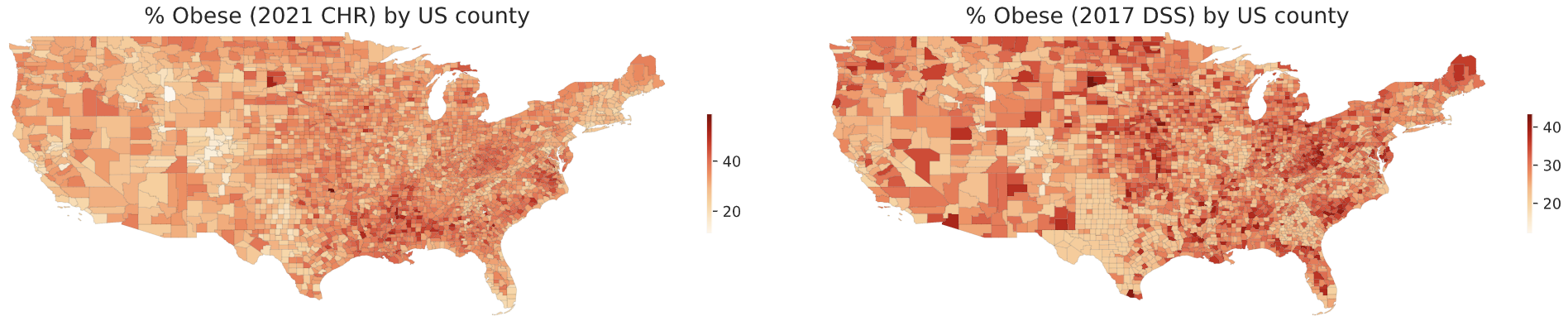
PLACES is a new project, so most of the older county-level obesity estimates seem to be from the DSS. But the DSS has changed its method of making estimates recently, and this seems to have had substantial consequences: a substantial negative correlation with income had been found in their estimates in 2013, before the change, even though I could find no correlation with the DSS's new estimates.
I hope someone tells me that I downloaded the wrong DSS datasets somehow, because all of them are really weird and I don't know what to do with them. The lack of a meaningful correlation between % Asian and obesity rate in those datasets, despite the fact that Asian Americans are much less likely to be obese than everyone else in the US, is extremely suspicious, as are the sharp state borders. But I probably shouldn’t just ignore them. For now, I guess I might just take a reasonably-weighted average of all datasets and use that when investigating what correlates with obesity rates?
I'd also want to know where the 2021 CHR dataset comes from? This page (control-F "2021") seems to indicate they use PLACES data, but this document indicates they use 2017 DSS data, and in practice, their dataset doesn't correlate well with either of those. I am probably misunderstanding something. Or maybe that data is from before the DSS changed their methodology.
- ^
I obtained groundwater lithium concentration data from here. The dataset provides explicit coordinates for a subset of the wells, and that was the data I used to obtain county-level lithium concentration estimates. I haven't managed to figure out the coordinates for the wells in the rest of the dataset.
Thanks again Elizabeth for pushing forward this initiative; Slime Mold Time Mold's obesity hypothesis has been one of the most interesting things I've come across in the last couple years, and I'm glad to see citizen research efforts springing up to pursue it~
The credit for combining the data set really goes to Oliver S and Josh C; I mostly just posted the bounty haha:
Since it looks like you're using Pandas, I'd recommend adding Seaborn for simple statistical plots, to avoid the saturation effect from having so many points on a scatterplot. It's a lovely toolkit for producing specific kinds of useful plots quickly and easily, with minimal customisation.
(specifically for these plots, I'd reach for a joint distribution plot with kind="hex" or kde or reg)
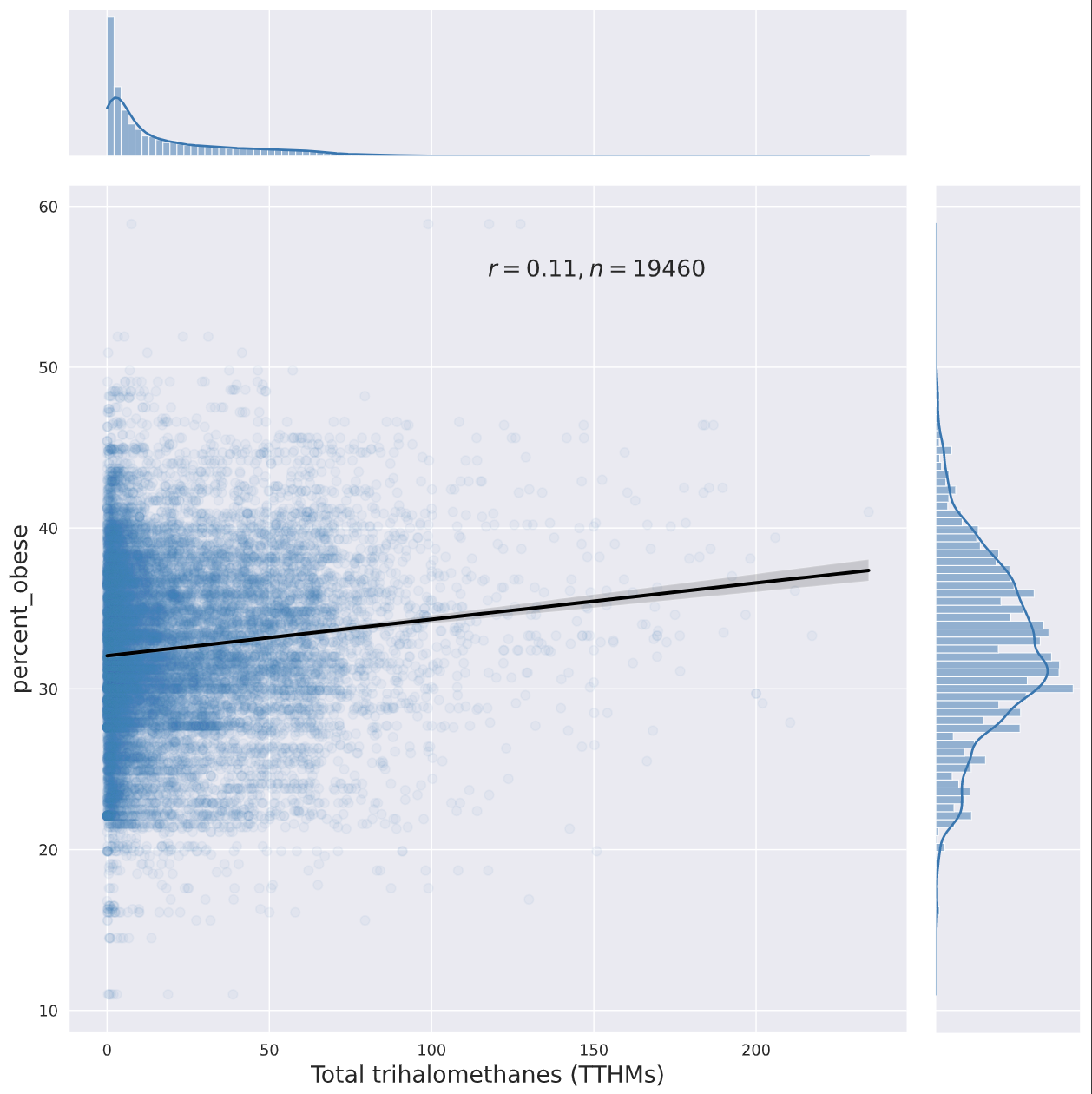
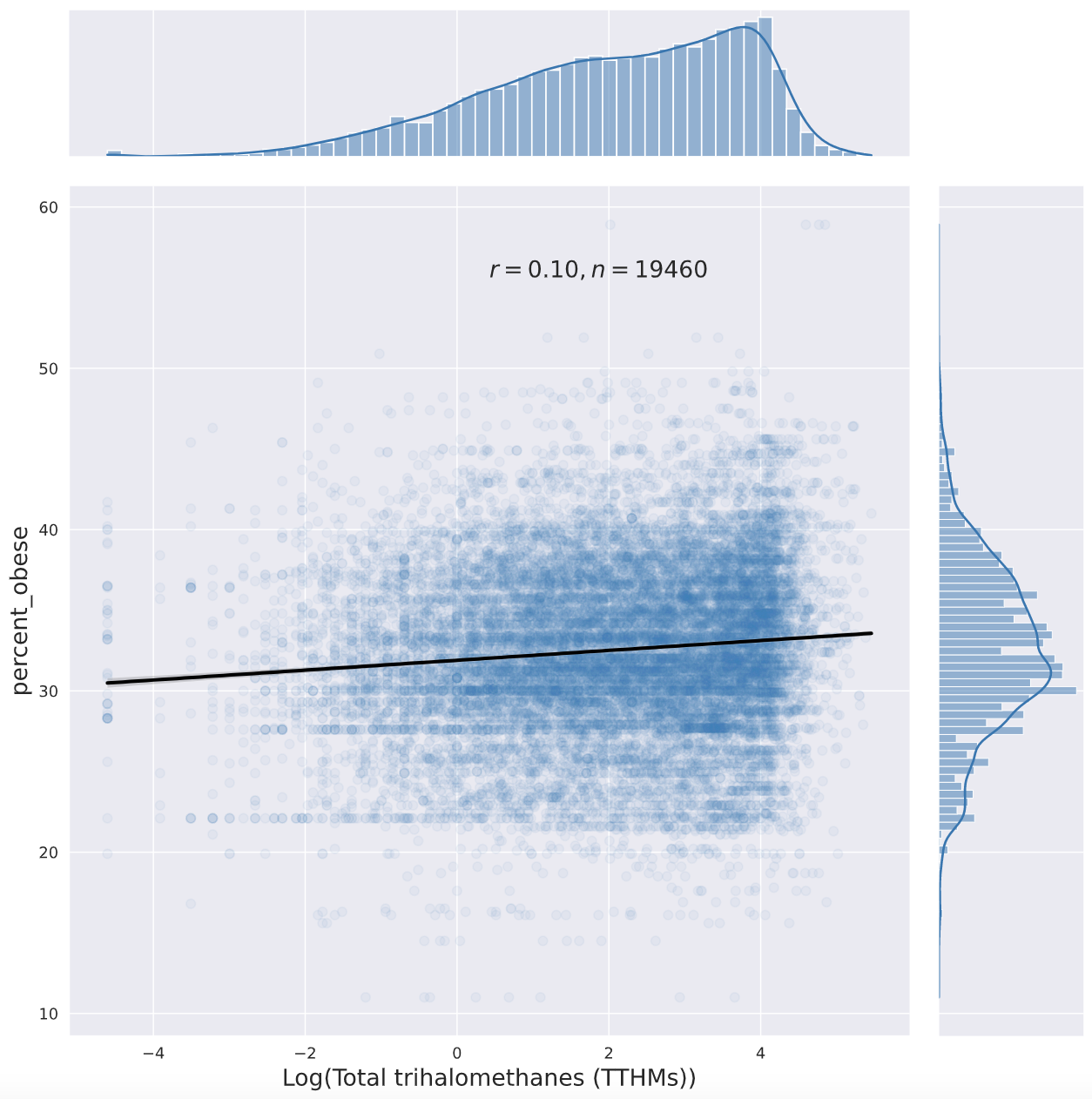
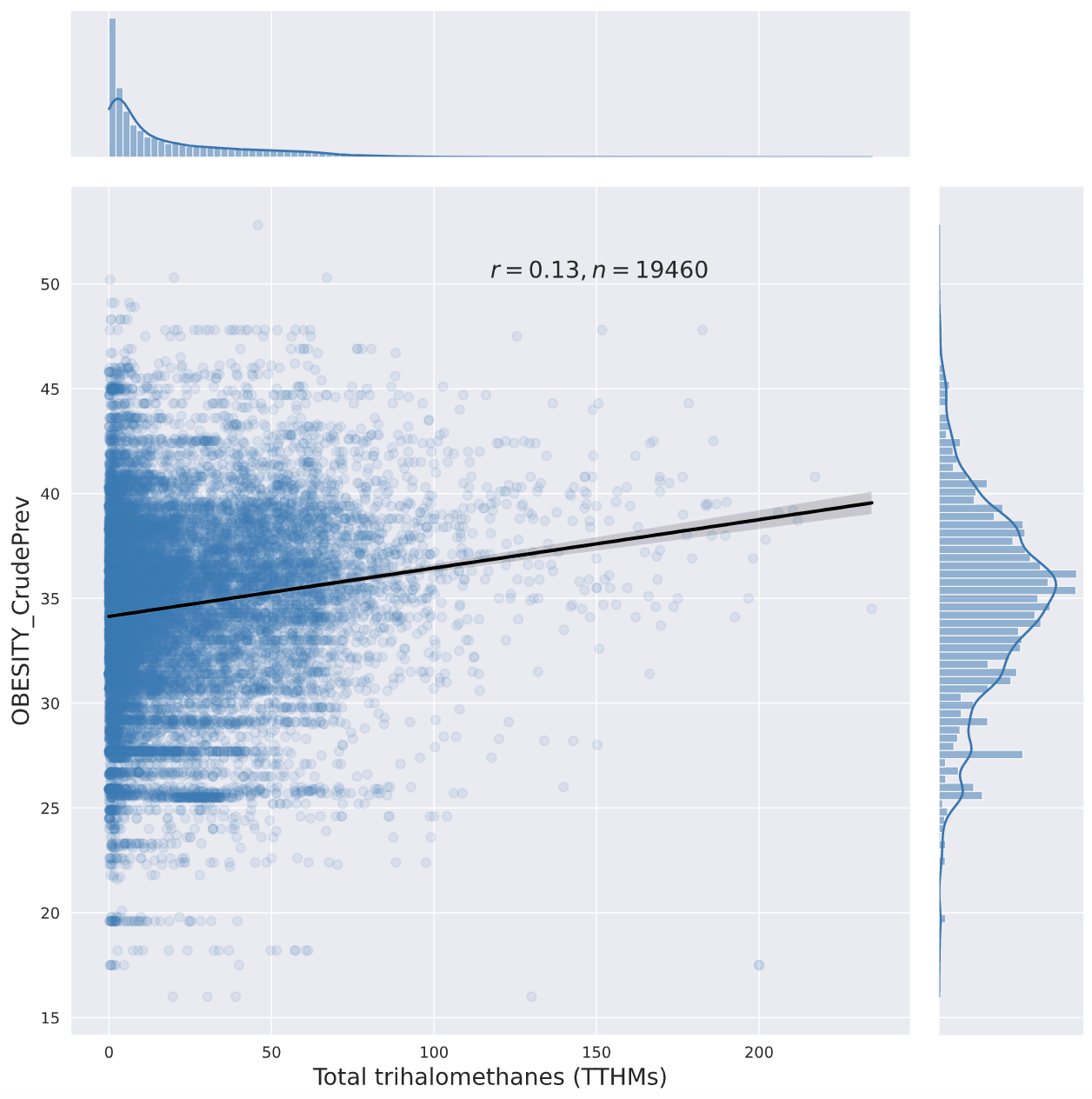
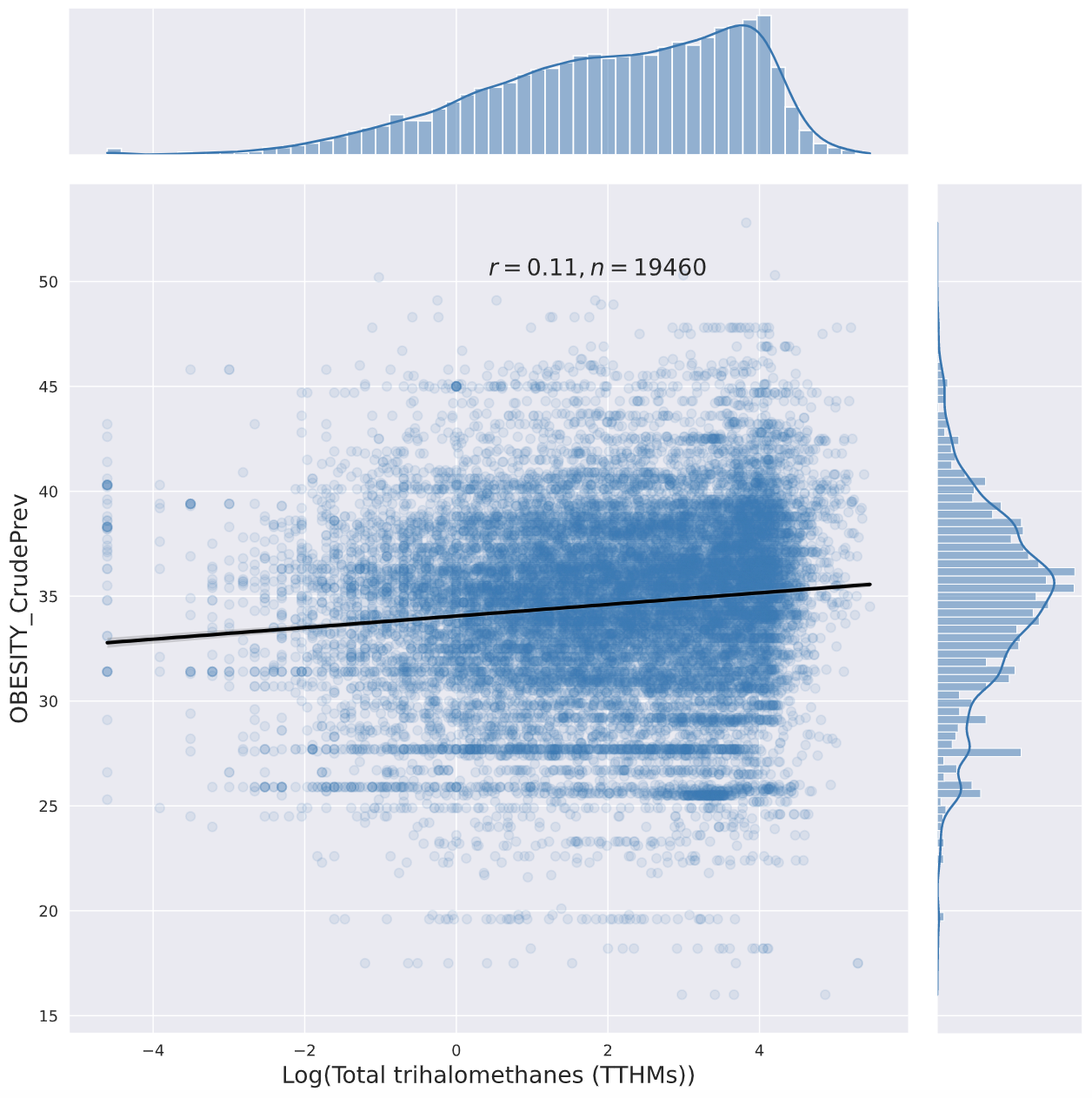
Here are a few jointplots I created with seaborn ("percent_obese" is from Elizabeth's original dataset, "OBESITY_CrudePrev" is from the PLACES 2021 Zip Code Tabulation Area-level obesity prevalence estimates):
None of those metrics would catch if a contaminant makes some people very fat while making others thin ( SMTM thinks paradoxical effects are a big deal, so this is a major gap for testing their model).
FWIW, it does not seem to be the case that, at a population level, very low BMIs are more common now than they were before 1980. The opposite is true: when you compare data from the first NHANES to the last one, you see that the BMI distribution is entirely shifted to the right, with the thinnest people in NHANES nowadays being substantially heavier than the thinnest people back then.
So, contra what the SMTM authors argue, whatever is causing the obesity epidemic does not seem to be spreading out the BMI distribution so much that being extremely thin is more common now.
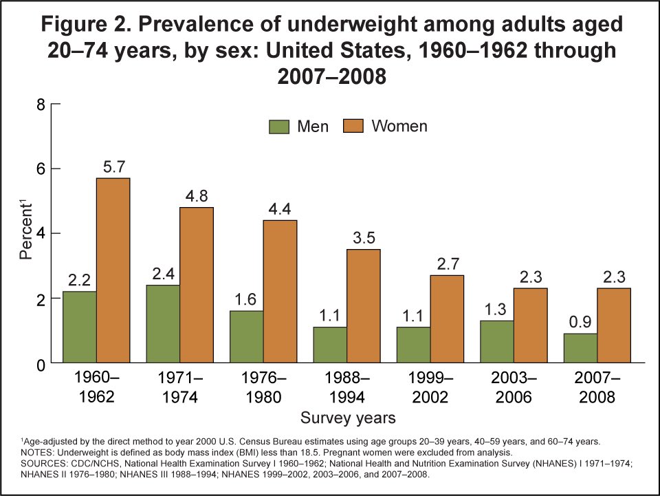
I apologize for commenting so much on this post. But here is more evidence that, contra SMTM, being underweight is a lot less common now, not more common:
- Underweight rates have decreased almost monotonically in the US over the past several decades.
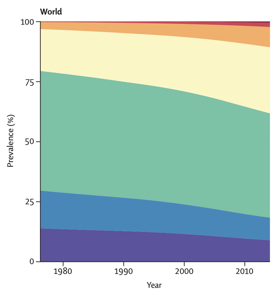
- The same trend can be seen in the rest of the world (the purple category is the percentage of the population that is underweight):
I don't know why they say that being underweight is more common now, given that that is literally the opposite of the truth, and given that it is quite easy to figure that out by Googling.
It is true that the variance in BMI has increased, but that is entirely due to higher BMIs being more common. Here are (sampling weight-weighed) KDEs of the distributions of BMI in the early 70s (orange) versus 2017-2020 (blue) in the United States, using data from NHANES:
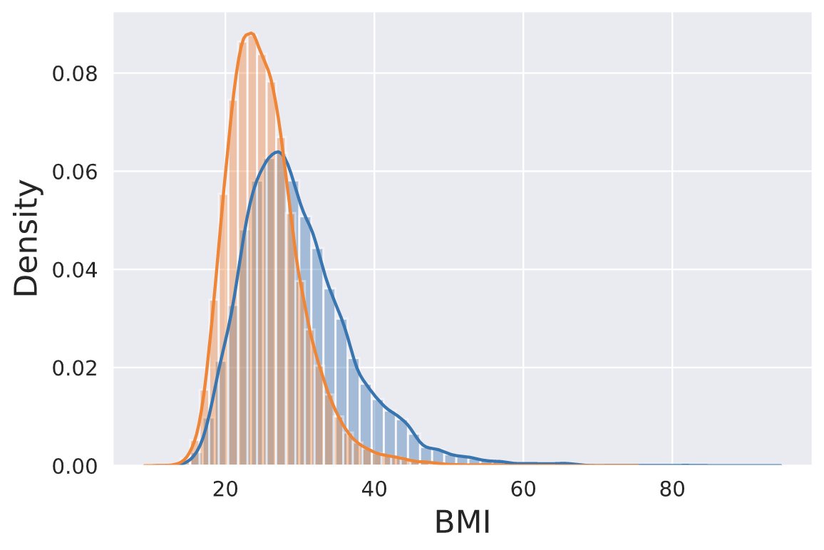
The code I used to create this plot is here.
Colorado is weird
I think most of us are still just happy to get noticed, even with our weed and decriminalized psychedelics. - A Coloradan named Craig
Your obesity source is using BRFSS. You should go directly to BRFSS, where you can get mean BMI, rather than %obesity. By county.
But BRFSS does not really have county data. It samples 400k people per year. If spread uniformly by county, that would be pretty good coverage of the 3k counties, but it weights by population and thus only lightly samples rural counties. But people want maps, which are dominated by rural counties, so it smooths out its patchy data. This produces the maps at SMTM and SSC with their sharp lines at state borders.
oh amazing, thank you. I don't have the bandwidth to properly follow up right now but if anyone else wants to I will happily share the updated resource.
Tl;dr: I created a dataset of US counties’ water contamination and obesity levels. So far I have failed to find anything really interesting with it, but maybe you will. If you are interested you can download the dataset here. Be warned every spreadsheet program will choke on it; you definitely need to be use statistical programming.
Many of you have read Slime Mold Time Mold’s series on the hypothesis that environmental contaminants are driving weight gain. I haven’t done a deep dive on their work, but their lit review is certainly suggestive.
SMTM did some original analysis by looking at obesity levels by state, but this is pretty hopeless. They’re using average altitude by state as a proxy for water purity for the entire state, and then correlating that with the state’s % resident obesity. Water contamination does seem negatively correlated with its altitude, and its altitude is correlated with an end-user’s altitude, and that end user’s altitude is correlated with their average state altitude… but I think that’s too many steps removed with too much noise at each step. So the aggregation by state is basically meaningless, except for showing us Colorado is weird.
So I dug up a better data set, which had contamination levels for almost every water system in the country, accessible by zip code, and another one that had obesity prevalence by county. I combined these into a single spreadsheet and did some very basic statistical analysis on them to look for correlations.
Some caveats before we start:
The correlations (for contaminants with >10k entries):
Of these, the only one that looks interesting is trihalomethanes, a chemical group that includes chloroform. Here’s the graph:
Visually this looks like the floor is rising much faster than the ceiling, but in a conversation on twitter SMTM suggested that’s an artifact of the biviariate distribution, it disappears if you look at log normal.
Very casual googling suggests that TTHMs are definitely bad for pregnancy in sufficient quantities, and are maybe in a complicated relationship with Type 2 diabetes, but no slam dunks.
This is about as far as I’ve had time to get. My conclusions alas are not very actionable, but maybe someone else can do something interesting with the data.
Thanks to Austin Chen for zipping the two data sets together, Daniel Filan for doing additional data processing and statistical analysis, and my Patreon patrons for supporting this research.