If anyone still reads/suggests posts on BoingBoing, that would be a great place to spread this.
I'm extremely tempted to get a youtube account so that I can unironically (supportive, that is) comment, "Cool story, bro!" as a response to the trailer.
I believe Yudkowsky said that people pestering him for updates was only counterproductive, so I will merely say that I've really enjoyed what I've read so far and hope for more to come in the future.
This is the first time I've listened to this podcast, and it's a cool project. One bit of hopefully constructive criticism: you read a little too fast. This is actually a common problem in public speaking.
Thank you! I'll try to slow it down. 6b is already recorded, but I'll keep it in mind going forward.
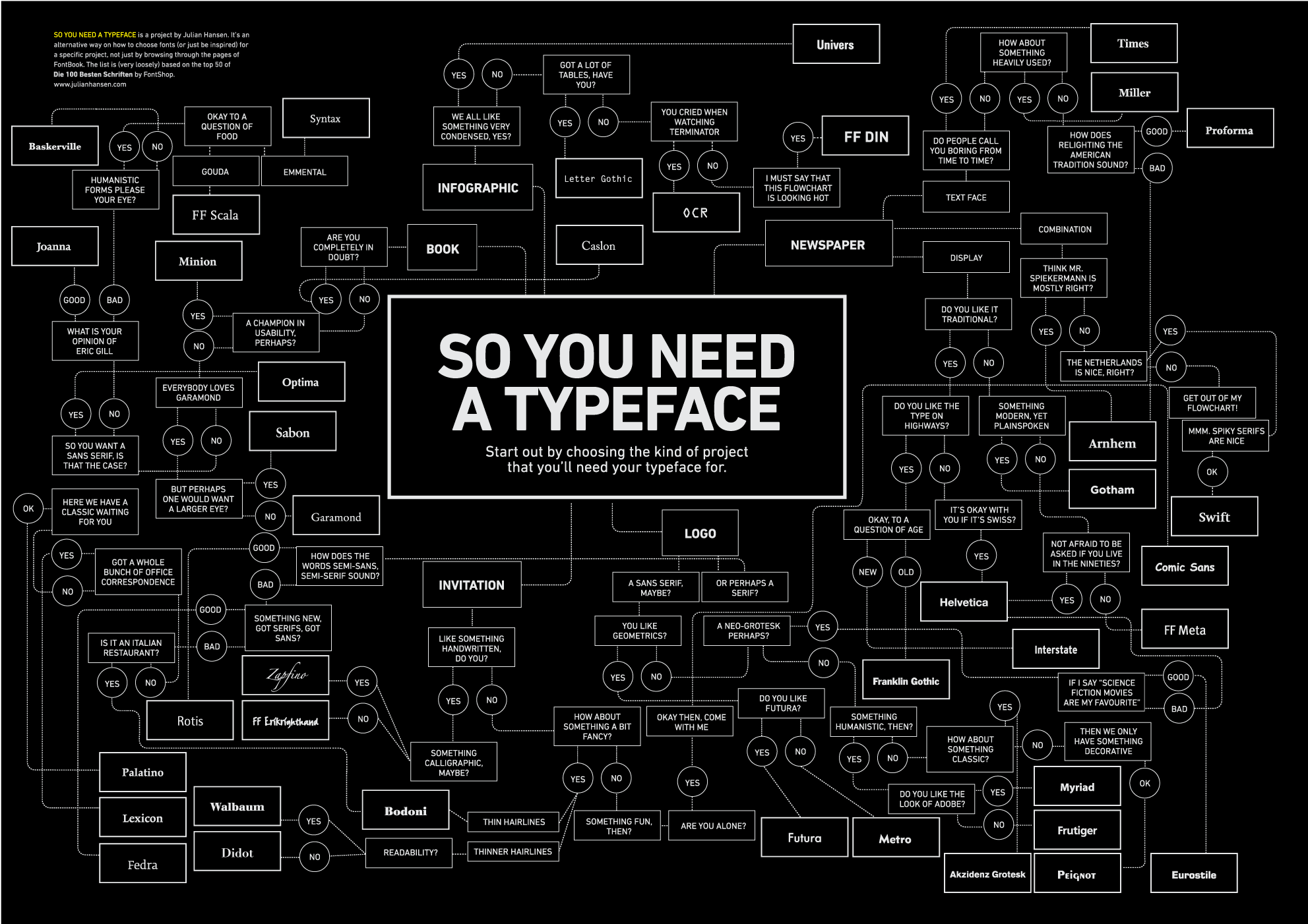
The only objection I have is to the use of a default font. It makes the whole thing look rather amateurish.
Is there some big index of fonts and what each of them mean? I've been publicly ridiculed for doing my webcomic in Papyrus, but I had no way to know anyone had specific value judgments about it, I just saw it on the menu and thought it was pretty. I'd like a way to avoid that in the future.
http://inspirationlab.files.wordpress.com/2010/04/infographiclarge_v2.png There's a more recent one I'm trying to find, will update with it.
It's not a list, but if you want to check on the general social opinion of a font, you can google the font name, possibly along with the word "font". For example, the first four results (for me at least; does anyone know how to stop Google from 'customizing' its search results?) for 'papyrus font' are a wikipedia page about it, a link to the google images search for it, "Papyrus Watch - Exposing the overuse of the Papyrus font" and "5 Terrible Fonts You Shouldn't Use in Print Design".
Hopefully I'm not spamming the discussion board. Anyway, based on the highest-karma comment from the last post, I've created a trailer for the Harry Potter and the Methods of Rationality podcast.
Here: http://www.youtube.com/watch?v=sozq1YsGgZ4