I really like this post and wish there were more like it on LW. One reason they might not is that people with a skill but no LW sounding theory already might feel bad about trying to put words to a bunch of fragile felt senses that aren't necessarily super robust to criticism. I've found that often the nice words/theory don't come about until I go ahead and try. Worst case you end up with a draft you don't post.
I enjoyed this post; I feel like it's a concrete example that's pointing to something deep about the nature of skill learning that generalizes beyond just drawing (e.g. understand the underlying generators of a domain, rather than just the superficial elements).
It also reminded me of Raemon's earlier drawing sequence, and in particular this post which discussed a similar point; I didn't really understand it from that explanation, but your version made me feel that I got it (copying superficial elements only teaches you to copy superficial elements, understanding the deep structure lets you draw many versions of that structure). (I would be curious to know whether Raemon agrees that this was his core point as well.)
The problem with Example A is that the artist is copying superficial elements of a particular style, without understanding the underlying principles that make good a good figure drawing. Example B has lots of overlapping lines, and vague messy shapes. But the figures there communicate a good understanding of anatomy, a grasp of weight, decent composition.
I feel like it's a concrete example that's pointing to something deep about the nature of skill learning that generalizes beyond just drawing
I think this post is pointing to roughly the same thing as Gears-Level Models are Capital Investments. From that angle, it makes a lot of sense that it would be a fairly general principle about the nature of skill learning.
One thing I'm curious about is whether this post was more successful at conveying the ideas than this comment (not a comment by me). This post definitely goes into much more detail, but I'd have expected Nornagest's comment to get across the basic idea.
I'm curious (pedagogically) if what happened here was more like 'Nornagest's comment didn't sufficiently get across the concept' (because it turned out exploring all the aspects of the idea was important to really grok the concept), or if the comment did get across the basic idea, but this post just fleshed it out more.
Hard to say: I didn't remember Nornagest's comment before looking up your post in order to reference it here. If it was enough to get the basic concept across, at least it didn't do it in a way that would have stuck in my memory. (Given that reading this post made me think "ahh, that's what Raemon was trying to say.)
If I had to guess afterwards, though, I would note that Nornagest only talks about the superficial style of drawing leading to drawings that end up with a "flat, disconnected look". I doubt I would have been able to make the inference that this also implies "and you will be bad at drawing characters from any other angle than the one you are used to".
Curated.
I like this post for a few reasons, most of which have been covered by other commenters. The object-level topic is a bit atypical for LessWrong, but
a) I think it ends up touching on some key meta-level LW topics, such as gears-level-understanding, and learning how to learn.
b) as Romeo notes, I think it'd be a bit better to have at least some more posts like this on the margin, even if at face value they don't obviously end up connecting to the "obvious" LessWrong paradigm topics.
The post itself is well written and make it's points quite clearly.
On a personal level, I also think it touches upon topics I wrote about several years ago, and I think makes the points I was trying to make much more clearly.
I like that this post addresses a topic that is underrepresented on Less Wrong and does so in a concise technical manner approachable to non-specialists. It makes accurate claims. The author understands how drawing (and drawing pedagogy) works.
Yeah. For me the aha moment came from Drawing the Head and Hands by Loomis, which is like an extended version of the post you linked. It feels great, you draw a sphere and some helper lines and end up with a realistic head from any angle.
Great post. I would have liked to see the images in this post but the links all appear to be broken. If the OP is here could you repair the links?
Based on the text alone, this strikes me as right on the mark.
An interesting bit of history: the New York Academy (which still exists, in another form) was back in the 1980s an unaccredited graduate school and the premiere training ground for classical figurative drawing and sculpture, which were otherwise in much neglect in the Art World. From what I have heard (second-hand), there were two competing schools within the Academy at the time, one group favoring "perceptual" drawing (essentially the skill of copying a 2D image, or seeing a model as a 2D image and then drawing what you literally see); and the other favoring "conceptual" drawing, the skill of understanding how objects in three-dimensional world generate the two-dimensional projection we see, and then drawing from an understanding of that underlying cause. I think the perceptual approach is typical of photo-realist painters (and most present day portrait artists), and the conceptual approach was typical of Renaissance painters.
An anecdote I love that illustrates the contrast is: apparently one day when the class was drawing a long pose the model took a break, and when she came back the light angle was slightly different such that all the shadows changed. The Perceptual students complained, whereas a Conceptual student countered: actually we should change the lights every 15 minutes. Then we can see what is actually there, and draw it from a better understanding.
For an example of what drawing looks like when approached conceptually, see the drawings of Luca Cambiaso (1527-1585). (This is not an artwork; it is a conceptual study done to figure out the scene 3-dimensionally in preparation for a classical renaissance drawing or painting).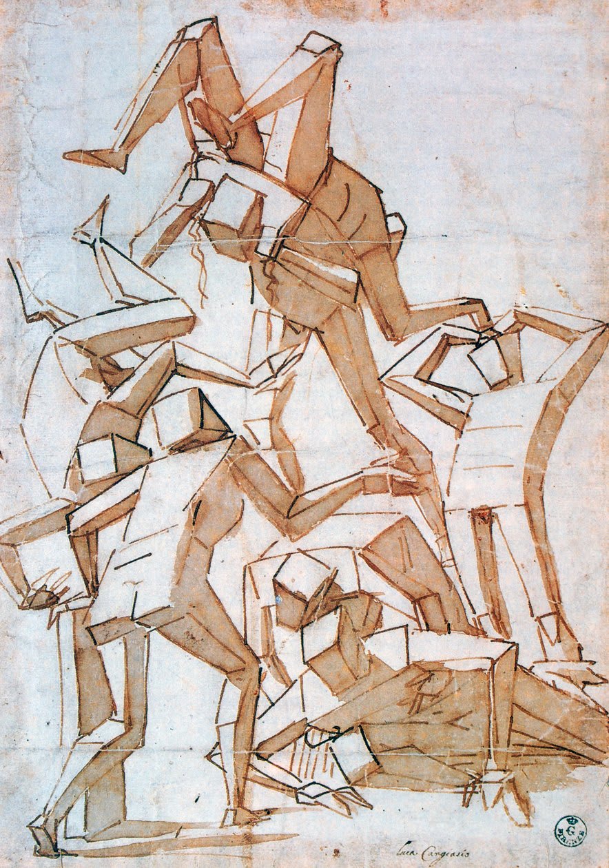
I’ve been interested in drawing ever since I was a little kid. I like drawing people. I practiced a lot by looking at a cool picture of a character I like, and copying it as closely as I can.
The better I got at copying, the better my work became. I got some great results this way. I even advanced to the level where I could take photos of real-life people, then painstakingly copying it to produce a portrait. I was pleased by and proud of many of my works. Many agreed that I was “such a good artist, wow!”
Here’s one piece I was particularly proud of; my sketch on the left, the reference on the right.
In middle school, I took on a new challenge: I wanted to draw commissions. People would give me a character design, sometimes with a few reference images, and I would draw their characters. This was really hard for some reason…
I had no images to copy directly from. My results were inconsistent. I spend a lot of my time tweaking things like moving around the eyes, redrawing the nose, etc. After a bunch of commissions, I got reasonably decent at drawing a character at the ¾ angle, the most common one for portraiture. I did hundreds of commissions, almost all of them at that angle. Soon, I felt uncomfortable drawing faces at any other angle.
Some examples of the stuff I drew. Some of them look kinda strangely similar, hmm...
I stopped doing art for a while because college was busy. When I started again, I took an anatomy class. I learned a lot of great things. But the biggest lesson I learned was that I’ve been approaching drawing all wrong. The biggest thing I had missed was that I had to understand the process that generates the image.
The art an artist draws is a projection of the 3D object onto a 2D surface. By practicing by only copying from 2D images without studying the 3D structures that generated them, I treated my reference images as being generated by some black box, and ignored the underlying gears and structures.
For example, the shape of an eye is determined by the 3D structures of the eyeball projected into 2D. I never learned what an eye looks like in 3D, so I didn’t know how to draw it from an angle different from the 2D references I’ve seen. It turns out, the eye isn’t a flat almond-shape like it seems in a picture. It’s a sphere inset into the skull, wrapped from the top and bottom by flaps of skin. No wonder I hit a wall when I tried to draw an eye from the side. I had never seen the sphere or practiced drawing it as a sphere. I probably tried to draw it as a slightly squished almond, then wondered why it looked wrong.
Another example: the lines describing a body in a drawing are dictated by the underlying bone and muscle structures. I had never studied these before. In the anatomy class, we looked at body parts in 3D. We reduced complex shapes (like a human torso) into simpler geometric shapes (boxes and spheres) which are easier to mentally rotate in space. Then we constructed lines of the torso using these basic shapes.
Some of my sketches of the torso.
Similarly, I learned to draw a head by starting with a sphere and a box. I then used these shapes to produce guiding lines, which then dictated where the surface features (eyes, nose, mouth) had to be located. If I wanted to draw the head from a different angle, I started with a sphere and box angled differently, which then produced different guiding lines. There was no more “guessing” where the eyes should go.
From this post
This is the reason artists draw from live models and study anatomy. The 3D shapes of the underlying structures generate the simple-seeming lines on a drawing. Drawing well requires opening the blackbox and looking at the internal gears of human anatomy.