This is a special post for quick takes by Joanna. Only they can create top-level comments. Comments here also appear on the Quick Takes page and All Posts page.
My dad is 100, and worked on nuclear energy policy for the US government for 50+ years. He was one of the attendees at the conference[1] that led to the formation of the IAEA. He is also somewhat AGI pilled.
If anyone has questions they'd like me to ask him, let me know. He'd be happy to help in any way he can.
- ^
He attended the second of two conferences that lead to the formation of the IAEA.
Some people who are concerned about AI have studied the formation of IAEA and other steps that reduced the risk from nuclear weapons. My Dad would be happy to answer questions about his experience at that time.
7
* What was his impression as to why the IAEA took so long to found? It was 12 years after the first nuclear weapons test, and 8 after the Soviet's acquired their own. Relatedly, what political actions do you remember as being most important for U.S.-USSR trustbuilding at the time (ex: Eisenhower giving his atoms for peace speech)?
* What was his personal impression of why the Baruch Plan failed? For a few years, it seems almost possible that the U.S. would have voluntarily limited its nuclear monopoly, if only it had been able to get the other major powers to agree.
5
The Soviets went all out after the Americans developed nuclear weapons and within a very few years had their own. Stalin was still alive. There was no hope for the Baruch plan or any other until his death. I'm afraid the initiative was on the basis on a US superiority in nuclear weapons, which was not a good basis.
Ultimately, the reason the IAEA came into being was the Russians could see advantages to themselves and one of them was certainty the East West split. The IAEA did not cause the tearing down to Berlin wall, but it provided a period of stability in Europe, coupled with Stalin's departure, that made broad cooperation exemplified by the IAEA mutually beneficial on both sides.
1
What I'd really like to know before I die is that we made some progress within our own country in two critical areas. One is a safe disposal site for high level waste. And second is the acceptance of recycle as a way of producing a very safe waste form for such disposal. A very stable, non-threatening waste form that can be buried and safe for mankind for 100,000s of years, which I believe is possible.
3
It required a joint effort by the major powers. There had to be on both sides a vision, a peaceful world in which atomic energy was used constructively and that vision came after Stalin. And I think more than anything else it required Eisenhower to really push it through because he worked constructively during WW2 with the Soviets to defeat Nazi Germany, and they knew him as a hero, as a peace maker because he engineered the Western Front. The nuclear cooperation required leadership that he provided. To me it was amazing how soon after this atoms for peace intuitive that there was an IAEA.
The person who asked the question doesn't know the period of hostilities [between the US and Soviet Union] that existed after WW2. It had to wait for Stalin's death as one criterion.
3
The person answered the question! Before he made it there had to be a lot of background work done. His speech was an important step towards international cooperation, but it was not the result of the speech, but rather the speech was a statement that we have together begun to visualize a path forward. Or another way of putting it, the speech didn't cause the cooperation, the speech was evidence of the corporation that was building following Stalin's death. I'm sure John Foster Dulles has a lot to do with it. I was not involved.
By the time I had my first trip to Russia, things had begun to move rather smoothly. I was able to visit there nuclear energy program offices and their laboratory and talk to people who were purely technical, not political. That was before the IAEA.
My second visit, again prior to the IAEA, was even broader it its scope, indicative of further progress, most of that coming out of the state department.
8
has he signed up for cryonics? when will he? even if he doesn't care, I'd like him available for future generations to ask questions of; would also be nice to have one more friendly face from the past around but old people are usually not convinced by such arguments, most of the value I expect most old folks would see is in being able to pass on much more of their knowledge much further.
1
He I had a conversation about it this week he's not interested. But it was also his first time considering it.
3
What about writing down his memories? Even if digital immortality will fail, his children can be interested in them.
2
what about cryonics-lite, ie cold-embalming
1
I think MAiD would be a hard sell.
4
Would be willing to consider advance approval for when a truly terminal disease arises and he loses capacity? I'm not familiar with the legal landscape in the States, but it might be an option. He sounds like a good man with an interesting character, it would be a shame for it all to end.
6
Wow. And funny coincidence, my grandmother recently also turned 100. But no nuclear policy.
My question for your father: What are the long term patterns in nuclear (and related) policy that he sees. Are there cycles, stabilizations, S-curves or something that is difficult for us to see because of our limited time horizon?
5
Joanna: My Dad was not able to answer this question. He got angry about his decades of working on nuclear waste disposal and its politic death.
5
I guess it is sort of an answer. Maybe even more so than a polished one: Over long timescales, slow moving technical and infrastructure efforts are often failing because of policy resets. Maybe the lesson is to not try to work on policy driven technology. Or at least be aware of its pitfalls.
3
Thank you to your dad for offering to answer questions.
Sometimes people make the argument that the U.S. needs to race toward AGI-ASI as rapidly as possible, because if China obtains it first, then the risks to the U.S. are unacceptably high. However, this argument can also be an appealing excuse for people in the U.S. who would wish to go full-speed toward AGI-ASI even if there were no competition from China.
I imagine similar arguments are also made in China, with the roles of the U.S. and China reversed.
Does your dad have thoughts about these kinds of arguments, considering that analogous arguments were made about the nuclear arms race? How does your dad think about the interaction of people who make these arguments genuinely vs. those who use these arguments as an excuse?
2
Sorry for the delay. I will ask him when I talk to him next.
3
Thanks & no apology needed : )
3
I asked my dad your questions, an d he got hung up on stating very clearly that these situations are not analogous. The risks from AI are much higher.
1
Fair enough & I appreciate the follow-up.
Though I will say --- It seems we need to find lessons somewhere in history, in part because we aren't smart enough as a species to reason purely from first principles. I'm certainly not smart enough for that, anyway.
When looking for lessons on AI, nuclear development may be the least worst historical analogy.
1
He meant there was no analogy on the race dynamics. The ai ones are much more risky.
3
Jesus. Are you sure your dad is not 1 million cockroaches in a trench coat, given occupation and resilience? Being lucid enough to do this usefully at 100 years old is genuinely impressive.
Jokes aside, I'd love to hear his take on ALARA. I am personally skeptical that it is good policy or based in grounded biological fact. My medical knowledge and review of the literature suggests radiation exposure limits are highly conservative. The difference between a large acute dose and low level sustained chronic exposure to a net identical dose of radiation is often elided.
My dad says: I was delighted to hear that the Secretary of Energy is no longer going to be using ALARA. The problem with ALARA is that it implies that any radiation is hazardous. The radiation in Tibet is much higher than the radiation at sea level, and there's some evidence of hormethis.
3
Thank you. I appreciate him taking the time to answer. I wish him well, may he have many more birthdays to come, as well as the cognitive flexibility and health to enjoy them.
1
What your dad would do in a letter of last resort? Would he bomb the United Kingdom's enemies in revenge?
Hi, I am Joanna. I did a design work trial for Lesswrong that ends tonight! As part of that, I designed a new profile page. If you don't like it, I won't be around to fix it unless they hire me. But, the team would surely care if you have comments! (And I would too.)
My contributions are primarily comments, it doesn't seem to have a way to make comments the main focus of the page. Also looks a bit wonky in dark mode. With the about-me no longer at the top, my about-me details are now hard to see. It makes me want to hide my posts, they're mostly all pretty boring, link lists mainly. It also makes me want to repost my favorite comments as posts, which I have been meaning to do anyway. Feels like it's wasting space - it's quite narrow on my screen. Not very dense, will be harder to find posts from the prolific posters (not me).
7
Actually, I just added a button to allow hiding the whole "top posts" section on your profile, since I do think for some users it doesn't really make sense to emphasize the posts this much.
2
It's not clear from the UI if "hide top posts" would only affect how you see your own userpage, or also how others see your userpage.
2
Oh, huh, it seems pretty clear to me that it would affect everyone (given that it's clear that your other choices in the same UI element will affect everyone), but I'll see whether other people are also confused and adjust if so.
2
(There are two different reasons to hide "top posts", one of them is that it's a useless thing when you are looking at your own userpage. The option turns out to address the other reason, rather than specifically this one, but the possibility/hope that it would makes the alternative hypothesis salient.)
1
It's how it effects all pages, but good to know that it wasn't clear.
2
It might or might not make sense to have two slightly different versions of the profile page - for the user himself and for others. I often use my profile page to find posts I want to share and also to access drafts. And there are necessarily differences between the views eg the drafts visible for their authors only (the drafts seem to gone in Joanna's design). But the question then is how a user can see how his profile appears to others. maybe move the drafts elsewhere entirely.
4
We have a drafts page! It's optimized to be dense:
3
Should be fixed!
[...]
FWIW, this seems like a win to me. Posts are the better unit of conceptual organization. I think it's good for profiles to push people to write more posts (that said, I do think we probably want to add the option of just removing posts from the top of the profile page, instead of just allowing replacing whatever is there).
[...]
Now also fixed! I increased the width to a more representative width for the rest of the site.
[...]
Yeah, I currently think the post list at the bottom needs some work. It's a bit better with the wider profile width that I just changed the profile to, but I do still think we want to do something to bring some density and variance back.
7
Ah, okay. In that case I won't consider it to be weird/defecty to repost my comments as a post.
I feel like a bunch of my negative reaction is from the watercolor slop pictures, maybe 30% to 40% of the reaction. I understand why you like them, it's cool tech that's able to create them, but they aren't my artistic decision and I wish they wouldn't get associated with my posts. If I was going to do AI art it would be quite specific, but more generally, it feels defecty for a site to show me non-greyscale pictures associated with text, because pictures activate emotions more directly. Feels very dark-arts. I'd rather that space was used for a compressed summary, ideally one that I could fill out in the post editor.
I'd like a way to hide posts from the extended list too - maybe not completely gone, but like, marked as "OP now considers this to be a Bad Post, but it's left here for archival purposes". right now I've hidden embarrassing posts entirely by moving them to drafts, but I don't so much mind being known to have bad old posts at all, I just want them in a "view bad posts" list. highlighting a few favorites does help if I move some of my more important points to a post, but what I'm mostly reacting to (the other 60% to 70%) is feeling like the new page puts the things I was cringing about having posted forward, in the uncustomizeable part. I do like the intent, it's just that it felt like a miss for my writing histogram.
4
While I dislike the new profile page on net, I feel positively about the pictures
1
You can always change them![1] I do like that LW has a house-style, and default pictures are pretty important for communicating a vibe.
We've always had default pictures for lots of stuff including sequences and posts that won the review, we just historically haven't emphasized images for other posts (but in the age of social media previews being image heavy and quite important, I do think that's a mistake and people should think about an image associated with each post).
[...]
Huh, in what way is the page doing that more than the previous post page? If anything it's now easier for someone to get to your comments than before (since for users who click the feed tab, that will be the default they see on profiles).
1. ^
Though we should make it a bit easier to see how to change them. Right now the UI for it is quite hidden and confusing, since it's in the social media preview section.
Huh, in what way is the page doing that more than the previous post page?
Comments aren't visible without clicking a button.
2
Sure, but previously we should show ~15 of your posts in chronological order above your comments, which seems like it's more prominent than allowing someone to see your comments with a click right above the fold. It's not a super obvious call, but it seems less emphasized to me.
9
Please make it possible for me to set my page to show comments to visitors without them clicking any buttons. Ideally, let me feature comments like posts. I have designed UIs many times, stop trying to know what I want better than me. I want to show my dang comments.
3
The sorting/filtering choice is a user-persistent setting. The only way to make it so that users reliably see your comments on your profile is to take away their ability to reliably see whatever they want to see on other people's profiles. There is no easy solution here as far as I can tell.
Pre-generalized solution: show both on the same page by default.
Dynamically generalized solution: let users choose what view their page opens in by default for users who haven't changed their preference on that user's page, so that I can set it so that new users see my comments, instead of my posts.
Like, the tension you are expressing seems to me to be fake, arising from a view that comments and posts are a different kind of thing, that comments are lesser and need not be shown to new users. I am frustrated by this; I have done a lot of commenting, tuned my presentation as a commenter, and now the LW team has decided something that, through the coarse-graining lens of "what has actually happened to the profile page over the past two days", they have a revealed preference of "we don't like commenting and won't show it to new users"; and when I try to ask for comments to be considered valuable again, I am told that it's okay because users can click things. But the reason we care about what's above the fold is that users don't usually click things. Users scroll more often than they click, and I previously was able to pin comments to show what I think are the most useful things I've sa...
2
I think the comments are under Feed which took me a while.
The top post may bei more useful for guests not for yourself.
1
Thanks! In the Activity section, you can filter by comments. And in about 10 minutes: once you open the Feed tab, and filter for comments, then it will re-open that every time to go to profile page.
I'd like it to always open that way for others when they visit my page, ideally. Also, does it still support pinned comments?
edit: it does, comments are just hard to see on dark mode. the background is also oddly light on dark mode, should be fully black like the rest of the site, imo.
1
Sorry about dark mode. I'll fix that next.
1
I don't currently plan to always open it that way for other users. But their preferences of how to open profiles will globally persist.
9
That's not good. I feel like with the new page, I'm now limited to being seen as what other people liked about me, rather than being able to say what I want on my user page. If I had had one request for a new profile page, it would have been to let me choose what posts and comments show in a self-curated section, and then a chronological section below that. I imagine someone who primarily writes full posts wouldn't feel as much like the new thing is bothersome, though I expect the narrowness will be bothersome.
This is likely to accelerate me moving to posting things on a separate website and linking them from lesswrong.
Note, as a figleaf - the visual design is alright; my reactions are all to UX.
8
No. I feel similarly.
The karma system is pretty good overall, but the tails do come apart. In particular social drama often attracts a lot of attention, but isn't people's most important or impressive contributions to the intellectual community.
My highest karma post is a repost of a twitter thread that I wrote about what postrats are, which was a fine thing to have written quickly, but is hardly the thing that I want to be most associated with my identity on LessWrong.
5
You can select which posts go there using the 'edit' button in the top right!
5
Ok. Great. I feel much happier with my selection of posts than with the default selection.
3
A lot of the goal of the redesign is actually to make it so that you have more control which content you want to represent you on LW. You can now select which posts you want at the top of your profile, and which one you want to give the most prominence, which you didn't have previously.
There is a tradeoff here, where for users who mostly write comments and want to highlight that, we have fewer options. The previous options weren't great. We were still showing people the full post list before we showed any of their comments, so the current situation still seems kind of better (since at least we let people choose which posts to show).
People did kind of horrendous things with their bio-styling, and I think the better choice if someone wants to make a big complicated explanation of who they are on LW is to make a post that they pin to their profile that summarizes what their deal is. But I am not sure! There are around 15 users who did anything complicated with their bio, with everyone else having stuff that makes more sense in the current design. But de-emphasizing the bio was definitely among the trickiest choices of the redesign.
5
Previously, you could group the post you consider to be thematically together into sequences that would be shown at the top of the page.
I think it's natural that user first think that having Top posts which the hover text "based on karma", actually shows the posts with the most karma even when it sometimes doesn't if you configure that on the profile.
One way to communicate the fact that those are switchable would be to show a button for switching when hovering over them on your own profile. Maybe renaming "top posts" into featured posts would also be helpful while changing the tooltip to mention that it also shows user selected posts.
2
It is the case very few people actually did this, but I agree it helped in some cases. But even when people did, most sequence titles are very uninformative, and don't really work for the purpose of "show people what I am about". They have even less space for a title than a post-item, and are very small, and if you only had a single sequence it showed up as a kind of lonely weird-looking section on your profile that was quite unbalanced.
[...]
Oops, that's a bug! I'll just remove the hover text, since it's currently definitely more confusing than clarifying.
[...]
Not crazy. I'll consider changing it to "featured posts".
2
I do want the line spaces in my bio to show up, tho. They are a few distinct paragraph, not a wall of text.
I don't think "using paragraph breaks" should count as "horrendous things with bio-styling."
2
Yep, sorry, that's definitely a thing we will fix. Let me actually do it right now.
Edit: Done! Should be live within 5 minutes.
2
Yes, realizing this swings the redesign from "clearly bad for me" to "a change, therefore terrible, but maybe pretty good aside from that."
2
You can choose which 4 posts appear! Hit "edit" in the top right and a menu will appear (currently takes a few seconds to load).
Here's some feedback. Reading over it now it sounds overly harsh (sorry!) but I mostly endorse it. Looking forward to further improvements!
- The biggest thing is it's less information dense. Being information dense is the single most important property for me, and I'd guess that it's possible to make the page look beautiful without sacrificing information density.
- It would be helpful to know what the goals of the redesign were (I'm guessing ease of use and aesthetics), so they can be accomplished without breaking existing workflows.
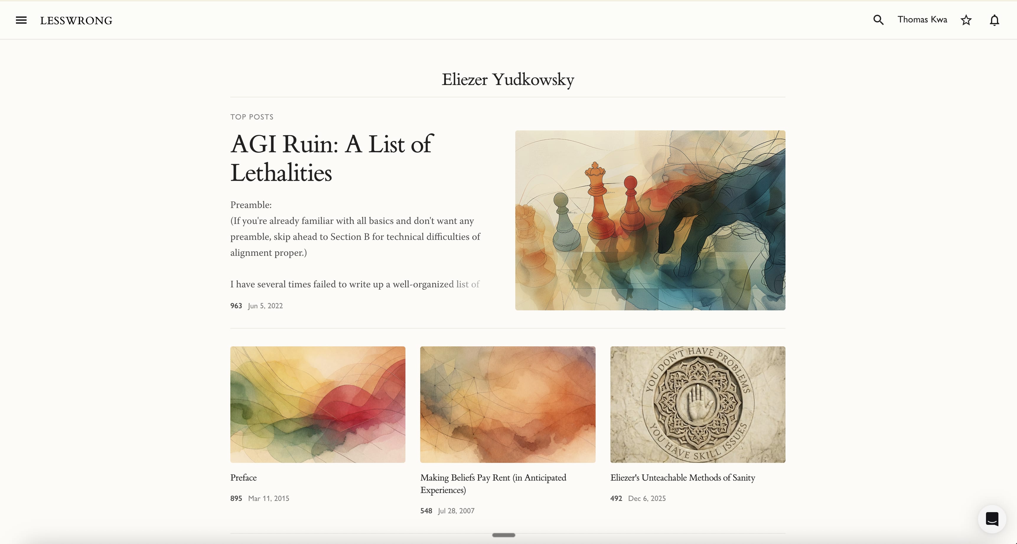
- If "Top posts" are enabled and users don't have custom photos on these top posts (which is the default), the entire screen above the fold is taken up by watercolor and a few post titles. This is unacceptable. Take Eliezer's user page: it only has about 50 words very far apart. I can't tell what the posts are about unless I click on them. They should at the very least be smaller and show the start of the post on hover.
- The larger size for the first Top Post is way too big. I would guess not many users want to be defined by a single post, which is what a single element taking up half the screen signifies.
- I can't find a way to choose just 1 or 2 top posts. I wo
6
Ok, let's actually compare this. This is what the same amount of vertical space looked like for Eliezer a week ago:
We have a grid of 9 sequences, basically with no ability to tell at all what they are about, and one of them visibly misaligned. The images are broken on archive.org, but they were all basically the same without any indication of what they are about. Then, when you look at the recent post list, you see a bunch of random recent posts, none of which are representative of Eliezer's writing.
I don't buy this is any better at showing you what Eliezer's writing is like, or helping you find good Eliezer content than our current UI. Yes, there are only 4 posts instead of 9 sequence items, but those posts are actually pretty representative of Eliezer, and it is indeed much more important for someone to have something they can click on and start reading, instead of seeing this non-descriptive grid of sequences that then when you click on them require you to choose again (and where most of them have a lot of prerequisites and are not good intro points).
[...]
Yep, this would be nice, but designing UI for any number of posts is just a lot of work. Two posts in-particular is pretty tricky with the way the aspect ratios work out.
[...]
You can always get those on hover. Indeed, in basically any context where you would click on the user you would see these statistics first.
But not having these at high prominence is actually really crucial to the new design! A major point of the design is to create a landing page that gives authors the feeling that it is their own landing page, with the focus being on the author's writing. Karma, in-particular, refocuses the landing page on the relative status of an author in the LessWrong status hierarchy, which I think is really quite bad for a landing page. I don't want people to have to worry that if they link someone to their LessWrong profile, that what they will end up focusing on is the relative ranking of that LessWro
1
I definitely repeatedly being annoyed by the grid of sequences, especially when there's more than 3 of them.
5
The feedback didn't feel harsh to me. I'm wanting to share more about the intentions behind the first iteration of the design.
As context, I think it's helpful to identify a primary user and scenario for a design because different design decisions trade-off against each other. In this case, I chose to have two primary users and scenarios because they seemed like mirrors of each other.
Primary users and scenarios:
A. Profile owners feel proud to share this. Feedback I heard on the previous page was that it was "kind of a mess".
B. Someone who is not a lesswrong user, but interested in a person's work, feels drawn to actually read it. More people who look at the profile click on an article and read it than before.
Secondary scenario:
People who use the page regulary can still still find the content they were looking for and their experience is not meaningfully harder day-to-day.
3
Ok, here's what I think the primary scenario as it applies to me:
* I feel like the challenge is to have the profile not be overwhelming and suggest while preserving information density. I can think of three potential solutions:
* Have fewer sections displayed at once, but each item of a section doesn't need to be large (like the Youtube Videos or Shorts tab on a channel page). This relies on thumbnails being informative, so they would need to improve.
* Make the top ~1/3 of the profile page really draw the eye and suggest some content, and the rest as clean as possible
* Global setting that regular users can change, which makes user pages more information dense (sort of like old/new reddit). Maybe this can be accessible on any user page.
* I think the new page (with or without top posts) looks better than the old page, but some part of the bio should definitely be at the top, or you can't even tell it's a user page (vs a subtopic or something). If a user has a bio, the first 10 words of it is probably the most important 10 words on the page, and a viewer might not want to read on any of their content if they don't know anything about the author. I would certainly want anyone who sees my user page to immediately know I work at METR, for instance.
1
I agree that the cog feels too subtle, and maybe not the right way to filter the feed. I tried version with tabs and again it drew attention away from the content. That said, I think the cog is too small and unbutton-like so it's too easy to miss.
1
I agree that the feed and all post concept could be combined more elegantly. If I had had more time I would have thought about that more. Ruby, who designed the feed, had similar feedback.
There's definitely something aesthetically pleasing to me about the new design, but it doesn't do what I valued the previous one for. Namely, it allowed me to quickly eyeball the user and see their recent fine-grained history, i.e., their comments, which are a good proxy of what they've recently been up to, LessWrong-wise.
Previously, I would first see their self-description, then their recent posts, but only titles, so that I don't need to scroll too much, or exercise small mental effort to ignore non-title text (which I have to do now), and then the comments.
Now, first I see the top posts, then the full list of posts, and the bio squeezed to the side, and I need to click "feed" to see the comments, where checking out recent comments is often the reason why I revisit somebody's profile.
In general, it would be very nice if such updates were first rolled out in a beta mode, where users can opt-in to having their profile page changed to a new design.
Or: have a 3×2 matrix: [I want to see profile pages in old design | I want to see profile pages in new design | I don't care] × [I want my profile page to show in old design to those who don't care | I want my profile page to show in new design to those who don't care].
3
Update: After 7 weeks of using the new profile page, I've learned to like and appreciate it, and I do not miss the old one. This doesn't mean that the old one was not better in some ways (e.g., more pronounced bio, possibility of pinning one's comments, rather than just highlighting selected posts, like the gears to ascension wanted), but those now seem not that salient to me.
I wanted to register that I like it now more than I expected when it was introduced.
1
I am pretty confident you actually pretty reliably care more about what the highest karma/self-curated posts from a user are, than what their most recent posts are (which is what we've always shown first so far)
[...]
This is a user setting that persists. So if you clicked on "Feed" for any profile, you will now always see the feed as the default list in everyone's profile.
[...]
Your brain is really good at parsing images! There is a reason why every other website on the internet uses images to convey context and content about a story. An image really conveys a lot!
Many posts on LW don't have well-chosen images, but now that image generation is cheap and can be reasonably high-quality, I think that's a bug, and I want to make images as a way to convey the topic and context and vibe of a post more common across the site.
I am pretty confident you actually pretty reliably care more about what the highest karma/self-curated posts from a user are, than what their most recent posts are (which is what we've always shown first so far)
Hm, for newish-to-me users, yes. But for users that I'm already familiar with / I've been reading for a while, I am more interested in their recent posts. And I open the profiles of the latter more often than those of the former.
or exercise small mental effort to ignore non-title text (which I have to do now)
Your brain is really good at parsing images! There is a reason why every other website on the internet uses images to convey context and content about a story. An image really conveys a lot!
Perhaps you misunderstood me. It's not about the images. I meant that this
is more time-consuming to browse through than a list like this
But now that I think about it more, maybe I'm overapplying the heuristics that I adopted for my email, and it's nice to be able to read the preview without having to hover. But I still will want to scroll through posts sometimes, so some "collapse/show preview" button would be great to have.
ETA: I also loved being able to see the comments withou...
Yeah, if I am looking for a post with a specific name, or just "I think I wrote a post on this topic", then seeing lots of article names is more useful than seeing only a few previews.
Perhaps add a checkbox "show previews"?
3
The flipside that made me excited about the current thing was "now, as I'm browsing posts, I actually have a chance of figuring out whether a post is good before clicking on it." It's not that there's less information density, it's that it's differently distributed.
I think there should totally be a view for "dense reading of post titles", but, it's not the only thing I might want.
(My current guess is there should be a search filter, and if you've typed into the search filter, you get a more dense view)
2
Ah, yep, I did misunderstand you. Agree that that section is now less dense.
[...]
Yeah, I do also like this, and I might try to add something like it back, but it's quite a bit of work (the "click on the comment icon to expand just the recent comments" interaction is among the most confusing interactions for new users, so it's a bit tricky to get right).
I am pretty confident you actually pretty reliably care more about what the highest karma/self-curated posts from a user are, than what their most recent posts are (which is what we've always shown first so far)
Aside from bristling a bit at being told that what I care about is wrong, I actually do care about recency more often than historical top-ranked for this view. Of course, sometimes I'm looking for "best of", but more often I'm checking whether the user is in a snit or otherwise commenting recently in a pattern I should understand/accommodate before I join one of their threads.
2
Much of UI design is figuring out what users care about, which involves disagreeing with people about what they care about! "If I had asked what they wanted, they would have asked for a faster horse", etc.
Agree that recent activity is also pretty important. I am thinking about whether we should make the feed view the default view in the section below the top posts, because I do think that's the second most common use-case for the page. I'll iterate a bit over the coming days.
3
In fact, you're absolutely correct - I retract that part of my response. I also recognize that I use this feature (looking at someone's profile to see their recent posts/comments) less often that others might use it for other purposes (looking at their best/top contributions).
Too many user-options is worse than slight misses on some defaults. I'm grateful for LW, even when it's optimized for people who are not exactly me. Carry on experimenting, and see how people react and change their usage.
3
I'm actually a bit confused what you currently believe about your preferences. You think you don't care as much about recency (but, some?). Or basically you overall prefer top posts when looking at author pages?
2
Sorry for lack of clarity in my retraction - I'm pretty sure I'm right about my preferences - I am usually looking for recency. That belief hasn't changed.
I have retracted my annoyance - I should not be, and no longer am bothered by your use of "you" when it's really "most users" or "our target user". I hope it was useful for me to give my common use case, but I don't intend to demand anything - this topic is peripheral enough to my value from LessWrong that I wanted to reduce, rather than increase, any load I'm imposing.
1
Oli told me there would be interactions like this.
1
Now that you tapped on feed once, anytime you go to someone's profile it should automatically go there. Same if you filter by comments.
3
Yeah, thanks. Works, but I'm not sure if this being a global setting is a good idea, probably because not sure the current Posts/Sequences/Feed design is a better idea than the previous design in the first place, but maybe I need to wait and see how I feel about it after one week.
One specific suggestion: I think it would be much better if the top "top post" panel were split into two, with the post preview taking one half, and the bio taking the other half (with the option of "show more" for the bio).
Also, I liked being able to bookmark posts without having to click into them.
Overall like the aesthetic a fair amount and think it's going to be a bit improvement once it settles, but am kinda unhappy with how many clicks it will now take me to get to my list of comments sorted by top. That's the most common thing I do with my userpage, and even though posts are way more important, this seems like it unnecessarily de-emphasises an also relevant feature.
Some vague vibes of... noticing that you want to re-prioritize the page in a way I roughly endorse, but then not taking cheap wins to preserve the values of the things being down-weighted? e.g. now there's no way to get to drafts from your own userpage, comments are three clicks away, profile desc is not fully expanded by default.
3
We store how you view your profile page as a user preference. So if last time you visited a profile you filtered for comments sorted by top, you will see the same thing the next time on any future user pages. This seems better to me for this use-case than the previous situation, where you would always have to scroll down, click on the sort button, then sort by top. Now it's just that way as soon as you land!
[...]
That's intentional, mostly to reduce confusion about which parts of the user page are shown to everyone, and which ones are just for you. A big problem with the previous page is that it had so many customized elements that you would only see on your own profile that it was very hard to build an intuitive model of what it looks like for other people.
[...]
Only one click away! Why would it be three clicks? Just click once on feed and you are there. Also if you did it once, it now becomes your default view for all profiles, if that's what you prefer.
[...]
We actually had been collapsing profile descriptions previously as well (though we've definitely moved it down the page with the new redesign and made it smaller). I think the collapsing broke at one point, but that was a bug, not a feature!
6
Yeah, that's a pretty good reason, I'm sure we'll adjust.
[...]
Specifically: Comments (or shortforms) only sorted by highest karma. It's click gear -> click comments + click top, even if I'm already on feed.
to be fair, this is kinda niche, but i do do it a lot as I often want to link some of my top comments to people. feel free to be like that's a weird usecase and ignore it[1], but seems correct to register that this user does this.
And I can just scroll a bit more on the feed sorted by top, which is only two clicks (gear->top)?
[...]
Right, given new placement it probably makes sense to fully expand as it's not going to push other content down, as a way to partly preserve the visibility here?
1. ^
2
Yeah, but if you do this a lot, this setting now persists, which I think will overall reduce your number of clicks here? Like, previously you had to do this on every visit, but now you only have to do it if you were doing something else on your last profile visit.
6
It doesn't persist on FF. The switch to Feed does, but not the settings.
2
Oops, well that's definitely a bug. Will fix.
It's beautiful, but it's less info dense. That's my biggest complaint. And my blog link is now in a dinky little corner. I like the addition of the top posts. The post preview is cool, but a bit less text would've been fine. It would be cool if I could close/open any/all of the previews with a single button click.
The old profile page made more sense to me: there was a list of posts (sortable), and then a list of comments. That's the information I needed.
Now everything above the fold is a newspaper-like display of just a few posts, with most of the real estate being taken up by illustrations, which are mostly default abstract imagery because most posts on this website don't (and probably shouldn't) have illustrations. How is this a good use of space? I understand the demand for customizability, but I thought the old profile page let you pin posts?
I don't like that you have to click "Feed" to see comments. Comments are important!
It's not even clear what information "Feed" is showing me! When I scroll down on my "Feed", after a bunch of recent comments, it shows a bunch of my posts one after another, but I definitely wrote comments in between those posts, as I can confirm on the GreaterWrong viewer. If "Feed" isn't a reverse-chronological list of both comments and posts (despite the fact that the gear menu says "Show: All"), what even is it? (Speculation: maybe this is a bug caused by the posts already being loaded in order to populate the "All Posts" view, whereas more comments aren't loaded ...
I don't love that the bio, which I explicitly wrote to highlight the main things that I want someone to know about me if they click on my user name, is no longer front and center, but is rather off to the side and much less attention grabbing than other elements on the page.
5
That makes sense you optimized the thing at the top of the profile page!
Part of the motivation here is that it generally makes the webpage much less interesting for people for the landing page to always have the identical static info that isn't interesting content like posts (no offense but I think your profile about your job and bio is much more boring than something like Historical mathematicians exhibit a birth order effect too).
Having a selection of highlighted posts seems like a good improvement to the page, especially if I can select which ones are most important to me. eg I'm not going to pick my three top posts, I'm going to pick the three good representative posts of the different kinds of things that I think and write about about—probably my best post on modeling the strategic situation, my best post on applied conversational rationality, and my best post on ethics, or something like that.
But, like, I do actually want the couple of sentences that I've selected to presented. myself to the world to be clearly highlighted, not kind of buried.
5
I think we both think it would be sad for people to not notice that info. Also my current sense is that it's fit into a somewhat too-tight margin, I think we're currently trying a re-design that gives it a bit more space.
Insofar as you think that this is the standard for what a blog is like, do note that most substacks, wordpress blogs, and slatestarcodex don't show people the "about" page or "bio" on the landing page. They show the blogposts!
4
Note though that the reference class "blog" is only partially apt. For example, some authors publish on LessWrong in the course of attempting to make or propagate serious intellectual progress, which is a rare aim among bloggers. It seems to me LessWrong's design has historically been unusually conducive to this rare aim, and personally, this is the main reason I hope and plan to publish more here in the future (and why I'd feel far less since excited about publishing on Medium or Substack or other platforms formatted like standard blogs).
3
True, but on LessWrong I interact with commenters, and sometimes want to quickly see who they are. In particular, I'm sometimes trying to check if a LessWrong commenter is a specific person that vaguely know or have a profesional connection with. And "this person works for [specific or]" is a generally concretely helpful piece of information.[1]
Having selected posts is also an improvement, because it lets me skim their thinking better than just reading their recent comments (which I sometimes also do).
1. ^
It's a little tricky to say why it's helpful. But among other things it allows me to situate them in their social context. If I know that someone works at OpenPhil or Forethought, I can quickly narrow down who they spend a lot of their time with.
5
You can also just hover over their username to get their bio.
4
Good point!
Had I not noticed that before now? Or did I just retcon my memory to think that it was just on the landing page?
4
Yeah, the explicit logic for de-emphasizing the bio on desktop was "well, in order to end up on this page the user needs to have hovered over a username before, and in that preview they saw the bio of the user, so we don't need to show that exact thing again when they navigate to the page".
On mobile where you don't have that interaction the bio is above the fold and more emphasized.
3
I'd be happy to at least have that section auto-expanded and slightly less faded out text?
2
If you want the bio above-the-fold you can now just deactivate the top posts section completely. I think that gives it a pretty appropriate amount of prominence:
Your profile styled this way:
The main issue is that I can no longer see if there were new comments on recent posts (both mine and for other users), which were previously indicated by the comment counts displayed in green, including for the shortform post (there doesn't seem to be an easy way to find it at all now).
I liked the list of draft posts at the top, it's a regular reminder to keep thinking about them. The "top posts" selection that takes up the whole first screen doesn't help when it's my own posts. It's plausibly a good thing for posts by other users, though I personally don't get the appeal of a huge section of the page whose only meaningful content is a post title that could just take up a single line (and leave space to fit more data about other relevant things on the screen, including more of the other posts). So some issues seem to be about different needs for your own userpage vs. userpages for other users.
3
Yeah, I think this is sad, and I want to do something to restore that functionality. Not fully sure how to best do it, but my guess is we'll figure out something.
[...]
I am hoping to generally destroy the abstraction of the "shortform post" soon. It's super confusing to tons of users, and also the post is very ugly. I do think as part of that I'll add some better UI for seeing new comments on shortform posts (somehow, I haven't figured out a good thing there yet), but I am quite confident we don't want to have the shortform post abomination as a user-visible thing in the long run.
8
I think it looks really clean and makes me excited to write more and share more broadly (generally gives the vibe of "my corner of lesswrong" instead of "here are my lesswrong contributions")
7
As far as the page goes, I feel like it's a worse than the old one. While it's a bit more beautiful it's a lot less functional. Trading functionality for beauty seems to go against the core way of LessWrong's usual design that's quite minimalistic. It would probably be best to revert to the old one.
In particular:
The new one doesn't show the biography at the top but to the right bottom where it's a lot less central.
It makes Sequences very hard to find, which reduces the agency of users to present their work by presenting.
If you are seeking a post by someone where you don't know the exact title but have some idea about the karma that the post had, the new placement of the karma makes it harder to scan for the post. Maybe there should both be list like the old UI and an expanded option.
Having to click on the dial to see which sort mode is currently selected seems to add unnecessary friction.
Currently, the user statistics don't seem to be shown at all if there's a biography. That's probably more of a bug than a design decision.
2
See: https://www.lesswrong.com/posts/qRQi9yzji8Ddzbzff/joanna-s-shortform?commentId=CSSd2wzE85kYbuXZn
[...]
The user has much more agency, they can now choose which posts to present themselves with, and with much more space to work with for that! I would take bets at high odds that many more users will feel agency over their new profile page instead of the old one.
[...]
Yep, agree, though the change feels pretty minimal to me. You can just sort by karma, and then that should allow you to find it pretty quickly.
[...]
Same decision as for the bio. The user statistics show on hover for every user, and they are particularly disorienting for someone who comes in from outside of LW to the profile (and everyone navigating to the profile from another LW page just saw the statistics when hovering over the username before clicking). On mobile where there isn't hover they are relatively prominent close to the top.
[...]
That's the standard pattern all across LW :P I am sure users would not appreciate having a giant sorting option box open by default.
7
I don't like it, and here's what I think is why: since LessWrong already does a good job of showing article text on link mouse over, I like having a bunch of titles that I can hover to get the article text if I want. The new page spends more of the screen on body that I could already easily see if I wanted to, and so is a waste of space.
I'm not sure how much of my feelings are just "AAA, THE UI CHANGED!". Considering how when I (rarely) use reddit I prefer the old UI despite having not been around in the old days and having used the new one for years after finding the platform, it's likely that I'll still object to this UI after getting used to it.
Edit: Looking at the mobile version: It's great! No complaints, I strictly like the new mobile version better than the old mobile version!
3
My current take is that we should make the below-the-first-screen post list a bunch denser, but I am strongly in favor of the above-the-first-screen post list being more spacious like it currently is.
It just makes a huge difference for people to get an immediate strong sense of what someone's best writing is, and especially new users (for which the profile page is a major entry point). But I currently am not super enamored with the post list, which both feels a bit whispy, and not dense/skimmable enough.
3
As an update, recently I was looking at the EA forum and, oh man, I definitely prefer the new LW UI. I still have my complaint about usually-useless images wasting space in the header, but on net I prefer the new UI.
1
I think I'd prefer the header-thing to take up half the vertical width that it does. But I have weaker feelings there and probably others like it more than I dislike it.
"whispy" certainly captures part of my aesthetic discontent. I think it is literally just going from (on my end in dark mode) the previous dark green text on black background to white and grey text on weaker grey background. Edit: I just looked at the wayback machine, the profile page did not look like what my memories thought it did - I must've been thinking of design features elsewhere on LW, like profile mouseovers and green links in post bodies. The "wispy" feeling has also mostly dissipated.
Another thing is that the text displayed per post in the list is actually less than what a hover normally does, but hovers don't cause the text popup in the post list. Seeing post text on hover is one of my favorite site features - though if I was Overlord of the Internet every site would have gwern's full on mini windows.
6
Feature update: I have added a new maximally-dense view of a user's posts and comments to the profile page. More info here.
4
The front page looks beautiful on my laptop, particularly like that the post list can include images. The watercolor defaults are cool too. The top post is too prominent though.
Not as happy with the mobile experience. Rather than "top posts" I just have a "top post" which takes up basically the entire screen. Unfortunately, it's not very representative of my work and also has not held up very well. So it kind of sucks to have it totally dominate my profile page.
I can't find my karma anywhere and my bio is nearly hidden. It seems that it is long enough to somehow take up the space where my karma would be listed.
Since I noticed other commenters focusing on their own profiles (which really we don't need as much information from at glance, though we certainly view them the most), I checked out a few others. They mostly seem much more informative than they previously did, except for Abram Demski's profile which was more informative when his sequences were emphasized. Also, karma is often impossible to find (except by hovering over their username).
1
You can change your top post right? Just click the edit button.
4
This is pretty minor, but my top posts don't have images, and so the thumbnails are basically (colorful!) wasted space.
2
Actually, it's a bit more confusing than that, since one of them does have an image.
5
I expect we'll make this more discoverable, but FYI the way you can set the image is by going into the editor for the post, scrolling to the bottom, and editing the Link Preview.
4
Great! I have successfully made one of my posts have a kind of terrible thumbnail instead of no thumbnail!
6
If only there was a handy-dandy lesswrong blog-publishing checklist that included “update the link preview image” as one of its items.
2
Maybe an AI should automatically read the article and generate an image based on it. At least that would give more information than a random (albeit beautiful) color thing.
Not sure whether this is a good idea, but it seems like an interesting experiment. Perhaps you could try this with some selection of high-karma (so the readers are more likely to remember them) recent articles that did not contain a picture, and post the results?
If the prompt "draw something that is associated with the text of the article" is not sufficient, maybe it could include some nudges, such as "check whether the article contains math? is about AI? is fiction?" and then maybe make some specific recommendations (e.g. use a specific artistic style for fiction).
2
Yep, we considered it, but were a bit hesitant to editorialize too much on behalf of the author (so went with very unopinionated images vaguely in the LW house style). We might try adding default images!
4
Also, something weird is going on with the display my top highlighted post. I most of the displayed text (on the right) is from footnotes? And it's cut off at the margins.
2
That's an issue with the social preview image you have for the post. We'll probably add more heuristics to get better images for people, but you can also set the social preview image manually (the image is the same as what would show up if you e.g. shared the post on Twitter or FB or whatever)
3
I liked the design when i saw it today, but also would like aggregate statistics like comments count/ post count/ recent activity. perhaps even something like github showing a calendar with activity for each commit. It would also be good to retain a bio with a self description and optionally urls to websites or social media accounts.
2
Those are still available in the hover, if you hover over any copies of the username on the profile See also: https://www.lesswrong.com/posts/qRQi9yzji8Ddzbzff/joanna-s-shortform?commentId=CSSd2wzE85kYbuXZn
3
I like the overall vibe. Two issues:
* It says "Top Posts" and the mouse-over text is "by karma", however in reality I can choose which posts to put there. Now, I like it that I can choose which posts to put there, but once I customized them, the mouse-over becomes a lie.
* The "recent comments" disappeared. This is really bad because I use that to find my recent comments when I want to edit them. (For example now I wanted to find this comment to add this second bullet but had to do it manually.) OK, I now see I can find them under "feed" but this might be confusing.
1
Thank you, re: lie. I agree. Will note that.
3
I like the new design. I looks nicer. For the functionality I agree with gears of ascensions points.
2
I notice that on Firefox Linux there is a semicolon on the far left part of the screen if you scroll to the bottom of the new profile page.
3
Took a while for me to find it
Edit: PRed
2
When I go to my page (with "All Posts" active) and click "See more" repeatedly, it works ~5 times but stops adding posts before there stop being more posts to add. I don't know if this was a bug or design choice, but either way I mildly dislike it.
2
Definitely just a bug! I'll make sure to fix it early next week.
2
My understanding is that neither of the following are actually your design's issue, but I am posting here as a general new profile page comment
* The ability to see which posts you have seen before is gone, and I use it quite frequently.
* The "see more" button in the posts tab seem broken. I know Research: Rescuers during the Holocaust (2018) is written by Martin Sustrik yet I cannot find it from their profile page. Somehow the "see more" button thinks I have reached the end of their posts at 2020. I can find it in the "post diamonds" on the right though.
3
Yeah, my guess is we'll add that back in somehow, though not yet quite sure how.
[...]
Huh, indeed. I'll fix whatever is causing this. We sometimes limit offsets in lists for performance reasons, and we might have accidentally done that here.
2
The drafts are no longer visible (I had three, but maybe because you didn't have any you never saw them). How do I find them?
3
When you tap on your name in the header there's a drop down with a link to your drafts.
2
https://www.lesswrong.com/drafts
2
It seems like the "feed" section shows some recent comments but when you scroll down past a certain point it is all posts and no comments?
I'm right now (unrelated to this new profile page change) going to someone's page to scroll and find a specific comment that they made like four or five weeks ago. How should I do that?
1
You can filter the feed section to only see comments. But it should by default be showing all items sorted by recency, so if it's not doing that, that's interesting.
2
How?
1
The cog
1
Bio should be at the top, and the user's Shortform aka Quick Takes page needs to be special case handled. It is so incredibly hard to find the quick take page now. Try finding it from https://www.lesswrong.com/users/habryka4
1
Just want to say I think the design is brilliant in the age where LW is competing for those posting on Substack and others, very well done.
-30