Oh my, this really does quite a bit for my perception of the site's readability. Thanks to everyone who worked on this!
I'm a user-styles kind of guy (and I mostly use GreaterWrong because of how heavy lesswrong is on my computer for some reason) anyways, but there are a couple more tweaks that might be killer while you guys are in the themes department:
- Typeface choices (especially some nice serif fonts)
- Customizable width (the site is really narrow on my screen for some reason, which causes a lot of wasteful eye movement from end-to-start of the line)
This is in fact the first alternate-theme built on a new infrastructure for theme-building. Part of my motivation for writing this was to be able to make styling changes in areas where the LW team doesn't have (and isn't likely to reach) consensus. Line-length is one example where we have an internal disagreement that might be resolved by a theme.
As for heaviness/load time, you might want to recheck. We've made great strides in loading-time. There's still a ways to go, but we also haven't stopped.
For technical reasons, we don't inherit the operating system dark-mode preference. Let us know in the comments if this is important to you and we might prioritize it.
Very important, for three reasons:
- Enabling dark mode in one tab doesn’t enable it in other tabs until you reload. With pure CSS prefers-color-scheme, a preference change applies to all tabs instantly.
- Operating system dark/light mode can be scheduled by time of day and micromanaging theme settings on many websites two times per day is a chore.
- prefers-color-scheme works without logging in and works in feed readers that don’t support JavaScript.
UI note: being able to select various shades of gray instead if white would help mitigate some of the problems that can be caused by white text on a dark background. I prefer dark modes, but I don't don't like full brightness text. Problems include halation (effectively blurring) and parts of your eyes becoming more dark adapted than other parts leading to lines of bright and dark in your vision that shouldn't be there.
I had two tabs of Less Wrong open, enabled Dark Mode in one of them, then opened a link from the Default (non-dark) tab, and the new tab was Default, too.
Playing around some more with this, it seems like the site doesn't remember the Dark Mode setting for me. Browser: Firefox desktop, v100.0.
I've tweaked some scoping options on the theme cookie which should hopefully address this. (There was a bug where it mattered what URL you were on when you used the theme-picker menu, in a way that it shouldn't have.)
Correction: The setting is still not working correctly for me.
For instance, I have this page set to Dark Mode, refresh the page, and it stays in Dark Mode as expected. But then I set it to Default and it becomes white, refresh the page again, and it's somehow back to Dark Mode.
Thanks. After your fix, I had to re-set the option to Dark Mode once more, but now the site seems to remember it across tabs.
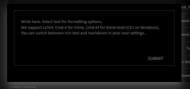
In dark mode, footnotes render as white boxes totally obscuring the footnote text you're drafting! You can click away to see the footnote text you've got, but not see it and have your text cursor there simultaneously.
Yep, that's a white-on-white bug (due to a piece of the editor not being dark-mode-aware). Should be fixed with the next deploy.
Intercom doesn't change in Dark Mode. Also, the boxes around the comment section are faded, and the logo in the top left looks slightly off. Good job implementing it, though, and I'm extremely happy that LW has this feature.
Comment-section borders: I agree that they're currently on the faint side, and will darken them.
Intercom: Darkening the button should be easy enough, I'll do that. The box that appears when you click it has enough custom styling from the library that it's probably not worth the trouble, though it looks like people have made extensions for this (eg this one which I have not vetted or tested at all).
That's funny, I remember getting that effect from trying to get dark mode using a tool before this (instead of the theme).
Re: supporting operating system dark-mode preference while still allowing the user to choose: you may want to take a look at how dark mode is implemented on gwern.net.
We actually have a prototype that enables dark mode conditional on system preference using media queries, and this works for almost everything, but unfortunately there's one library we're using (material UI) that this doesn't work with because it generates its styles dynamically in an SSR context. So most of the remaining work for this is prying apart that particular library to get finer grained control of its stylesheet-generating internals.
Yesssss! Awesome! The first thing I did when I saw the title was find the setting and switch :)
Feedback: The images in the "read next in sequence" feature are a bit too bright in dark mode, don't know if it's sequence specific or not.
Also, the text might be a bit too bright? I'm not sure if it needs to have so much contrast, if it was a setting I would probably lower the contrast of the text for myself.
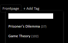
User feedback: it's 3am where I am, and dark mode makes the site much easier on the eye. I do find the green-on-black a bit garish sometimes, also the different shades of green on the site are much more noticeable to me. (I think the ground truth is that most site-UI is a weaker shade of green than the URLs are.)
Bug Report
This absolutely might just be me being blind, but in dark mode I'm not seeing a difference between read and unread alerts.
One of the more commonly requested features on LessWrong is a dark mode. Well, now we have it! To activate, hover over the user-menu in the top right, open the Themes submenu, and click on Dark Mode there.
Notes: