I like it too, especially that it's short. You might consider putting 'featured articles' above 'recent articles' if that page is geared for newcommers.
Disagree very strongly. The first thing you should see on any website is content. Splash pages are extremely poor design.
I agree that there's too much unchanging material at the top of the page. I recommend something much shorter, with a link to a few paragraphs for getting started.
Another possibility is that the existing intro only appears if you show up at the home page without being logged into an account.
I think LW is somewhat of an exception to this rule, at least for newcomers. And those who come to check the site frequently can just bookmark the /promoted url.
I don't know anything about SEO, but wouldn't giving the main page unchanging text that summarizes what the site is about help us appear higher in searches, as well?
I don't know anything about SEO, but wouldn't giving the main page unchanging text that summarizes what the site is about help us appear higher in searches, as well?
Not at all, Google strongly favors "fresh" content. I don't think the change will make any real difference though; there's still the same amount of fresh content at a different URL, and (I assume) most searches point to a specific post rather than the front page.
Y Combinator doesn't have any content to put on the front page. It's a business. The blog and news sites are secondary to informing people what it is that Y Combinator does. If they sold something then I'd argue that what they sell should be frontmost but they don't. LessWrong is all content so the content should be upfront.
I like the new "reply" icon, and the fact that the comment count is now in the sidebar - good work!
I have exactly ONE complaint about the curent site design. Otherwise it's perfect.
PLEASE make the difference between what links you've visited and which ones you have not more visible at a glance.
I'm very positive about the change! I think the text on the front page is great, and I really like that this is the first thing people see at lesswrong.
It's not immediately obvious how to proceed to the list of articles (other than by reading the front page text) since "MAIN" appears in black text on the front page, implying that that's where you already are. I suggest making the top menu read "HOME | ARTICLES | DISCUSSION" where home=lesswrong.com/ and "main" is renamed to "artircles".
Also consider merging the right menu (wiki, sequences, about) with this menu to keep it simple.
The new front page is great, good work.
One nitpick: It seems to me that the Back to Less Wrong button on the wiki should take you to the main page, not the welcome page again.
I use that resolution as well, but have a fairly wide monitor. Text size is usually fine, but some sites I simply use the browser zoom one or two levels.
Edit: I didn't check the screenshots - I don't have that issue, unless it's fixed already.
Typically, text windows are capped horizontally for that reason, and so that isn't an issue, and you get a number of ancillary benefits (text is often centered, the other light from your screen is the page's background rather than your desktop, etc.).
The titles of the categories "promoted articles" and "upcoming meetups" should link to the pages that list them all. (I'm not sure how to edit that part of markup on the wiki, should I just add something like around the headers?)
There are two additional improvements I'd really like:
Count of up/down votes rather than of up minus down.
Code pages so that the contents of the window are always resized to fit in the horizontal width of the browser window, without needing to side-scroll. This is more of an issue when editing a post than when reading.
I don't know whether it's got anything to do with the site changes, but LW has become less reliable about opening links. I'm getting those joke error messages relatively often, though I can usually get the link to work on a second try. I just got some sort of proxy error the first time I tried to open recent discussion posts.
There was an issue that at random intervals would cause that error page to be returned. It should be fixed now.
In the upcoming meetups and in the upcoming events, they only show unusual events. All regular meetups are not displayed, which to a newcomer makes it look like there aren't any events in those areas. I would suggest a permanent pin on the areas that are confirmed to have regular meetups, with a link to the page that declares the regular time and place.
On the front page, is it supposed to say "regular regular meetups", or is this a redundancy typo?
drpowell and I both just showed you how you can fix errors like this in the future. You now have a new power.
Thank you for that. I'll probably be working a little more with the wiki now. The reason why I hadn't gotten the hint was because I assumed that ordinary users did not have the power to edit such essential pages, and just moved along. But now I know that to be false.
Is there a karma requirement for editing in the wiki, or can a troll come along, make an account, and subtly but profanely edit the front page of LW until someone who cares to read through the intro (probably not many regular readers, and likely an impressionable new reader with no knowledge that it is a wiki page) finally notices and reverts the change?
There is no karma requirement for those pages (karma on the main site isn't integrated into the wiki, and the wiki code doesn't know what your LW karma is).
We think that it's not very obvious that the front page is under wiki control. If we start to get spam on those pages it's easy to "Protect" them, which will make them behave as you expected them to behave (only special wiki users can edit them).
Again, thanks for working on the site, and especially for keeping up with it even though the initial reaction was less than overwhelmingly positive. :)
It's not very clear how one gets to lesswrong.com/new/ from the new front page, or for that matter anywhere. I looked around a bit, but couldn't find a link anywhere. EDIT: Ah, there is a link on lesswrong.com/promoted/ , but you have to go there first to find it. That's not an optimal situation.
ETA: I second the comments about the new reply icon being better, and about appreciating the comment counts in the sidebar. (Though I was for a moment a bit confused as to what the "c" referred to, as I thought it was an implementation of the showing upvotes/downvotes separately thing.)
It's not very clear how one gets to lesswrong.com/new/ from the new front page…
Yeh - that's fallen out as being harder than I'd imagined. Any ideas?
The thumbs up/down icons are clear and nice, but the parent, edit, reply. permalink, and retract confuse me. They also appear to take up more vertical space. I'd much rather have the text back for those.
I am glad to see continuing work on the site.
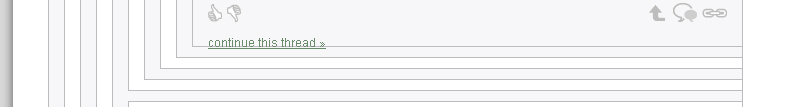
Bug: the "continue this thread" link is not positioned correctly: Firefox 5 screenshot. (Behavior in Chrome 12 was pixel-for-pixel identical.)
Quick note, there's no mouse-over text for reply and link anymore, is that intended? In a positive note, I like the look of the site in general though, it's more friendly to newcomers.
Hmm… working for me (on the same OS and the same browsers). Do you have js turned off?
Others? Can anyone reproduce falenas108's bug report?
We've pushed out some new changes, including a front page. Promoted articles are now available at http://lesswrong.com/promoted/ and from the MAIN link in the top nav.
Most of the recent changes were requested here or here.
This is the place to comment on the new changes… but please remember that:
Front page "Featured Articles" are edited here. I humbly suggest that willing featured article editors nominate themselves in the comments, and everyone who doesn't get a lot of support forgets this link and leaves that page alone.
And if spam becomes a problem for the front page, the about page, or the comment markup help, poke a wiki admin and ask them to "protect" the special pages.