Please give feedback on how this affects the reading experience! If the feedback is positive, this will leave beta and be enabled (for comments above a karma threshold) for everyone.
There's an option on the new/edit-post page for authors to disable this on their post. (The option is currently only visible if you've also opted into beta features in your user settings.) This changes the default from show-10+-karma to hide-all. This may be useful if comments are likely to derail readers from finishing the post, or contain spoilers.
I am finding it somewhat difficult to work with. As I'm reading the post, scrolling down and first come across the comment icon, I hover over it. But at this point I'm scrolled down such that the comment icon is at the bottom right of the screen, which makes the text of the comment cut off. It's also covered by the Intercom button. So I have to scroll to see the text of the comment. But when I scroll my cursor is no longer over the comment icon, so the comment text disappears.
All of that just means that I have to scroll to the right position first and then put my cursor over the comment icon. Part of me feels like that's not really a big deal, but another part of me feels like it might be a trivial inconvenience that makes me too unmotivated to use the feature. I can't tell yet.
Yeah, I also find this kind of annoying. The "intended" way of using it is to click on the comment icon which "pins" the comment open and then you can do with your mouse whatever you want. We played around with a few different ways of leaving it open, but all of them had more frustrating interactions than the current one.
Ah, that's good to know about clicking on it. In retrospect I'm surprised I didn't realize that.
And that makes sense about being difficult to come up with a better option. I was thinking of having the comment appear in the middle of the screen to the left of the comment icon. That has the downside of being more intrusive. My sense is that the upsides outweigh the downsides, but I'm not particularly confident. I also think it makes sense to not let the perfect be the enemy of the good with this feature, especially wrt releasing fast and seeing what users think.
I strong-upvoted it for the user-experience. Jim, can you leave me a different comment for me to strong-downvote to even it out?
There's a special case for the post author, which exempts them from the karma minimum. If it's not showing it's because the visibility is set to "hide all".
In order to appear as a side-comment, quotes should be an exact match, including formatting
This might be inconvenient for markdown editor users. Because, when you copy text into the markdown editor, it loses the formatting. It would be nice if either formatting was ignored for side-comment matching purposes, or if copying formatted text into markdown would automatically add the relevant tags (the latter would have other benefits as well).
It should probably also match blockquotes where it's been edited at all, like adding '...' ellipses to condense or links or even just simple spelling error/typo fixes. (I do a lot of all of those.) One might look at systems that try to link specific ranges of HTML text for how to do 'loose' matches which don't break at the drop of a hat.
This is very cool. Lining up with the text by matching blockquotes is very clever!
Is there some way to make the side comments start out expanded, or expand them all?
This is very cool. Lining up with the text by matching blockquotes is very clever!
Yeah absolutely. I'm curious: how difficult was it to implement this feature? Utilizing blockquotes that way means you don't have to store side comments any differently really, so maybe it was easy to implement. Then again, things are never as easy as you'd initially expect.
You can see the PR here: https://github.com/ForumMagnum/ForumMagnum/pull/6023. Calendar-time from first starting on the first prototype to today was ~6 weeks; accounting for unrelated concurrent projects, I'd say I spent 3-4 FTE equivalent weeks on it. The biggest time sinks were HTML-token-stream wrangling to find matches, mark where to highlight, and so on, and UX details of the hoverable comments themselves. There's also a partially-implemented system in there for shifting things left (closing the ToC if necessary) to get a wider right margin and avoid scrolling, at certain screen widths, which might get deployed later.
There isn't currently a way to do it. It's feasible to add, but requires adding a fair bit of new code to deal with vertical sizing and overlap issues. (Currently it relies on the fact that one comment icon aligned with the top of each paragraph is guaranteed to not create any overlap issues.) I'm not sure that expanded-by-default is good to have by default, though; one of the goals of the current design is to minimize intrusiveness; there's a risk that, with side-comments visible-by-default on the first pass, people would have trouble making it to the end of a post without getting diverted into sidetracks..
I very much appreciate that the relevant text is not highlighted by default, which I've always found very intrusive into my reading (on kindle/medium). I think I also prefer not having the comment visible until hover as well.
I agree that the highlights shouldn’t be highlighted by default, and I am not asking for a way to make them highlighted by default, or all highlighted, or all highlighted when all the comments are expanded, or any such thing. (Maybe someone else wants that, but not me.)
I just want to have the option (which can be off by default, and toggled in user settings) all the side comments expanded by default (or with one click). (I don’t want this to result in all the highlights being visible at once!)
I agree with you re: defaults; see my reply to Ben for the feature I think would be good.
As far as v-sizing and overlap issues, I certainly know what you mean. Take a look at the sidenotes layout algorithm in sidenotes.js; you may find it useful to adapt or as inspiration.
Awesome! First thing I noticed is that I can't leave the button to hover over the pop-up comment without it disappearing, and that's pretty annoying, because I like hovering over things when I read them.
A way I would like to see this feature used: Commenting on citations, so future readers can know if they really support what's being said or not, and whether they worth visiting in general either way. For example, if I wrote:
This article shows that pigs can fly.
Then someone could comment on it whether it does or not, and future people can see that discussion the moment the reach that part, and that way we can better assess whether posts are well cited (cause no one wants to check every citation on every post by themselves).
It would be ideal if it was possible to comment on the link itself, cause many times several links are given in quick citation (e.g "(Link1, Link2, Link3)"), but meanwhile this could work almost as well.
this is wonderful, thank you!
for a v1.4 is there any chance this could someday add support for splitting a comment with multiple blockquotes into multiple highlight points?
It only shows one icon on purpose, so that if someone goes through a post responding to things point-by-point in a single long comment, and then a reader goes through the post expanding the comment each time, they don't get flooded with duplicate views of the same comment. If you pin a comment, though, it will highlight where all the blockquotes were, including ones further down in the post, so you can track things somewhat that way.
Excited about this!
Points of feedback:
- I don't like to have to scroll my screen horizontally to read the comment. (I notice there's a lot of perfectly good unused white space on the left side; comments would probably fit horizontally if you pushed everything to the left!)
- Sometimes when you mouse over the side-comment icon, it tries to scroll the page to make the comment readable. This is very surprising and makes me lose my place.
- Hovering over the icon makes the comment appear briefly. If I then want to scroll in order to read the comment, there seems to be no way to 'stay hovered' -- I have to click and toggle it, to make the comment stick around so I can actually read it. (This plus being forced to scroll the screen makes the hover feature kind of useless.)
Overall, feeling optimistic though, and will probably use this.
I don't like to have to scroll my screen horizontally to read the comment. (I notice there's a lot of perfectly good unused white space on the left side; comments would probably fit horizontally if you pushed everything to the left!)
Yeah, this is pretty annoying. We spent a decent amount of time trying to make it so that the whole page shifts to the left when you open a comment, but it ended up feeling too janky. We might still make it work later on.
The current layout is optimized for 1440px wide screen size, which is the most common width that people use the site with, but we can probably make it work for people who are more zoomed in or have smaller screens after a bit more work.
Sometimes when you mouse over the side-comment icon, it tries to scroll the page to make the comment readable. This is very surprising and makes me lose my place.
Hmm, this seems likely a bug. What browser and OS are you using?
Hovering over the icon makes the comment appear briefly. If I then want to scroll in order to read the comment, there seems to be no way to 'stay hovered' -- I have to click and toggle it, to make the comment stick around so I can actually read it. (This plus being forced to scroll the screen makes the hover feature kind of useless.)
The way I've found it most comfortable to engage with the side comments was to hover, read the first few lines, author and karma, then click to pin the comment open and then read the rest. This... is of course harder if you are on a smaller screen and can't even get that basic information without scrolling first. As a bandaid (though this isn't great), the hover-area over the comment icon actually extends horizontally all the way to the right of the screen, so you should be able to start hovering, then scroll to the right, and then decide to click (though if you decide to not click and hover away, your scroll position is janked in a disorienting way, which is also pretty annoying, IMO).
I think overall we probably should find some way to make the post move further to the left. The big problem with this (which you can't see on this post) is the Table of Contents which actually takes up most of the available space on the left when it is present, and making both the side comments appear and the ToC appear is actually pretty hard and we don't have a ton of extra space to work with.
It's technically doable, but I think probably not worth implementing because the main benefit is mostly not there. With posts, the paragraph and the comment that replies to it may be very far away; but comments are usually shorter, so comments-replying-to-comments are not so far apart.
Seems... hard and a bit overwhelming. My current guess is we are unlikely to do that, just because at least in my mental eye it feels like it would make the comment section quite cluttered.
The icon could be to the side of the comment section (same place as it is on the post). I think it would be nice on long comments, but only on long comments. so if it is implemented the implementation should include a check for how long the comment is, which makes thing more complicated. But maybe it can be implemented along with voting on the bottom when a comment is long, seems like that part is the same piece of code.
Weird bug on desktop Firefox: Load this URL (the anchor URL of a nested comment, reached via the "see in context" button of a side comment), enable displaying side comments, then hover over the jimdanromh side-comment icon, and the browser does some weird scrolling. Here's a very brief gif recording. This does not happen via regular comment permalinks like this one.
Every time I refresh the page, the Side Comments setting resets to Hide All. I initially thought that might be intentional behavior, and one can enable experimental features in the settings to make this permanent; but that just moves the default, so now every time I refresh the page it resets to "Show Upvoted", instead.
User experience: When you hover on the side-comment icon, the side comment pops up; to pin it in place, you have to click the side-comment icon.
To unpin and hide the side comment, I figured I could then click on the side comment once more, but that doesn't work; you have to click somewhere outside the box marked in this screenshot. It might be more intuitive if the side-comment icon was a toggle.
I just checked after emptying my cache & deleting cookies, and for me toggling still doesn't work. I can pin side comments by clicking the icon, and unpin them by clicking anywhere outside the marked box, but I can't unpin by clicking the icon again.
That said, maybe changes to the website take a while to propagate to end users or something?
Nah, seems to be a browser-specific bug. I expect we will fix it next week, after Thanksgiving.
Huh, there is in fact a bug here, but it's browser-specific (fails to close in Firefox, closes correctly in Chrome). Will investigate.
If a comment contains more than one blockquote that could be used to place it as a side-comment, it will be placed based on the first one. In order to appear as a side-comment, quotes should be an exact match, including formatting; there is some provision for "..." ellipses, but it's fairly limited.
I am expecting that when I would be writing a post that would qualify for this, I would more frequently be doing it as separate comments to guide this feature to have more of the content pinpointed to specific questions.
If a comment contains more than one blockquote that could be used to place it as a side-comment, it will be placed based on the first one. In order to appear as a side-comment, quotes should be an exact match, including formatting; there is some provision for "..." ellipses, but it's fairly limited.
I am expecting that when I would be writing a post that would qualify for
Trying to wrap my head around I find myself expecting that it would work for comments also, but at this stage it does not.
This is what it looks like on my laptop; I'm using dark mode and set side comments to "show all". You can see the two little comment icons in the lower right. The higher one has a number 3 on it, which seems to indicate the number of side comments on that paragraph. But that number is incredibly small and faint; without zooming in, mostly all I can tell is that it's a one-digit number. I think I'd say that, if you are going to put a number there, it should be bigger.
Do you think it would be potentially good to implement the full "Google Docs commenting mode", which enables editing suggestions on articles? If implemented in published posts each Google-Docs-style-edit might be able to be voted by users, so the author has a better sense if to accept the edits or not. And of course, you should also be able to hide this feature. The posts would become more collaborative, even after being published.
I really like that you're adding this feature. Together with other features like agreement votes, LessWrong is making truth-seeking easier and easier, diverging from what I'm used to in good ways. Thanks for your work :)
LessWrong now has side-comments. This feature is in beta; you can turn it on for yourself on individual posts using the triple-dot menu below the post title, or enable it for all posts by going to your user settings and checking the "Opt into experimental features" checkbox in the Site Customization section.
Side-coments on LessWrong are conceptually similar to the side-comments you may be familiar with from Google Docs and other places, with one key difference: side-comments are placed automatically by lining up blockquotes. As a result, many historical posts already have side-comments on them! Side-comments are also still displayed in the comments section below the post as usual.
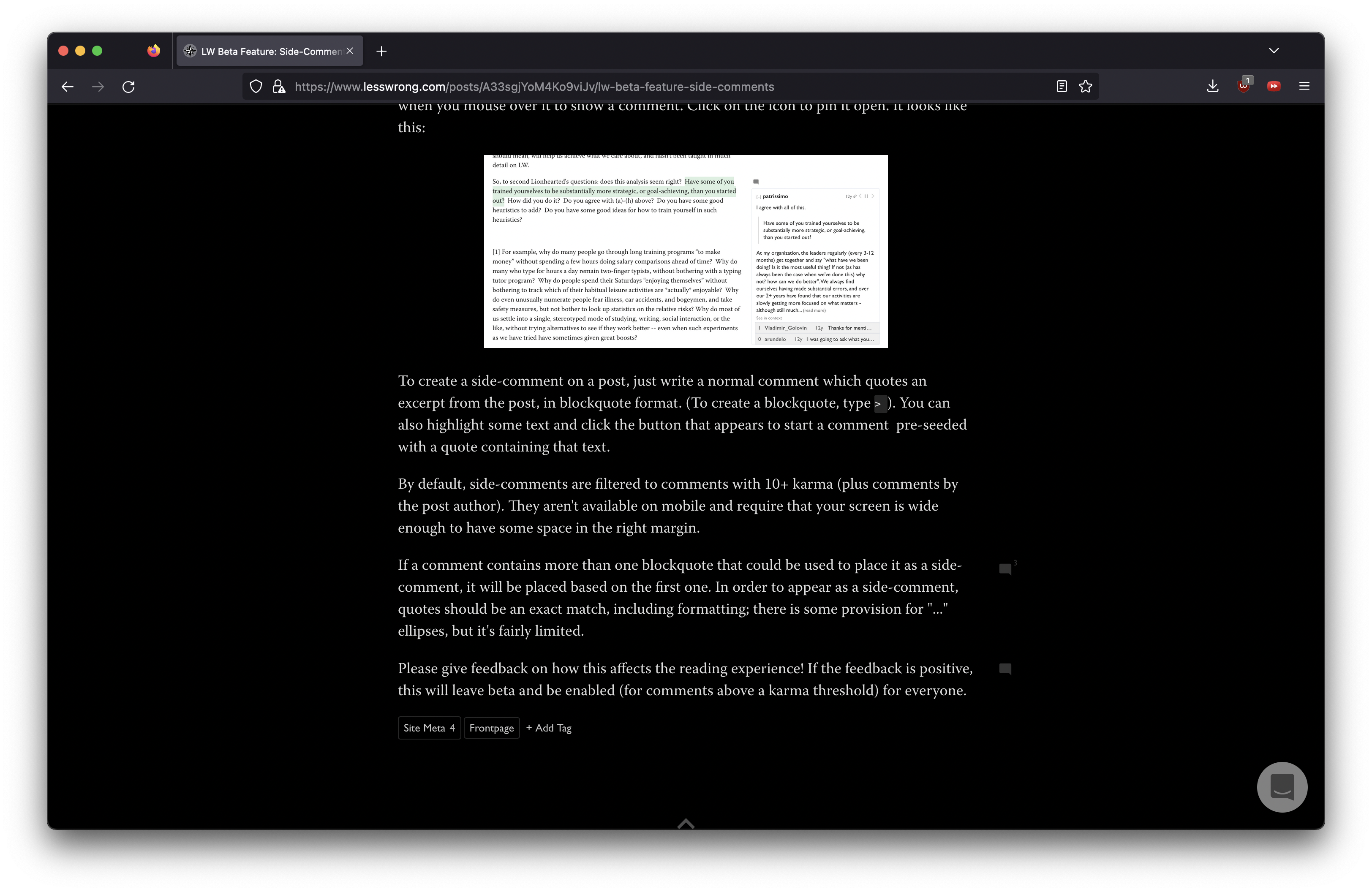
Side-comments take the form of a comment icon in the right margin, which expands when you mouse over it to show a comment. Click on the icon to pin it open. It looks like this:
To create a side-comment on a post, just write a normal comment which quotes an excerpt from the post, in blockquote format. (To create a blockquote, type
>). You can also highlight some text and click the button that appears to start a comment pre-seeded with a quote containing that text.By default, side-comments are filtered to comments with 10+ karma (plus comments by the post author). They aren't available on mobile and require that your screen is wide enough to have some space in the right margin.
If a comment contains more than one blockquote that could be used to place it as a side-comment, it will be placed based on the first one. In order to appear as a side-comment, quotes should be an exact match, including formatting; there is some provision for "..." ellipses, but it's fairly limited.
Please give feedback on how this affects the reading experience! If the feedback is positive, this will leave beta and be enabled (for comments above a karma threshold) for everyone.