Thanks! This is exactly the kind of toy model I thought would help move these discussions forward.
The part I'm most suspicious of is the model of the control system. I have written a Colab notebook exploring the issue in some detail, but briefly:
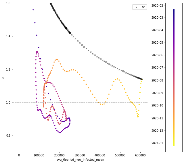
To get a sense of scale, here is one of the plots from my notebook:
The colored points show historical data on R vs. the 6-period average, with color indicating the date.
More general commentary on the issue:
In other words, you are looking at a mostly constant R (with a slight sustained recent upswing), and concluding that this lack of a change is actually the result of two large changes that cancel out:
When R has been remarkably constant the whole time, I'm suspicious of introducing a sudden "blast" of large changes in opposing directions that net out to R still staying constant. What evidence is there for this "blast"?
(The recent trajectory of R is not evidence for it, as discussed above: it's impossible to explain recent R with these forces in play. They have to have have suddenly appeared, like a mean Christmas present.)
My model of the R/cases trends is something like:
The missing piece is what sets the noise/oscillations, because if we can control that we can help. However, any model of the noise/oscillations must calibrate them so it reproduces 2020's tight control around R~1.
This tight control was a surprise and is hard to reproduce in a model, but if our model doesn't reproduce it, we will go on being surprised by the same thing that surprised us before.
- It seems better to first propose a model we know can match past data, and then add a tuning term/effect for "pandemic fatigue" for future prediction.
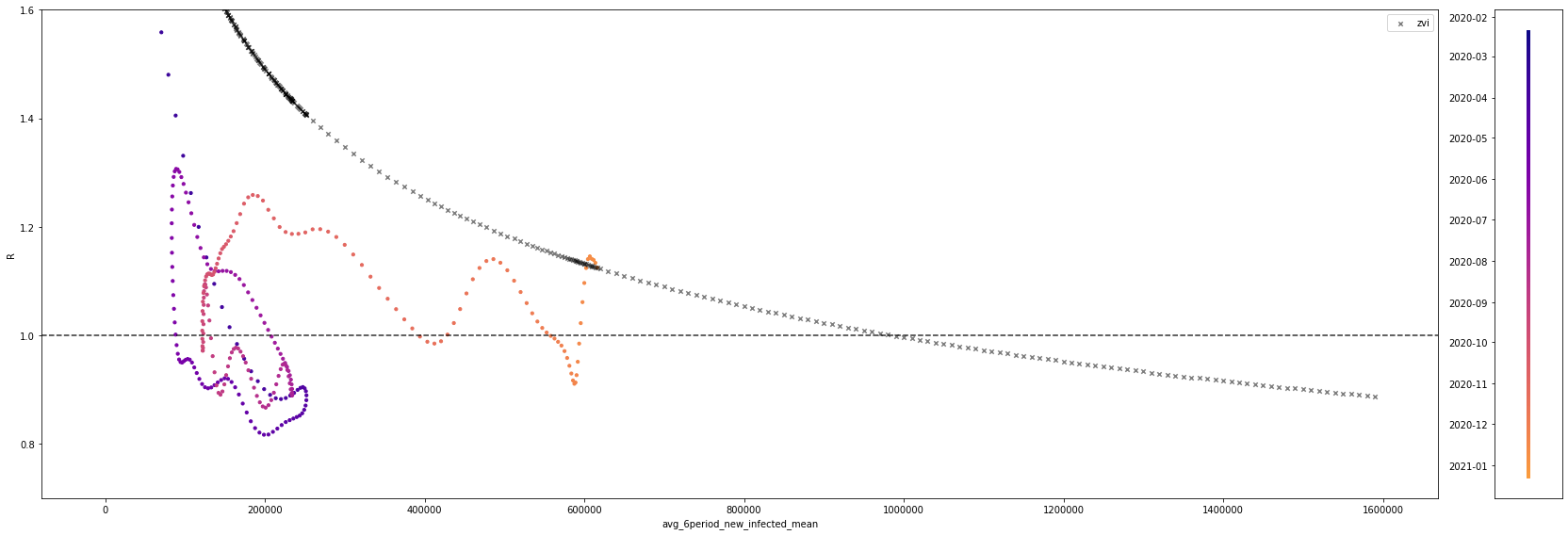
To get a sense of scale, here is one of the plots from my notebook:
The colored points show historical data on R vs. the 6-period average, with color indicating the date.
Thanks for actually plotting historical Rt vs infection rates!
Whereas, it seems more natural to take (3) as evidence that (1) was wrong.
In my own comment, I also identified the control system model of any kind of proportionality of Rt to infections as a problem. Based on my own observations of behaviour and government response, the MNM hypothesis seems more likely (governments hitting the panic button as imminent death approaches, i.e. hospitals begin to be overwhelmed) than a response that ramps up proportionate to recent infections. I think that explains the tight oscillations.
I'd say the dominant contributor to control systems is something like a step function at a particular level near where hospitals are overwhelmed, and individual responses proportionate to exact levels of infection are a lesser part of it.
You could maybe operationalize this by looking at past hospitalization rates, fitting a logistic curve to them at the 'overwhelmed' threshold and seeing if that predicts Rt. I think it would do pretty well.
This tight control was a surprise and is hard to reproduce in a model, but if our model doesn't reproduce it, we will go on being surprised by the same thing that surprised us before.
My own predictions are essentially based on continuing to expect the 'tight control' to continue somehow, i.e. flattening out cases or declining a bit at a very high level after a large swing upwards.
It looks like (subsequent couple of days data seem to confirm this), Rt is currently just below 1 in London - which would outright falsify any model that claims Rt never goes below 1 for any amount of infection with the new variant, given our control system response, which according to your graph, the infections exponential model does predict.
If you ran this model on the past, what would it predict? Based on what you've said, Rt never goes below one, so there would be a huge first wave with a rapid rise up to partial herd immunity over weeks, based on your diagram. That's the exact same predictive error that was made last year.
I note - outside view - that this is very similar to the predictive mistake made last Febuary/March with old Covid-19 - many around here were practically certain we were bound for an immediate (in a month or two) enormous herd immunity overshoot.
Based on what you've said, Rt never goes below one
You're saying nostalgebraist says Rt never goes below 1?
I interpreted "R is always ~1 with noise/oscillations" to mean that it could go below 1 temporarily. And that seems consistent with the current London data. No?
I meant, 'based on what you've said about Zvi's model' I.e. Nostalgebraist says zvi says Rt never goes below 1 - if you look at the plot he produced Rt is always above 1 given Zvi's assumptions, which the London data falsified.
Rt can go below one in Zvi's model. It just takes an even higher rate of new infections.
Here's the same picture, with the horizontal axis extended so this is visible: https://64.media.tumblr.com/008005269202c21313ef5d5db6a8a4c6/83a097f275903c4c-81/s2048x3072/7b2e6e27f1fb7ad57ac0dcc6bd61fce77a18a2c1.png
Of course, in the real world, Rt dips below one all the time, as you can see in the colored points.
As a dramatic example, Zvi's model is predicting the future forward from 12/23/20. But a mere week before that date, Rt was below one!
One thing that you didn't account for - the method of directly scaling the Rt by the multiple on the R0 (which seems to be around 1.55), is only a rough estimate of how much the Rt will increase by when the effective Rt is lowered in a particular situation. It could be almost arbitrarily wrong - intuitively, if the hairdressers are closed, that prevents 100% of transmission in hairdressers no matter how much higher the R0 of the virus is.
For this reason, the actual epidemiological models (there aren't any for the US for the new variant, only some for the UK), have some more complicated way of predicting the effect of control measures. This from Imperial College:
We quantified the transmission advantage of the VOC relative to non-VOC lineages in twoways: as an additive increase in R that ranged between 0.4 and 0.7, and alternatively as amultiplicative increase in R that ranged between a 50% and 75% advantage. We were not ableto distinguish between these two approaches in goodness-of-fit, and either is plausiblemechanistically. A multiplicative transmission advantage would be expected if transmissibilityhad increased in all settings and individuals, while an additive advantage might reflect increasesin transmissibility in specific subpopulations or contexts.
The multiplicative 'increased transmissibility' estimate will therefore tend to underestimate the effect of control measures. The actual paper did some complicated Bayesian regression to try and figure out which model of Rt change worked best, and couldn't figure it out.
Measures like ventilation, physical distancing when you do decide to meet up, and mask use will be more multiplicative in how the new variant diminishes their effect. The parts of the behaviour response that involve people just not deciding to meet up or do things in the first place, and anything involving mandatory closures of schools, bars etc. will be less multiplicative.
I believe this is borne out in the early data. Lockdown 1 in the UK took Rt down to 0.6. The naive 'multiplicative' estimate would say that's sufficient for the new variant, Rt=0.93. The second lockdown took Rt down to 0.8, which would be totally insufficient. You'd need Rt for the old variant of covid down to 0.64 on the naive multiplicative estimate - almost what was achieved in March. I have a hard time believing it was anywhere near that low in the Tier 4 regions around Christmas.
But the data that's come in so far seems to indicate that Tier 4 + Schools closed has either levelled off or caused slow declines in infections in those regions where they were applied.
First, the random infection survey - London and South East are in decline and East of England has levelled off (page 3). The UKs symptom study, which uses a totally different methodology, confirms some levelling off and declines in those regions - page 6. It's early days, but clearly Rt is very near 1, and likely below 1 in London. The Financial Times cottoned on to this a few days late but no-one else seems to have noticed.
I think this indicates a bunch of things - mainly that infections caused by the new variant can and will be stabilized or even reduced by lockdown measures which people are willing to obey. It's not impossible if it's already happening.
To start, let’s also ignore phase shifts like overloading hospitals, and ignore fatigue on the hopes that vaccines coming soon will cancel it out, although there’s an argument that in practice some people do the opposite.
I agree with ignoring fatigue, but ignoring phase shifts? If it were me I'd model the entire control system response as a phase shift with the level for the switch in reactions set near the hospital overwhelm level - at least on the policy side, there seems to be an abrupt reaction specifically to the hospital overloading question. The British government pushed the panic button a few days ago in response to that and called a full national lockdown. I'd say the dominant contributor to control systems is something like a step function at a particular level near where hospitals are overwhelmed, and individual responses proportionate to exact levels of infection are a lesser part of it.
I think the model of the control system as a continuous response is wrong, and a phased all-or-nothing response for the government side of things, plus taking into account non-multiplicative effects on the Rt, would produce overall very different results - namely that a colossal overshoot of herd immunity in a mere few weeks is probably not happening. I note - outside view - that this is very similar to the predictive mistake made last Febuary/March with old Covid-19 - many around here were practically certain we were bound for an immediate (in a month or two) enormous herd immunity overshoot.
So you're saying that you think that a more infectious virus will not increase infections by as high a percentage of otherwise expected infections under conditions with more precautions, versus conditions with less precautions? What's the physical mechanism there? I don't understand it, and if I'm going to believe it, I'll need an explanation of physically how it works that way, if it works that way.
As for the outside view thing, well, sure, of course, but it doesn't sound like you have very different models of what might be done by people in these scenarios this time - your theory is that the lockdowns can work.
But I'd also ask, even if it would be enough, how long do you think England is prepared to keep the Tier 4 + Schools thing in place for and get cooperation? And do you think the USA could get to that level at all at this point? Especially given it only levels things off at a very high level, and doesn't actually make much progress, so you can never relax. And the overall UK numbers are still steadily getting worse.
So you're saying that you think that a more infectious virus will not increase infections by as high a percentage of otherwise expected infections under conditions with more precautions, versus conditions with less precautions? What's the physical mechanism there?
Wouldn't "the fractal nature of risk taking" cause this? If some people are taking lots of risk, but they comply with actually strict lockdowns, then those lockdowns would work better than might otherwise be expected. No?
But I'd also ask, even if it would be enough, how long do you think England is prepared to keep the Tier 4 + Schools thing in place for and get cooperation? And do you think the USA could get to that level at all at this point? Especially given it only levels things off at a very high level, and doesn't actually make much progress, so you can never relax. And the overall UK numbers are still steadily getting worse.
Hi I am a political scientist and I have an article about this exact question. You can read it here and give constructive comments - https://www.lesswrong.com/posts/em5HYZ6cq9tt65842/why-lockdowns-failed-a-letter-to-the-policy-entrepreneurs-in
I did some calculations of basic herd immunity thresholds based on fractal risk (without an infection model) a few months back, and the difference between splitting the population into high exposure vs low exposure captures more than half the change from the limit of infinite splits. The threshold stopped changing almost entirely after three splits, which was only 6 subpopulatuons.
With many other variables as exist here I'm not confident that effect would persist but my default guess is that adding fractal effects to the model will less than double the change from the homogenous case, and possibly change very little at all as the herd immunity threshold and therefore level of spread reduction will be changed even less (especially with control systems.)
That may end up being pretty significant in terms of actual number of deaths and infections at the end, but I would be very surprised if it changes whether or not there are peaks.
One could certainly split into low/high with a larger-than-actually-estimated division and call that close enough, or do something continuous in the middle with the assumption that the super-risky top is already spoken for, or something.
To me there's still a big mystery of why it seems like herd immunity hasn't done more work than it did.
A toy model that makes some sense to me is that the two population distinction is (close to) literally true; that there's a subset of like 20% of people who have reduced their risk by 95%+, and models should really be considering only the other 80% of the population, which is much more homogeneous.
Then because you started with effectively 20% population immunity, that means R0 is actually substantially higher, and each additional piece of immunity is less significant because of that.
I haven't actually computed anything with this model so I don't know whether it is actually explanatory.
Thanks for doing this, it was news to me that this would last so long before herd immunity. Is this for the whole world, or just the USA, or what? Do you think the graphs would look different for London, UK in particular -- perhaps shifted forward a month or so?
This was USA only. You could do something similar elsewhere if you had the relevant numbers.
My guess is England will come in with less immunity from infections, but is much further along towards its peak. Time is already up there, so the question is whether the super tier 4 can do enough or not.
In your model you seem to keep the R value constant at the 1.5 ratio (S$1 cell).
I've seen calculations regarding where herd immunity kicking in based on adjusting R given the percentage of the population with immunity (already infected). I was not completely sure how to try making that adjustment so took the % infected in row 2 as the base constant from which I then subtract from the other values in that column.
I didn't look at the full impact but calculate an Adjusted New. For the most part the timeline runs the same -- the adjustment seems to more one period earlier than your calculations. For example, the adjusted new peak is on May 28 where as the peak in your calculations occurs on June 4.
The big difference though is in magnitude. The peak infections for the new variant in your calculations was 7,325,028. In my adjusted new variant cases the peak was 5,370,409. That seems to be a significant difference.
I'm wondering if the adjustment I'm apply for some reason is not valid.
How would vaccine refusers impact this model?
There will be plenty of accepters until after it ends. So I think what this changes is it reduces the favorable selection in vaccination, because you can't do as many vulnerable people, reducing death rate cut somewhat. Nursing home residents who don't vaccinate should still benefit a lot from local here immunity. From what I saw, the elderly refusal rate was relatively low but good data is lacking.
The refusers mostly don't seem to be vulnerable people (as you would expect). So it doesn't change this model.
Since we are so far not trying to model vaccinations to reduce spread.
(yes I live in a cave where I don't think the new strain is being identified) Why does the old strain disappear? And shouldn't we expect yet another strain after very many people get infected? (Of course, it could go whichever way with it spreading faster or not.)
By assumption here the new strain is more infectious than the old strain, either 50% or 65% more (in the sheet you can set it to anything you like). I am highly confident it's near that range. The control system reacts to the new strain's rise, and the old strain quickly gets wiped out.
It is of course possible for another yet more infectious strain to arise in the future, but I'm not attempting to model that. It would need to happen relatively soon to have much impact, unless it escaped from the vaccines.
People react to levels, not rates of change. Things rapidly getting worse or better doesn’t much matter to them. Mainly they care about how dangerous things seem to be. This is a lot of the evidence for pandemic fatigue – if we are stabilized at relatively high levels now versus before, despite substantial immunity and better knowledge, there must be a factor pushing in the other direction.
Or that factor is the better knowledge.
Epistemic Status: Highly speculative. I threw this together quickly, and wrote this to document how I went about it. This is an attempt to create a first toy model, so others can error correct and improve, and upon which less-toy models can hopefully be built. You can see the spreadsheet with my work here. Please take this and run with it, and please don’t take this as more than trying stuff to see what’s wrong with it.
No one seems to be creating models of various scenarios in a way that feels remotely realistic, or even in a way that feels super simplified but that can be used as intuition pumps or baselines.
This post aims to fix that, or at least provide a first step.
At this point, we mostly know we’re f***ed, and that the new strain is at least ~40% more infectious, probably 50%+ more infectious, perhaps as high as 65%-70%.
What happens now?
Speeding up vaccinations seems to be the opposite of what we are doing, but seeing exactly what it would take to get us out of this mess seems like a worthwhile exercise. Time to start building toy models.
Completely Naive Model
To start off, I did the quickest thing at every step to see what happened.
Note that we’re measuring and predicting actual cases not positive tests. The observed and official numbers will always be several times lower than the real ones.
This model assumes:
That’s deeply silly, of course, but it’s not more deeply silly than models that have been offered and taken seriously in the past, despite being obvious nonsense. Assuming away vaccinations is the most obviously nonsensical part of that, but control systems and heterogeneity point in the other direction in many places, and our vaccination progress has been pathetic, so it makes sense to start off extra naive.
I do believe approximately in assumptions 1, 2, 3, 4, 5 and 7, so we have three things we’ll need to fix: Heterogeneity, control systems and vaccinations. And we’ll need to vary the infectiousness level of the new strain, considering at least the 50% and 65% cases.
We’ll also want to add deaths, especially since the control system likely depends on that number.
First let’s check out what you get without fixing any of the three issues.
You get this:
This is rather disastrous.
The safest day between now and the endgame is around Pi Day, March 14, at roughly 40% of current levels.
The most dangerous day is around June 1, at around 244% of current infection levels. If you are not infected by then, you’d be 380% more at risk than today, because of increased immunity in others. In addition, the hospital system would presumably be under at least extreme strain.
The number of infections reaches current levels twice. On the way back up, it happens on about April 20, and on the way back down, on about July 1. Note that July 1 is still much more dangerous than today for those still vulnerable.
We get to 10% of current levels around August 8, 10% of that around September 1.
The new strain is 1% of infections by January 20, 10% by February 20, 50% by March 20.
Approximately 63% of the population ends up infected.
We can contrast that with a 65% more infectious strain:
That is a true disaster. This is not the same scale as the previous graph. Check the Y-axis.
The safest day is now February 17 or so, most dangerous is April 24 and it’s really bad with over three million infected on that day alone. Hospitals would be facing five times the current case levels, and would be fully in triage mode at best.
We get back to current levels by around May 21, 10% of that by June 10, 10% of that around July 1.
The new strain is 1% of infections by January 15, 10% by February 9, 50% by March 2.
Approximately 75% of the population ends up infected.
We are not currently approximating deaths. If we did, since we are assuming zero vaccinations and heterogeneity, we’d choose a fixed IFR and then adjust for the collapse of the hospital system. It would not be pretty.
That’s all an intuition pump of why there’s a very large difference between 50% and 65% more infectious. It compounds quickly, and the crisis hits much faster and much harder. The second scenario’s peak crisis has twice as many simultaneous cases.
Adding Vaccination
The most obvious missing knob is vaccinations.
We presumably add some number of people who are vaccinated, and thus effectively immune, on some accelerating function from week to week.
Given how things are going, it seems safe to treat being vaccinated and previously infected as mostly uncorrelated.
As of January 5, about three weeks after approval, 1.4% of the population (4.73 million doses) has been confirmed as vaccinated. That’s a really pathetic pace, and didn’t even require second doses. It seems safe to assume we’ll do better than that going forward, but how much better? That’s much harder to say. The limiting factor could quickly shift to the limited vaccine supply soon, so one approach is to assume that we administer most of the doses we have purchased. Biden has vowed 100 million shots in 100 days, so my ‘baseline scenario’ will assume we can do 250,000 vaccinations a day from December 14 until January 20, then 500,000 vaccinations a day starting January 21, and they are (for now) chosen at random.
Once someone is vaccinated, how immune are they and how fast? I will assume for now that everyone gets shot number two at the three week mark. My understanding is that you’re 80% immune by about day 10, and that with the booster we will say that jumps to 95% immune on day 30. We’ll say that you get no effect until day 10, people will be careful and be dealing with side effects at home, but also will have had to take some physical infection risk to get the shot, so let’s say those effects cancel.
To make my life easier without changing the math much, we’ll say that you get full 95% protection on day 15, and before that you have nothing, and simulate that by counting vaccinations as if they happen on day+15. It’s basically the same thing, and avoids having to keep track of who catches the virus before the vaccine can work.
There’s the model where such folk are X% immune to each potential infection, and there’s the model where such people are X% likely to be immune period and (100-X)% likely to be fully vulnerable. I’m going to model the second version, so all we have to do is multiply our vaccination numbers by 95%.
So each cycle, there will be an additional 2.5 million people vaccinated, which we will add to either the “Vaccinated and Previously Infected” or “Vaccinated and Never Infected,” and both categories will be fully safe.
Let’s see what that does.
Excellent news! It’s a much better picture if we’re looking at only 50% more infectiousness, despite being a rather pathetic pace of vaccinations.
For a 50% more infectious new virus, the worst remaining day is already behind us.
It takes over from the old strain at exactly the same pace (of course), but the peak is no longer terrifying, because there’s enough immunity to turn the tide quickly.
There is still a secondary peak later on, effectively prolonging our agony for those not yet vaccinated from May until September. That sucks, but it’s not a crisis situation.
We end up with 36.7% infected, versus 63% infected without the vaccine. Big improvement.
However, if you change from 50% more infectious to 65% more, we get a very different picture.
Now we have a terrifying peak at the end of April.
We end up with 51.5% infected. Much better than 74%, and a peak of 5,000,000 per cycle we still see what looks like hospitals very overwhelmed in May and June.
This still is a more reassuring picture than I had going on. At 50% additional infectiousness rather than 65%, we have a very good sporting chance to have the vaccine arrive almost exactly on time, and keep the final wave in check.
This is strong motivation to push hard on the vaccine side of the race. If we can accelerate faster than this, it will help a lot. Conversely, much slower than this, and things get much worse.
Now we need to add control systems. This will potentially help in some places, but also hurt us in others.
Adding Control Systems
It is known that the pandemic has involved powerful control systems of various sorts.
As people see infection rates, hospitalizations and deaths go up, they take less risk. As they see such things go down, they take more risks. Governments do the same, opening and closing various businesses, schools and other locations and activities to keep things in balance. For our purposes here, these forces all look similar. The question is how they would react in these new circumstances.
My model has the following gears:
For now, we are assuming vaccinations are random, so they won’t impact the IFR. While that remains true, we can approximate the combination of all these factors by an average of the infection counts of the past several weeks, with infections lagging one cycle, deaths lagging four or five, and some reaction time, so let’s say we take the average of the last six cycles.
To start, let’s also ignore phase shifts like overloading hospitals, and ignore fatigue on the hopes that vaccines coming soon will cancel it out, although there’s an argument that in practice some people do the opposite.
As a first guess then, let’s take that average of the previous six cycles, the ratio of that to current levels, then raise that to some exponent. As sanity checks, I ask myself what I think people would be capable of doing from here if things got how much worse, and when they’d mostly return to normal, and I noted that I’d be highly surprised if such forces were sufficient to cause an additional peak after the new strain started declining again, with vaccinations continuing and a lot of immunity.
This settled me on an exponent of 0.25, which is the limit of where a final peak does not emerge with 65% additional infectiousness. You can see it almost happening on the chart but it stalls out.
Now what happens?
With 65% more infectiousness:
That’s a higher peak than before. That makes sense, because lag is your enemy here. By the time people realize things are getting bad again, they’ve let the situation get further out of control, and it happens about a month faster, in early April instead of early May. We also see an extended die-out period afterwards, which seems realistic. We end with 54% infected, slightly higher than without the control system.
With 50% more infectiousness instead:
Instead of the new peak being below the old peak, now it’s slightly above it, although it does not last long which gives less time for disastrous scenarios to accumulate. Final infected percent is around 49%, again somewhat higher.
Weird things happen with overeager control systems. I don’t expect this at all, but if you set the exponent fully to 1 and allow full pre-pandemic behavior to emerge, there’s even a ‘false dawn’ scenario, where it looks like it’s over, people go fully back to normal, and then it isn’t over, and there’s a final even bigger crisis, and then it happens again even bigger:
That’s because even with a lot of immunity, by assumption the new virus spreads really, really fast when everyone ignores it. Reducing to an old base R0 of 3 makes both later peaks stop at 1.2mm cases a day.
That doesn’t mean I think such things are likely, but it is worth noting that we could be this stupid. I can’t rule it out.
I also added a knob to make current R0 only move a percentage towards the target R0 to avoid dramatic shifts like the ones in that graph, if one wants to do that. It’s not clear the knob does much extra work.
The big tricky thing is that the control system largely depends on hospitalizations and deaths, and those depend on who gets sick. If we vaccinate the vulnerable first, hospitalizations and deaths will begin to lag behind case counts. That’s great in terms of patient outcomes, but has a dangerous side effect.
What does that do to the control system?
Adding Heterogeneity
There are two major heterogeneity effects I think require incorporation before the model will seem complete: Selective vaccination, and selective infection.
Selective infection, as I see it, is mostly about different levels of risk taking, and also different levels of vulnerability, which presumably is correlated with superspreading. If you take twice as much risk, you are twice as likely to be infected each day. Depending on the distribution of risk taking, this can mean either not much, or a hell of a lot. If the superspreaders slash super-risk-takers are super out of control, they can get taken out quickly, and a little immunity can go a long way.
This seems very plausible to me. If anything, I continue not to believe that immunity isn’t doing a lot more than it is. Some people wear masks and hide, others disdain masks and go to crowded bars. Some get to work at home, some have to be essential frontline workers. This doesn’t seem like it should be complicated.
Me and many of those I know, both family and friends, are doing effective prevention, well above 90% below pre-pandemic activities, and were generally doing less of the risky things to begin with. Yet if people overall took more than 75% less risk than they started with, we would not have a pandemic before the new strain arrives.
It seems likely to me this effect is roughly fractal. If we say that one third of the people take two thirds of the risk (which seems crazy low) then I’d suspect that one third of that top third takes 4/9ths of the total risk, and so on, in both directions. Then each person is likely already infected proportional to how much risk they take.
We then also need to consider that those taking more risk are probably less likely to accept a vaccination, although some policies put them at the front of the line. No idea how that works out.
It all gets complicated, but we can probably treat this for now as one knob, by saying the first 50% of those who get infected will have taken on X% of the combined risk, and treating vaccinations as still roughly random with respect to risk taking (see the other adjustment for death rate concerns) since we have forces pulling in both directions, at least for now. Previously we’ve set this X to 50, which is too high, and thus we have been underestimating immunity from infections (assuming that reinfection remains super rare).
Then we have heterogeneity from vaccination. One aspect of this as noted before is how much risk such people take. For now, I’m willing to not worry about that, or set a knob and default it to no adjustment.
The more interesting question is what happens in terms of vaccinating the vulnerable. Right now, we are vaccinating on two fronts.
Nursing home residents, who are 1% of the population and 40%, are in the first wave of vaccinations everywhere. At some point, all areas add the elderly, but most are waiting.
Simultaneously, health care workers start the other angle of vaccination attack, followed by other essential workers, politically powerful or influential people, and those “most deserving” of allocation via politics and power. There are some old people in this group, but overall they are frontline and so tend to be younger than average, and less vulnerable than average, at least for those over 18.
Because risk grows so dramatically with age, doing some very old people early is more important than worrying about the other group being unusually young. Thus, we should expect to continue to lower the IFR further as more elderly get vaccinated.
On the flip side of that, IFR will go up if hospitals are overwhelmed. We don’t see evidence of that now, so it seems like hospitals can mostly handle current levels, but we are seeing definite signs of strain. At a minimum, patients with other conditions are suffering. So the behavioral effects should come into play more rapidly anywhere above current levels.
So presumably, we should add a column for IFR baseline, and one for IFR effective given infection levels and who has been vaccinated at a given stage, and adjust people’s reactions based partly on that, with a knob for how much weight they give hospitalizations/deaths versus infections.
To be conservative, I’ll assume an IFR of 0.45% to start, to make us line up with recent death numbers.
How much can we cut deaths? Let’s mostly focus on age:
Nursing homes have about a third of all Covid deaths, presumably almost all from people who are 70+, so we’ll want to note that we’re going there first, then assume we have two tracks, one for politically approved adults who have random risk, and one for old people in descending order.
Right now, the vast majority of doses in most places are going to the politically approved – there are many times more prioritized workers than there are residents of nursing homes. In the second phase, it plausibly reverses, as we hit a wall of who is plausibly better than the elderly. Things have been so crazy and random it’s hard to know.
About 6% of the population are health care workers, depending on your definition. If you expand that to other ‘essential’ workers you can get more or less as many extra political choices as you want. We’ll make a knob, but let’s assume for now that the first stage does all health care workers and those 70+, combined 14% of the population. Nursing homes going very early means that the early doses should be at least that effective. Then we have an even split between random people and those 60-69 or so, who are 20% of deaths (and the majority of remaining deaths) while being 7% of the population.
So the first 14% of the population protects against roughly 67% (two thirds) of deaths, then the second 14% protects against another 20%, which is about two-thirds of the remainder once again. Hospitalizations should be somewhat less extreme, but still not that dissimilar. After that, it’s likely that they open things up to everyone, but still exclude kids, so there’s a quarter of the population left out that basically never dies, and we sample from the rest.
Then we have to decide how much such factors matter to people, versus observing their own risk or case numbers, when deciding what to do. And also we have to consider that if people you know are vaccinated, you might then not care as much because you can’t infect them, and you sense less risk.
As a default let’s do an even split. Half of consideration is deaths. The other half is case counts, unadjusted for immunity because people don’t seem to make that adjustment.
Thus, at 14% vaccinated, relative death rates will be down by 62%, which reduces perception of risk in this model by 31%. At 28% vaccinated, relative death rates are down by 75%, reducing perception of risk by 37%. Then we don’t improve further.
In the interests of simplicity, let’s call that a decrease in risk perception of 33% and deaths by 66%, phased in linearly over the first 15% of the population vaccinated. Close enough.
Of course, it takes time to kick in, so we’ll give it 8 cycles (3 for the vaccine to work, 5 for people to actually die). Again, that’s an approximation but should be fine, as the effect comes in continuously anyway.
We’re not considering kids here at all, who are almost never hospitalized but also relatively rarely tested, I’m not sure how that adjustment works.
Before setting that up, the obvious prediction is that this will create much higher peaks in terms of number of infections under our control system assumptions, but still greatly reduce deaths.
Here’s what we get at max effect, when we have the control system only look at deaths, and with zero control system memory (so it doesn’t look at how safe we were being last week):
65% more infectious:
50% more infectious:
Those are substantially higher peaks than without the modification. 63% and 56% of people get infected respectively in these new scenarios by the end, again substantial boosts.
If the control system is 50% deaths/hospitalizations and 50% infections, you get an answer halfway between the two extreme scenarios, as you would expect.
While substantial, those are much smaller bad effects than the positive effect on saving lives.
(Reminder: So far there have been about 350k dead, and the next three weeks are already baked in.)
There’s a clear strong benefit to vaccinating old people early in terms of deaths. With the more infectious variant under plausible numbers, we end up with 663k dead, but with random vaccinations we would have had 844k dead.
Note that if we take the new strain out entirely, our model predicts a slow but steady improvement from here, with a combined 525k dead:
I think I’ll stop there, but give everyone a chance to look at the spreadsheet, spot errors, and make copies to try for yourself. You can use this link.
No doubt there remain errors of all kinds, both spreadsheet errors and conceptual mistakes, and things that weren’t incorporated, including things I know about (e.g. I’m intentionally not using the fractal nature of risk taking, which is hard to estimate but could be a very large advantage).
This is not meant to be an answer. This is meant to get juices flowing, and at least ask some of the questions and throw out concrete possible futures. Let’s work to improve it, and/or inspire other attempts.