I guess this is fine, but I'm not convinced. This mostly just seems like you pushing your personal aesthetic preferences, but it feels like I could easily come up with arguments for following exactly the opposite advice.
This post reminds me of lots of writing advice: seems fine, so long as you have the same aesthetic sensibilities as the person giving the advice.
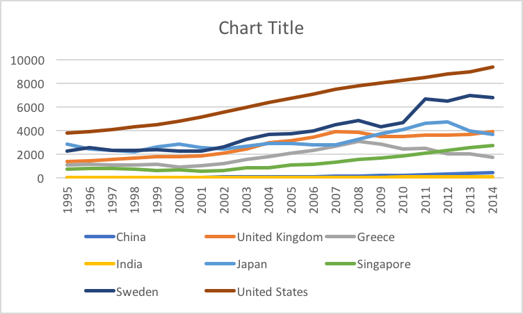
I was wondering about this too. I thought of Eugene Wei writing about Edward Tufte's classic book The Visual Display of Quantitative Information, which he considers "[one of] the most important books I've read". He illustrates with an example, just like dynomight did above, starting with this chart auto-created in Excel:
Wei adds further commentary:
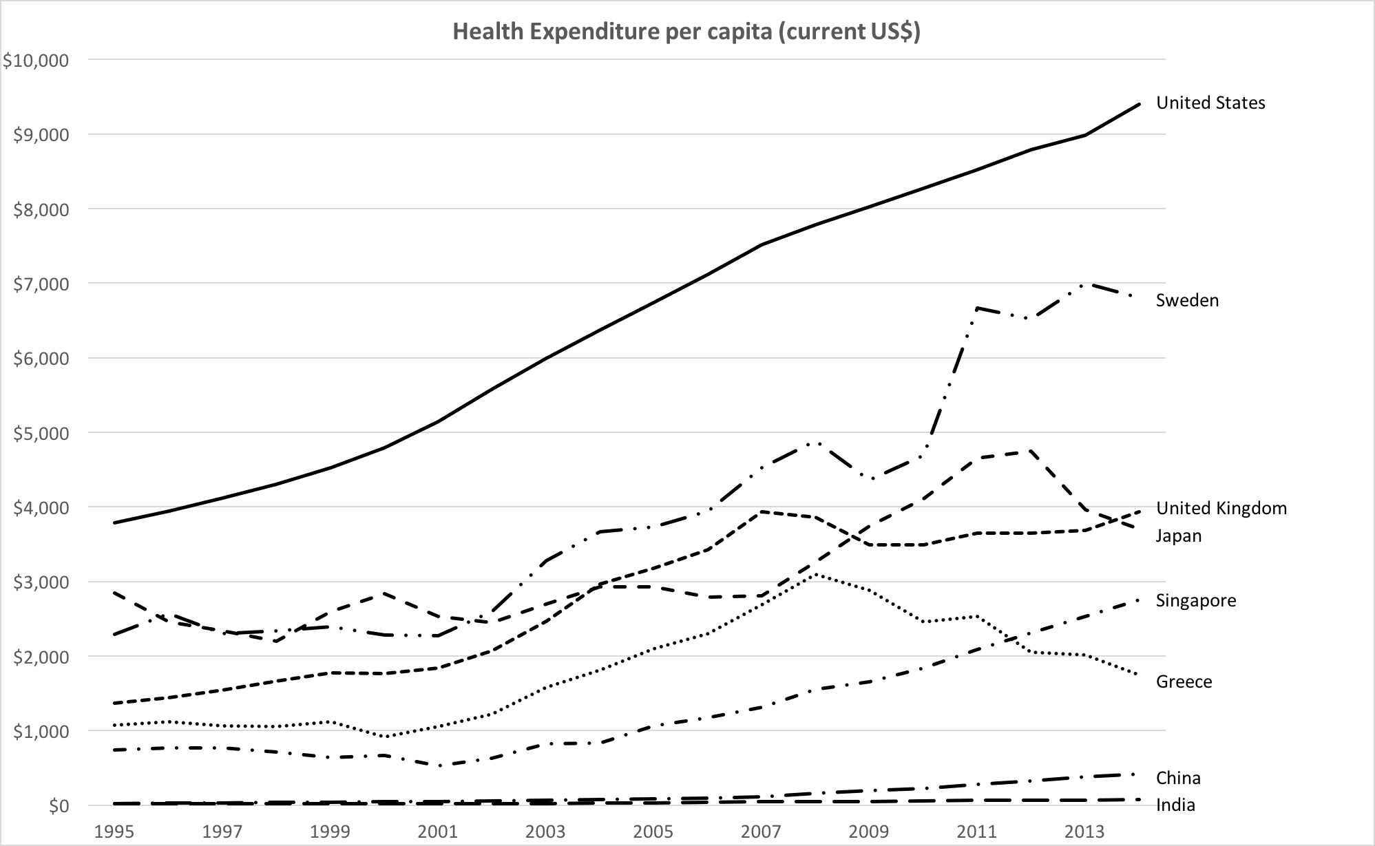
No issues for color blind users, but we're stretching the limits of line styles past where I'm comfortable. To me, it's somewhat easier with the colored lines above to trace different countries across time versus each other, though this monochrome version isn't terrible. Still, this chart reminds me, in many ways, of the monochromatic look of my old Amazon Analytics Package, though it is missing data labels (wouldn't fit here) and has horizontal gridlines (mine never did).
We're running into some of these tradeoffs because of the sheer number of data series in play. Eight is not just enough, it is probably too many. Past some number of data series, it's often easier and cleaner to display these as a series of small multiples. It all depends on the goal and what you're trying to communicate.
At some point, no set of principles is one size fits all, and as the communicator you have to make some subjective judgments. For example, at Amazon, I knew that Joy wanted to see the data values marked on the graph, whenever they could be displayed. She was that detail-oriented. Once I included data values, gridlines were repetitive, and y-axis labels could be reduced in number as well.
Tufte advocates reducing non-data-ink, within reason, and gridlines are often just that. In some cases, if data values aren't possible to fit onto a line graph, I sometimes include gridlines to allow for easy calculation of the relative ratio of one value to another (simply count gridlines between the values), but that's an edge case.
For sharp changes, like an anomalous reversal in the slope of a line graph, I often inserted a note directly on the graph, to anticipate and head off any viewer questions. For example, in the graph above, if fewer data series were included, but Greece remained, one might wish to explain the decline in health expenditures starting in 2008 by adding a note in the plot area near that data point, noting the beginning of the Greek financial crisis (I don't know if that's the actual cause, but whatever the reason or theory, I'd place it there).
If we had company targets for a specific metric, I'd note those on the chart(s) in question as a labeled asymptote. You can never remind people of goals often enough.
And I thought, okay, sounds persuasive and all, but also this feels like Wei/Tufte is pushing their personal aesthetic on me, and I can't really tell the difference (or whether it matters).
One way you could measure which one is "best" would be to measure how long it takes people to answer certain questions. E.g. "For what fraction of the 1997-2010 period did Japan spend more on healthcare per-capita than the UK?" or "what's the average ratio of healthcare spending in Sweden vs. Greece between 2000 and 2010?" (I think there is an academic literature on these kinds of experiments, though I don't have any references on hand.)
In this case, I think Tufte goes overboard in saying you shouldn't use color. But if the second plot had color, I'd venture it would win most such contests, if only because the y-axis is bigger and it's easier to match the lines with the labels. But even if I don't agree with everything Tufte says, I still find him useful because he suggests different options and different ways to think about things.
Yeah, agreed that getting people to answer questions using the chart, and measuring their speed and accuracy is the key objective metric of design quality. Also, I like it when both color and line styles are used together. Keeps it clear for colorblind people, and makes it extra clear for colorsighted people. Choosing colors should be done carefully to balance contrast with the background color. And can be done in such a way as to be visible even to the most common colorblindness types.
Hey, you might be right! I'll take this as useful feedback that the argument wasn't fully convincing. Don't mean to pull a motte-and-bailey, but I suppose if I had to, I'd retreat to an argument like, "if making a plot, consider using these rules as one option for how to pick axes." In any case, if you have any examples where you think following this advice leads to bad choices, I'd be interested to hear them.
When I looked at your proposed GDP-Time chart, I felt I was more inclined to treat the year as quantitative and the amounts as categorical. Though I don't know how that would actually play out if I were trying to make use of it in anger.
Agreed (except about the “this is fine” part). The arguments are unconvincing and the recommendations seem bad. (In particular, the suggestion that the “vary between $50T and $53T” graph shouldn’t be drawn with a zero-based y-axis is egregious.)
If I measure gravitational force against altitude, and end up with points like the following:
- 0 ft above sea level, force is 9.8000 m/s2
- 1000 ft above sea level, force is 9.7992 m/s2
- 2000 ft above sea level, force is 9.7986 m/s2
- 3000 ft above sea level, force is 9.7980 m/s2
would it be egregious for me to plot this graph without a zero-based y-axis? Do I need to plot it with a y-axis going down to zero?
Certainly there are cases where it's misleading to not extend a graph like this down to zero. But there are also cases where it's entirely reasonable to not extend it down to zero.
Would you graph with a line chart? No. And it absolutely would be egregious to use a line chart and then not use a zero-based y-axis.
I'm surprised to hear you say that. I would consider it perfectly reasonable to use a line graph without a zero-based y-axis to plot gravity against altitude: the underlying reality is in fact a line (well, a curve I guess)! Gravitational force goes down with altitude in a known way! But the effects of altitude on gravity are very small for altitudes we can easily measure, and extending the graph all the way down to zero will make it impossible to see them.
Eh, I've encountered plenty of times when I really needed to understand the variance of data such that I had to "zoom in" and put the start of the axis at something above 0 because otherwise I couldn't find out what I needed to know to make a decision. But I do often like to see it both ways, so I can understand it both in relative and absolute terms.
Just so; the correct way is indeed to show the full (zero-based y-axis) chart, then a “zoomed-in” version, with the y-axis mapping clearly indicated. Of course, this takes more effort than just including the one chart; but this is not surprising—doing things correctly often takes more effort than doing things incorrectly!
As someone who's spent a while designing charts for published books, I have generally been strongly against axis lines. One thing that has really influenced my approach to using lines is the section of Butterick's Practical Typography on tables.
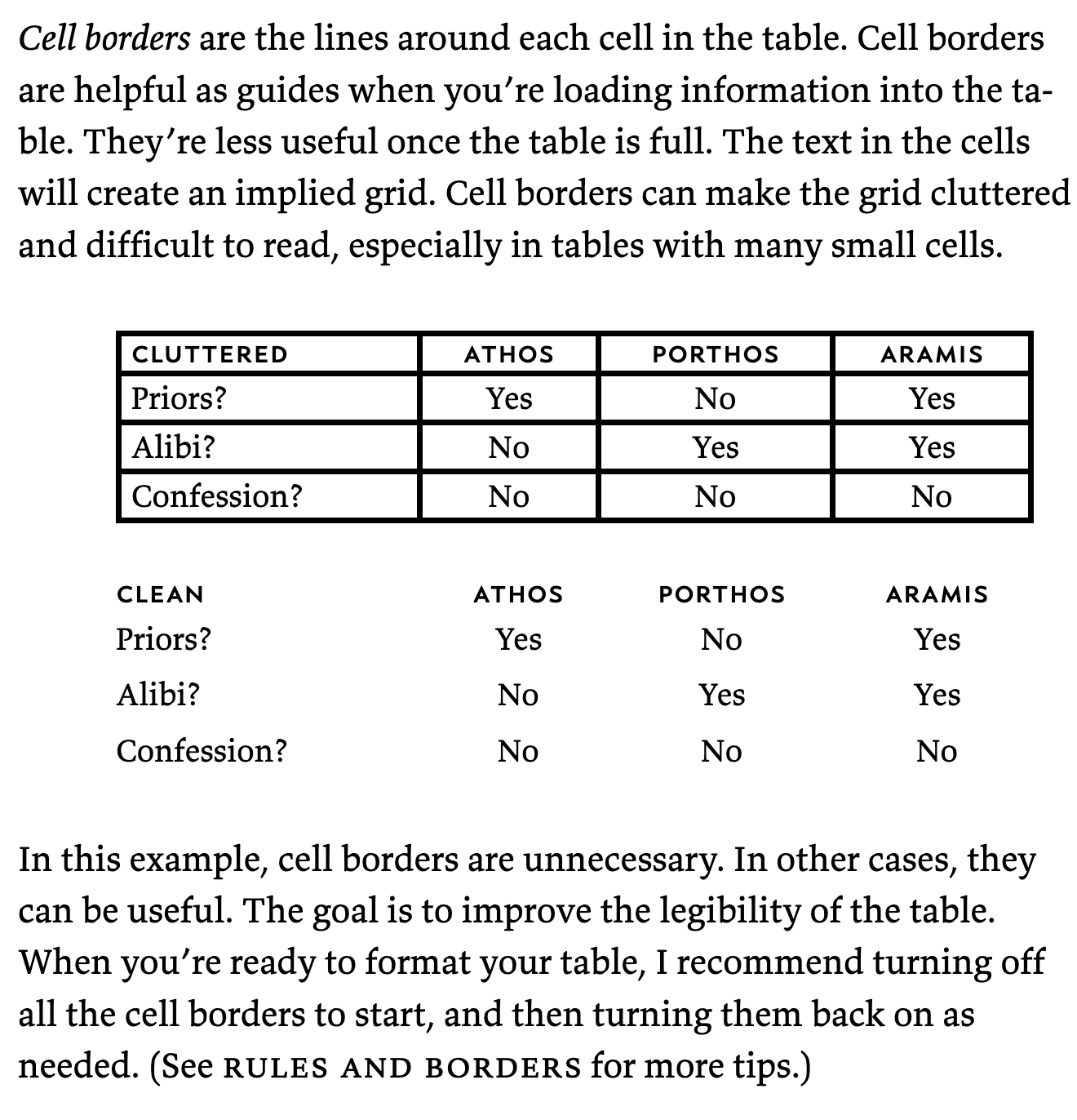
Nowadays I remove all lines on tables and charts unless there's a strong argument in favor of one; implied lines are much easier on the eye.
This post overall moved me toward using gridlines a little bit more, for intuitively measuring distance when that's important.
The cell borders example is misleading. The readability issue is not the cell borders themselves, the issue is that the borders are heavier weight than the text, and there's no difference between the borders separating the row and column headers, and the borders separating the data rows and columns.
If your only choices for gridlines are "off" and "obnoxious", "off" seems like a good choice. And for small tables, no borders works well. But for larger tables, finer lines (maybe in a lighter color or shade) can really improve the readability.
I second this. Also, consider using instead of lines (or in addition to) an alternating pattern of white and light grey for the background. I love subtle grey/white background alternations for guiding the eye straight across a bunch of columns.
I’m a big fan of Butterick’s book (and Butterick’s stuff in general), and one of the things I appreciate about his guidelines is that he does well at distinguishing between hard-and-fast rules and mere heuristics or suggestions. For example, here, he correctly says: “In this example, cell borders are unnecessary. In other cases, they can be useful.” (Emphasis mine.)
Butterick’s example table has a mere four rows and columns. A larger table simply can’t do without some visual delineation. (But take a look at the linked table, and you may note that it doesn’t have lines[1] either—it has alternating row background colors. Meanwhile, the columns need no delineation, because the human eye is better at vertical alignment than horizontal alignment!)
Yeah, there seems to be a lot of personal preference involved. Removing cell borders is obnoxious and inconvenient, the table below hurts. The table above has the borders a tad too thick, but removing them is a cure that's, personally, worse than the disease.
One downside of not using lines, it makes it harder to tell where one plot ends and the next begins.
I mean a plot like this is just a mess. You could probably get situations where it wasn't even clear which plot a data point belonged to.
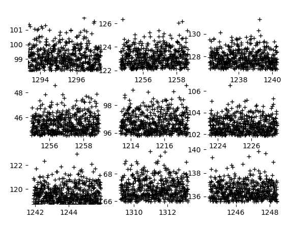
At least with the boxes, you have a nice clear visual indicator of where the data ends. Here it's not obvious at a glance which numbers match up with which plots, and the ticks are easy to confuse for point markers.
All right it's a bit of a mess with the edges in too. But at least it's crisper.
I feel like displaying a grid of plots is a different use case. And if I had my druthers here, I'd want the plot bounding lines to be around the axis numbers, not within the axis numbers. And definitely not allowing the axis numbers to overlap onto neighboring plots! Wow, ugh. Also, when displaying multiple plots you are clearly in a danger-of-misinterpretation zone when the plots don't share the same numeric min/max points! In this case, the solution would clearly be to normalize the data, so everything was between 0 and 1. If you wanted a comparison between clusters that non-normalized data could give you, then the clusters should be on the same plot, with differing colors & symbols.
(Rant about philosophical meaning of “0” and “1” and identity elements in mathematical rings redacted at strenuous insistence of test reader.)
I'm curious about this :)
I'm sad that the post doesn't go on to say how to get matplotlib to do the right thing in each case!
I think matplotlib has way too many ways to do everything to be comprehensive! But I think you could do almost everything with some variants of these.
ax.spines['top'].set_visible(False) # or 'left' / 'right' / 'bottom'
ax.set_xticks([0,50,100],['0%','50%','100%'])
ax.tick_params(axis='x', left=False, right=False) # or 'y'
ax.set_ylim([0,0.30])
ax.set_ylim([0,ax.get_ylim()[1]])These suggestions seem plausible. A few notes:
- Tick marks for years are ambiguous. Is the tick mark indicating the start of the year? The middle of the year? The end of the year? I have worked with chart libraries, and sometimes it's even the current date, n years ago. Like a tick mark labelled "2010" = March 9, 2010. A better alternative to tick marks is to have "year separators", where the "2010" is placed between two "tick marks" rather than under one, which can only be interpreted as start and end of the year.
- Regarding temperature. Physically speaking, only 0 Kelvin is an objective zero point, such that something with 20 Kelvin has "twice as" much temperature as with 10 Kelvin. Kelvin is a "ratio" scale. Celsius and Fahrenheit are only "interval" scales, so 20°C is not twice as hot as 10°C, but only ~3.5% hotter. (See also this interesting Wikipedia article on the various types of scales.) This is even though 0°C (water freezes) seems more objective than 0°F.
Nonetheless, Kelvin is not relevant to what we perceive as "small" and "large" differences in everyday life. We wouldn't say 20°C only feels a mere 3.5% warmer than 10°C.
I guess it helps to include two familiar "reference points" in the temperature axis of a chart, like freezing and boiling of water (0°C and 100°C, or explicit labels for Fahrenheit) or "fridge temperature" and "room temperature". That should give some intuitive sense of distance in the temperature axis.
Good point regarding year tick marks! I was thinking think that labeling 0°C would make the most sense when freezing is really important. Say, if you were plotting historical data on temperatures and you were interested in trying to estimate the last frost date in spring or something. Then, 10°C would mean "twice as much margin" as 5°C.
There's something about the way you write introductions that reminds me of good YouTube videos. It's a combination of easy-to-understand illustrations, simple words, and starting with an interesting question.
Thanks, someone once gave me the advice that after you write something, you should go back to the beginning and delete as many paragraphs as you can without making everything incomprehensible. After hearing this, I noticed that most people tend to write like this:
- Intro
- Context
- Overview
- Other various throat clearing
- Blah blah blah
- Finally an actual example, an example, praise god
Which is pretty easy to correct once you see it!
This is a good point. Beginning in medias res seems also one of the reasons why posts by Eliezer Yudkowsky and Scott Alexander are so readable.
But for long posts I think a short abstract in the beginning is actually helpful, perhaps highlighted in italics. Unfortunately some people use the abstract as a mere teaser ("... wanna know how I came to that startling conclusion? Guess you have to read the whole paper/post, hehe") rather than as a proper spoiler of the main insights.
"Spoiler" sounds bad from the perspective of the author ("will people still read my post when I already revealed the punchline in the abstract?"), but a spoiler can actually provide motivation to read the whole post for "fun" reasons. E.g. by going "I already agree with that claim in the abstract, let's indulge in confirming my preconceptions!" or "I disagree with that claim, guess I have to read the post so I can write a rebuttal in the comments!" Not very rational, but better than not being motivated to read the post at all.
Though you probably use other tricks to make a post more readable. From your post above I inferred these points:
- Use examples
- Include images if possible
- Don't clutter the post with a lot of distracting links and footnotes
- Include rhetorical questions
- short sentences
- delete unnecessary tangents to make the post shorter
That's what I thought anyway. Maybe you could share your own tips? "How to Write Readable Posts"
The problem I see here is that you are trying to use functions at all. Take the years/GDP line. If your measure the GDP once a year, you should use a bloc graphic.
Else you have a lot of imaginary points per month, day and hour, that, in reality, are not there. Take black friday - lots of changing , take holidays, when the shops are closed - little changing.
Days - lots of changing, nights - little changing. And you can´t really know the GDP for the next year - there can always be a drastic change.
Take the cannabis/homeowner plot graph on the other hand. You have a lot of (x,y) pairs (homeowners, cannabis supporters)
Some of these points have the same place on the x - axis, but different places on the y - axis. That is the reason you can´t just draw a function through all this points.
Such a set of points is called a relation in mathematics. Just because you can draw a line through them does not mean you should.
And just because it is customary to draw orthogonal x- and y- axes in mathematics does not mean that is always the best way.
Especially If the points of a relation are not stochastically independent it might not be a good idea.
After all, you draw on a euclidean plane and your are free which axes to chose on a euclidean plane.
GDP is an absolute quantity. If GDP doubles, then that means something. So readers should be thinking about the distance between the curve and the x-axis.
But 1980 is arbitrary. When comparing 2020 to 2000, all that matters is that they’re 20 years apart. No one cares that “2020 is twice as far from 1980 as 2000” because time did not start in 1980.
This is the difference between a ratio scale and a cardinal scale. In a cardinal scale, the distance between points is meaningful, e.g., "The gap between 1 and 2 is twice as big as the gap between 2 and 4." In a ratio scale, there is a well-defined zero point, which means the ratios of points are also meaningful, e.g., "4 is twice as large as 2."
My first impression was also that axis lines are a matter of aesthetics. But then I browsed The Economist's visual styleguide and realized they also do something similar, i.e. omit the y-axis line (in fact, they omit the y-axis line on basically all their line / scatter plots, but almost always maintain the gridlines).
Here's also an article they ran about their errors in data visualization, albeit probably fairly introductory for the median LW reader.
Curated. Beyond the object level arguments for how to do plots here that are pretty interesting, I like this post for the periodic reminder/extra evidence that relatively "minor" details in how information is presented can nudge/bias interpretation and understanding.
I think the claims around bordering lines become strongly true if there were established convention, and more weakly so the way currently are. Obviously one ought to be conscious in reading and creating graphs for whether 0 is included.
In ggplot (R statistical language) the defaults include a subtle grid and no axes. They also put in the extra random space.
Here is some code in case someone else using R wants to try out things discussed here:
library(ggplot2)
qplot(wt, mpg, data = mtcars, colour = factor(cyl)) +
theme(axis.line.x = element_line(color="black", size = 0),
axis.line.y = element_line(color="black", size = 1)) +
scale_x_continuous(expand = c(0, 0), limits = c(0,8)) +
scale_y_continuous(expand = c(0, 0), limits = c(0,36))
I promise that readers will recognize a plot even without lines around it.
I'm not so sure. Without lines or tick marks, it's not all that clear what the squiggly line is. I'm sure some squiggly lines would be more obvious, and a scatter plot without axis lines or ticks would be more obvious still.
Suppose your data is how the GDP of some country changed over time, so the x-axis is years and the y-axis is GDP.
When you introduce tick marks and tick labels, I think you've already done most (if not all) of the work that the axis lines do. Now it's way more clear what we're looking at, and to the extent that the reader is invited to make ratio- or interval-level comparisons, the tick marks and labels provide most (all?) of the relevant information.
The LessWrong Review runs every year to select the posts that have most stood the test of time. This post is not yet eligible for review, but will be at the end of 2025. The top fifty or so posts are featured prominently on the site throughout the year.
Hopefully, the review is better than karma at judging enduring value. If we have accurate prediction markets on the review results, maybe we can have better incentives on LessWrong today. Will this post make the top fifty?
Say you want to plot some data. You could just plot it by itself:
Or you could put lines on the left and bottom:
Or you could put lines everywhere:
Or you could be weird:
Which is right? Many people treat this as an aesthetic choice. But I’d like to suggest an unambiguous rule.
Principles
First, try to accept that all axis lines are optional. I promise that readers will recognize a plot even without lines around it.
So consider these plots:
Which is better? I claim this depends on what you’re plotting. To answer, mentally picture these arrows:
Now, ask yourself, are the lengths of these arrows meaningful? When you draw that horizontal line, you invite people to compare those lengths.
You use the same principle for deciding if you should draw a y-axis line. As yourself if people should be comparing the lengths:
Years vs. GDP
Suppose your data is how the GDP of some country changed over time, so the x-axis is years and the y-axis is GDP.
You could draw either axis or not. So which of these four plots is acceptable?
Got your answers? Here’s a key:
Why?
GDP is an absolute quantity. If GDP doubles, then that means something. So readers should be thinking about the distance between the curve and the x-axis.
But 1980 is arbitrary. When comparing 2020 to 2000, all that matters is that they’re 20 years apart. No one cares that “2020 is twice as far from 1980 as 2000” because time did not start in 1980.
Years vs. GDP again
Say you have years and GDP again, except all the GDP numbers are much larger—instead of varying between 0 and $3T, they vary between $50T and $53T.
What to do? In principle you could stretch the y-axis all the way down to zero.
But that doesn’t seem like a good idea—you can barely see anything.
Sometimes you need to start the y-axis at $50T. That’s fine. (As long as you’re not using a bar chart.) But then, the right answer changes.
The difference is that $50T isn’t a meaningful baseline. You don’t want people comparing things like (GDP in 1980 - $50T) vs. (GDP in 2000 - $50T) because that ratio doesn’t mean anything.
Years vs temperature
What if the y-axis were temperature? Should you draw a line along the x-axis at zero?
If the temperature is in Kelvin, then probably yes.
If the temperature is in Fahrenheit, then no. No one cares about the difference between the current temperature and the freezing point of some brine that Daniel Fahrenheit may or may not have made.
If the temperature is in Celsius, then maybe. Do it if the difference from the freezing point of water is important.
Of course, if the freezing point of water is critical and you’re using Fahrenheit, then draw a line at 32°F. Zero and one are the most common useful baselines, but use whatever is meaningful.
(Rant about philosophical meaning of “0” and “1” and identity elements in mathematical rings redacted at strenuous insistence of test reader.)
Homeowners vs. cannabis
Sometimes you should put lines at the ends of axes, too. Say the x-axis is the fraction of homeowners in different counties, and the y-axis is support for legal cannabis:
Should you draw axis lines? Well, comparisons to 0% are meaningful along both axes. So it’s probably good to add these lines:
But comparisons to 100% are also meaningful. So in this case, you probably want a full box around the plot.
Lines can also be used for evil
Lots of people hate the Myers-Briggs personality test—suggesting that you should use a created-by-academic-psychologists test like the Big Five instead. I’ve long held this was misguided and that if you take the Myers-Briggs scores (without discretizing them into categories) they’re almost equivalent to the Big Five without neuroticism or “Big Four”.
So I was excited to see some recent research that tests this. They had a bunch of people take various personality tests and then rate themselves on 40 life outcomes, e.g. how happy they were and how many friends they had. They then looked at the correlation between personality tests and life outcomes:
Here, the correlation is an R value—0 means a test tells you nothing about life outcomes, and 1 means the test allows you to predict life outcomes perfectly. So this suggests the Big Four is similar to Myers-Briggs scores, but maybe a little more informative.
But we’re here to talk about figures, not psychology. So look at how the above numbers were pictured in Scientific American:
That “small correlation” line is genius—your eye naturally compares the dots to it, rather than the “no correlation” line, giving the impression that the Big Four is twice as good as the MBTI. Of course, the difference between a correlation and a “small correlation” threshold is not something that anyone could conceivably care about.
A plot that follows the rules I laid out here is much less misleading:
Related advice
Andrew Gelman advises, “If zero is in the neighborhood, invite it in”. The idea is that if your plot almost includes zero, and zero is meaningful, then extend the y-axis down to zero. He gives this example:
I agree with this advice, though I’m not sure about that vertical line. Is “time since the Slim Shady LP came out” paramount here? And if you don’t extend the y-axis to zero, then you shouldn’t draw a horizontal line either. So I think this would be a better demonstration of the principle:
Axis lines ≠ tick marks
On a related note, see how there are tick marks in the previous plots, even when there are no axis lines? You can do that. It’s fine. Put tick marks wherever you want. Tick marks are no excuse for axis lines.
Matplotlib’s tragic defaults
Matplotlib is a popular plotting library. Here’s an example of using it:
I don’t want to quibble with the default of adding axis lines everywhere. After all, there has to be some default, and if the right choice depends on the semantics of the data, then you can’t expect the plotting library to guess that.
Except, I can’t not quibble because there’s a more serious problem. Do you see it? Here’s a little hint: