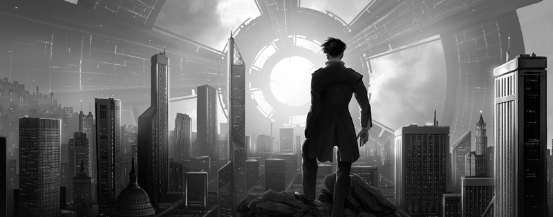
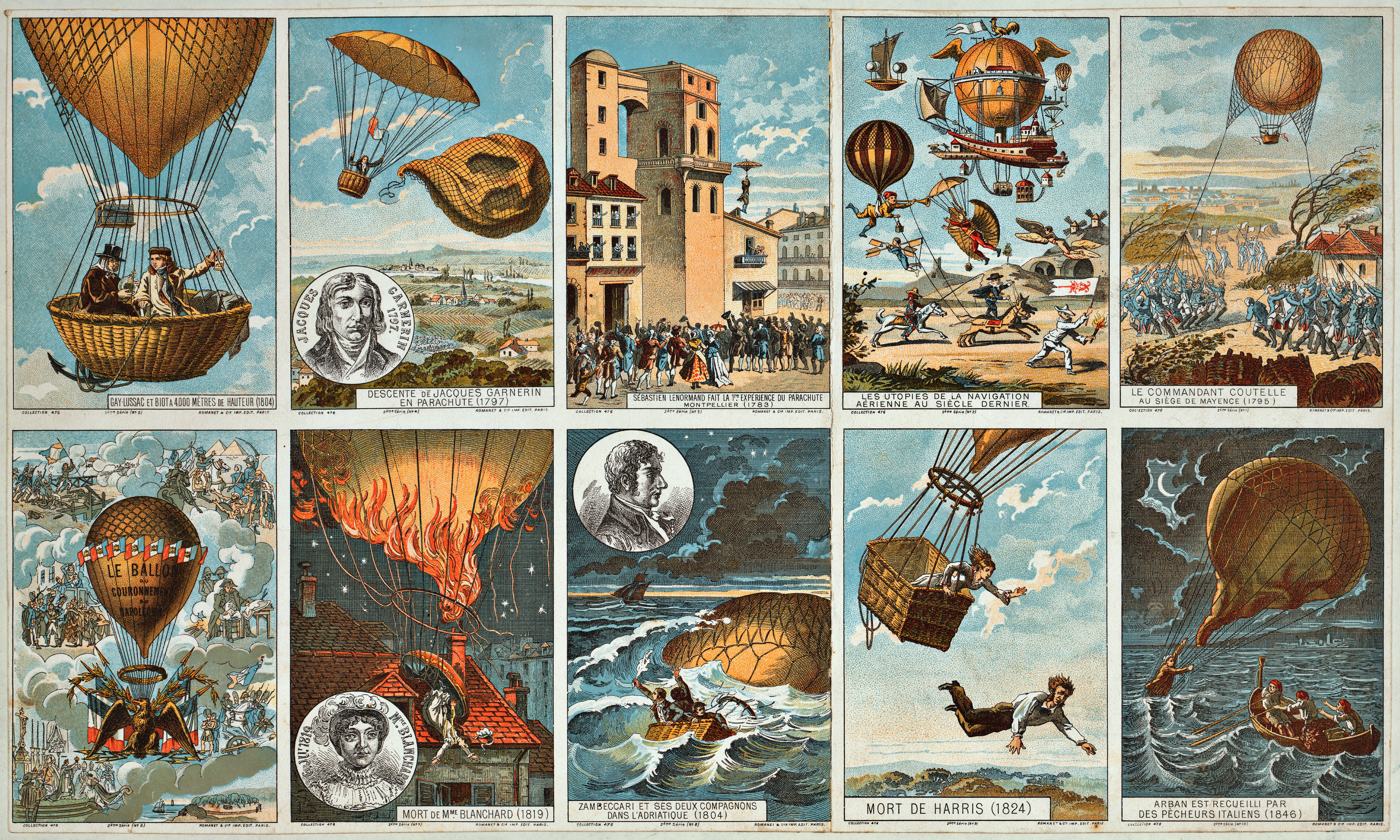
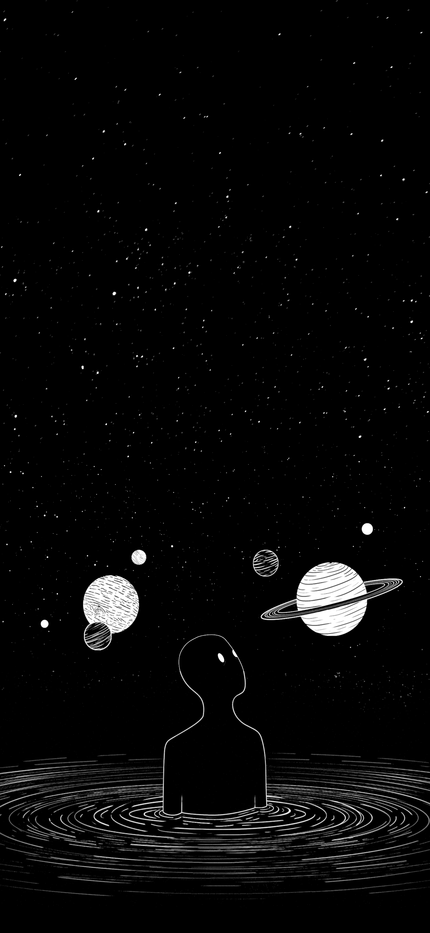
So you can now drag-and-drop images into comments. (Thanks, LessWrong dev team!)
Hence, this post is an excuse to build a beautiful, inspiring, powerful — and primarily visual — comment section.
Let's celebrate all that is great about the Art of Rationality, with images.
Rules
Each answer must contain a picture. No links!
It should be possible to just scroll through the comments and adore the artwork. There shouldn't be any need to click-through to other pages. (Think of it like a Pinterest board, if you've ever seen those.)
Adding text is fine, but consider doing it in a comment underneath your image, so it can be collapsed.
Pictures should be somehow relate to the Art of Rationality, as practiced on LessWrong.
Not allowed: a random pretty mountain; the Mona Lisa; abstract expressionism, ...
I'll be liberal with this condition if you can give a good justification for why you chose your piece.
Pictures should be beautiful art independently of their relation to rationality.
Allowed: an exquisite shot of some piece of elegantly engineered machinery; a richly colourful and swirling galaxy, ...
Not allowed: a random picture of Einstein and Gödel hanging out; a low-resolution photo of a galaxy which is cool because it represents an important advance in astronomy, but which in-and-of-itself just looks like some lame computer graphics; Petrov's own tourist photos, ...
Don't be a jerk, but do note if you think something is a major conflict with a virtue.
Probably goes without saying... but don't be a pretentious art critic. The point of this thread is to pay tribute to those virtues that keep us striving to leave this world in a better place than we found it, guided by the Light of Science. Don't shout over the music.
That being said, I do care about pictures actually representing rationality. For example, take that photo of the exhausted surgeon after a 23h heart transplant. If it turned out (hypothetical) to have been the result of really poor utilitarian calculations, and actually is in direct conflict with some of our virtues: I think it's important to note that.
---
Note: I'm certainly not saying that the above rules are all that rationalist art is about. I'm just going for a particular vision with this comment field. Other posts can enforce other visions. :)
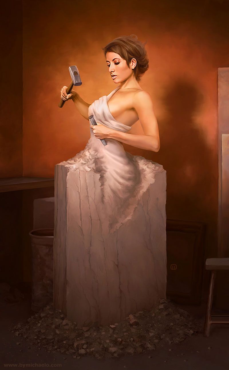
Nice with a female version, but nicer if the artist didn't feel the need to focus on her beauty instead of strength. Makeup, really? Also, with the colored skin I have a hard time identifying her as a statue; she seems to be about to open a bleeding wound with that chisel.
2Yiar
Agreed!
I actually didn't reflect about her having makeup. I recall (but hopefully don't misrepresent in my paraphrasing) Julia Galef discussing that a society where people wear makeup is perhaps a more fair option since the difference between the most and least naturally beautiful people would be smaller then. I haven't thought deeply about this, but in that case, wearing makeup might be the rational thing to do. However, regarding the appraisal that the artwork represents the woman's beauty more than her strength, I can totally see how that reinforces problematic norms.
Rationality is in part about taking control, and you have more control over your strength than your beauty. Still, if I could sculpt myself I would probably rather be sculpting myself pretty than musculus (well, I guess they intersect for some people). Beauty probably has more benefits than muscles these days and physical strength is much less important for rationality than mental strength. An unnecessarily muscular body might also be a sign of prioritizing the wrong things.
It's hard to get the metaphors perfect and it is easy to rationalize how details make it fit or not. But it's interesting to see which metaphors resonate with the community, and would be even more interesting if more people wrote why as you did. So thanks for your perspective!
2Cedar
My objection to makeup is that it's sorta a zero sum game, where if everybody spends 1hr a day on makeup, the world isn't really a better place since beauty is a relative thing.
I agree that, in a society where everybody is judged by their made-up looks, innate beauty would matter less, and that's good.
However, people will start competing on effort spent on makeup, which to me feels like a really bad thing. Imagine everybody having to spend 2 hours on make-up every day before heading out. I think that's what some women already have to deal with in their workplaces and I'd rather not everybody's lives be like that.
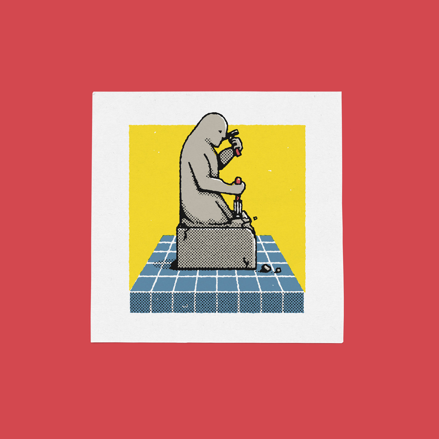
Betulaster's image made me think "surely there is a version of this concept that's more polished." Turned out there were several different ones when I googled "self sculpting man". Many of them are sculptures that I suspect work best in person, but I liked this one.
Image link seems to be broken. Try this one:
https://nitter.net/pic/media%2FEoFhowJVcAAsvM8.jpg%3Fname%3Dorig
2Raemon
(If you're me, the image was [probably?] broken because you block twitter during the day. I haven't checked if it's actually broken yet but you might want to doublecheck that if you do any twitterblocking)
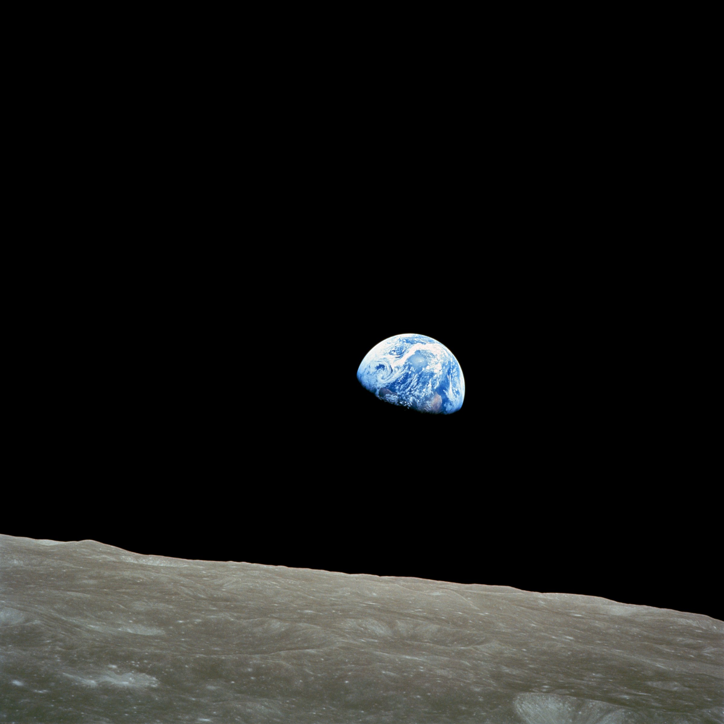
'Earthrise'. Taken from lunar orbit by astronaut William Anders on December 24, 1968, during the Apollo 8 mission. Nature photographer Galen Rowell declared it "the most influential environmental photograph ever taken".
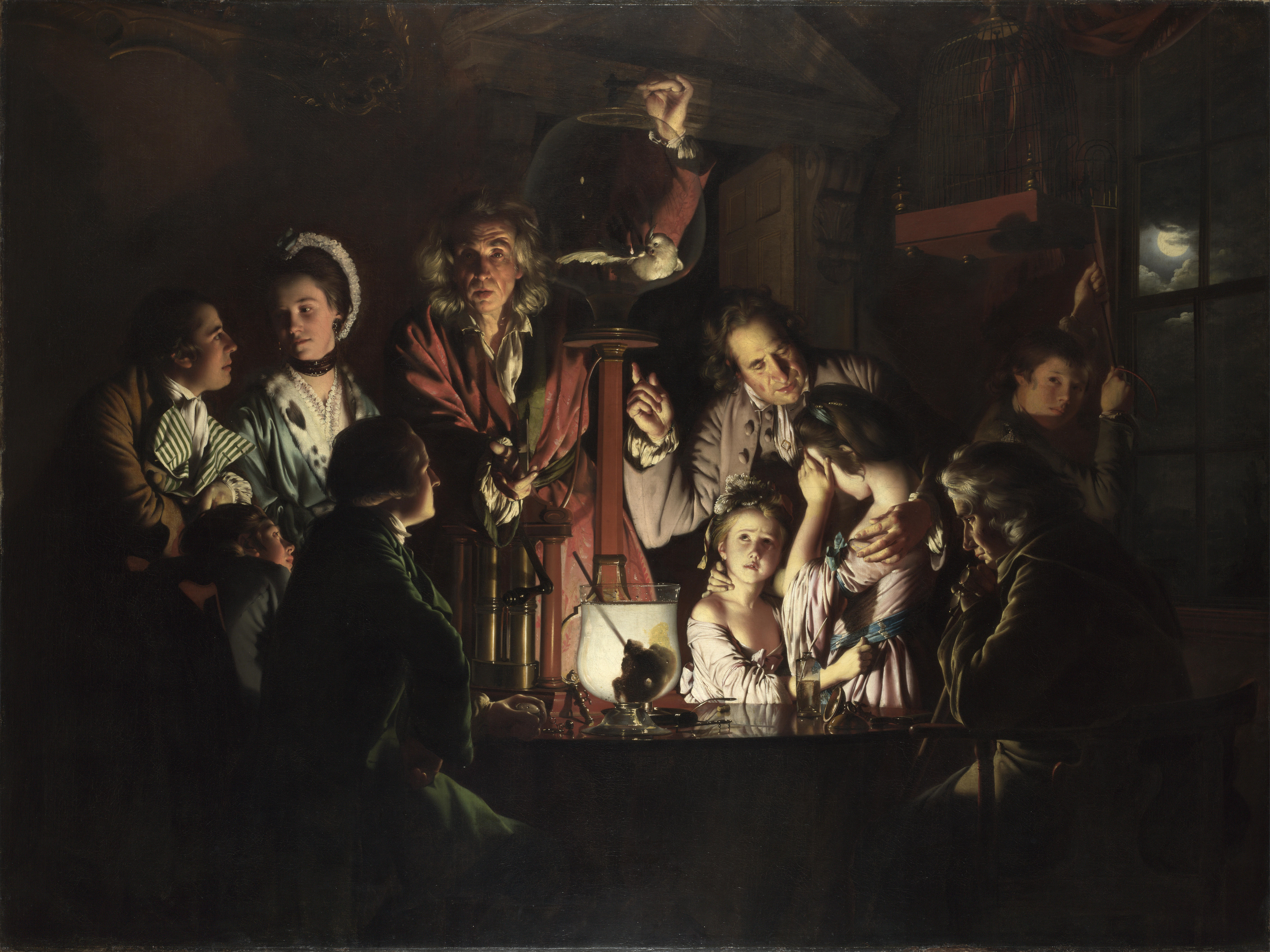
From Wikipedia: An Experiment on a Bird in the Air Pump is a 1768 oil-on-canvas painting by Joseph Wright of Derby, one of a number of candlelit scenes that Wright painted during the 1760s. The painting departed from convention of the time by depicting a scientific subject in the reverential manner formerly reserved for scenes of historical or religious significance. Wright was intimately involved in depicting the Industrial Revolution and the scientific advances of the Enlightenment. While his paintings were recognized as exceptional by his contemporaries... (read more)
Thanks for sharing the picture. I feel like the excerpt you posted from Wikipedia isn't the most important part. While it touches on the artistic significance of the piece, it leaves open many questions about the relevance of the piece as a symbol of rationality. I found the following excerpts from the same article to be more enlightening in this regard:
The painting depicts a natural philosopher, a forerunner of the modern scientist, recreating one of Robert Boyle's air pump experiments, in which a bird is deprived of air, before a varied group of onlookers. The group exhibits a variety of reactions, but for most of the audience scientific curiosity overcomes concern for the bird. [...] Despite the operational and maintenance obstacles, construction of the [vacuum pump] enabled Boyle to conduct a great many experiments on the properties of air [...] He listed two experiments on living creatures: "Experiment 40", which tested the ability of insects to fly under reduced air pressure, and the dramatic "Experiment 41," which demonstrated the reliance of living creatures on air for their survival. In this attempt to discover something "about the account upon which Respiration is so necessary to the Animals, that Nature hath furnish'd with Lungs", Boyle conducted numerous trials during which he placed a large variety of different creatures, including birds, mice, eels, snails and flies, in the vessel of the pump and studied their reactions as the air was removed.
Worth noting that these are all photographs. (Some of them are modified, e.g. the earth is added from another picture, and some of them are colorized.)
I feel like photography (and in particular, photographs showing interesting physical systems) is a particularly good fit for "rationalist" artwork. For me, one of the top two or three most fundamental principles of rationality is entangling oneself with the world - living in the real world, and appreciating the real world, rather than escaping into one's own imagination. That's not to say imagination is bad, but rather that the role of imagination is to act on the real world, rather than to live on a separate plane of existence. Let the real world inform our beliefs, and use that knowledge to bring our ideas into physical reality.
Photography is a great fit for that, because it portrays physical reality. In some cases, a photograph can help us entangle our own beliefs with reality - as in scientific photographs, like an image of a cell with certain organelles stained. In other cases, a photograph can display the form of some brilliant idea made real - as in the photograph above.
Dr. Zbigniew Religa, a Polish cardiac surgeon, and a nurse, both exhausted after a 23-hour heart transplant; the first in Poland's history. (I don't know much about the story beyond that.)
It's a classic and has been featured on various lists of most influential photos.
To me this photo honors technical mastery, perseverance and the miracle of modern medicine.
Representing existential risks. A lost opportunity to grab the Reachable Universe (edit: /expand through the cosmos). (at least, that's my interpretation)
This would be much stronger if there weren't a surviving human figure (who can somehow afford to feed a horse, no less!) in the scene. I'm not sure this is what extinction risk looks like at all
5Mati_Roy
I didn't say extinction risk.
[...]
source: https://www.nickbostrom.com/existential/risks.html
5mako yass
It doesn't look like a permanent curtailment if humans are still living and the artifacts of the magic of old are still there to inspire them.
5MikkW
Not all existential risks are extinction risks- if a disaster can destroy humanity's potential, even without killing every single human, then it would still be an existential risk, which would fit the image
Part of why I like this one is that I was confused by some of it, and did some research, and thus learned that the big hazy blue/white thing isn't like... a rocket's glow from near and close to the camera, but rather it is a wispy but vast object that "exists out there"!
This is one of the most beautiful images I've ever seen. The optical effects are stunning, and the fact that you can see the entire scope of it, for a planet of inconceivable size, in one view just blows me away. This image feels like the essence of cosmological wonder. It's almost painful to take in.
False color radar map of Titan's methane & ethane lakes, ~2007? From footage taken by Cassini. Credit: NASA / JPL-Caltech / Agenzia Spaziale Italiana / USGS
This was the version I had saved on my computer, but we actually have a more complete map now. I love this image both by what it represents:
Exploring a new world
Alien geology
Cool maps
Including a sense of process (I don't actually know anything about how this image put together, but just looking at it, I'm nearly certain we're looking at a map composited orbits that Cassini took over the source of the planet - like a scanner!)
The true patronus was discovered (possibly rediscovered) by Harry Potter, when he finally understood that Dementors represent Death incarnate. His empathetic desire to protect all of humanity from the pain of that loss allowed him to not just drive away the fear of Death, but to conquer Death itself. This caused his Patronus to evolve into its true form; his Patronus took on the shape of an androgynous human. In this form, the Patronus gains additional abilities, including the ability to destroy Dementors and block the "unblockable" curse, Avada Kedavra.
I chose this photograph because it displays one of the most elegant watch movements ever made. Within this movement there is a perpetual calendar complication.
A perpetual calendar complication is a calendar feature within a watch that accounts for both short months and leap years. If you own a watch with a perpetual calendar complication, it would only have to be adjusted once every 100 years.
I've recently gained a better appreciation for how astonishingly good this work is at linear perspective, which had only come about in European art in the prior century. Many things about this painting are good (and some bad to my eye, like the messy color scheme) but those hexagonal details on the curved arches in perspective is 100% Raphael showing off.
An aside, but linear perspective is the most rational part of art, in the older philosophical sense of rational; it's pretty much the only major part of classical art which descends from first principles rather than having an empirical basis.
Are the books that are visible in this picture actual parts of the library's catalogue, intended to be available for reading or borrowing, or are they just there for aesthetics?
(It seems like it must be the latter, for at least some of them.)
Oh, that's a bit disappointing. I'll put that in the "just for aesthetics" bucket, then. To me, that makes this feel less like "rationalist art", though I'm not sure how fair that is.
Illustration from Michael Haddad for Wired. It was originally commissioned for an article about biohackers, but I find that it captures the spirit of agency and self-improvement that is well-aligned with some of rationalist values.
From Wikipedia, "Vostok was a family of rockets derived from the Soviet R-7 Semyorka ICBM and was designed for the human spaceflight programme. This family of rockets launched the first artificial satellite and the first crewed spacecraft in human history. It was a subset of the R-7 family of rockets."
I chose this picture both because I find its composition to be aesthetically striking, and for its portrayal of Piotr Wozniack, in deep thought and ready to jog (an activity which I personally find conducive to great thinking), someone who represents many of the traits I appreciate in a rationalist mind:
Wozniack wanted to learn as much as possible, as efficiently as possible, and ran into fundamental limitations with the capabilities of the human mind, without access to any technology that could help him overcome the barriers he faced. So he did the only r... (read more)
I saw this when it was exhibited at the National Gallery in London. They also exhibited a smaller sketch for the painting, in which Copernicus has a telescope at his feet. Someone must have seen the sketch and pointed out to Matejko that the telescope had not been invented in Copernicus' time, as he took it out of the final painting.
This is from Arm in Arm: A Collection of Connections, Endless Tales, Reiterations, and Other Echolalia. It's a children's book full of pictures suggesting logical paradox or infinite sequences.
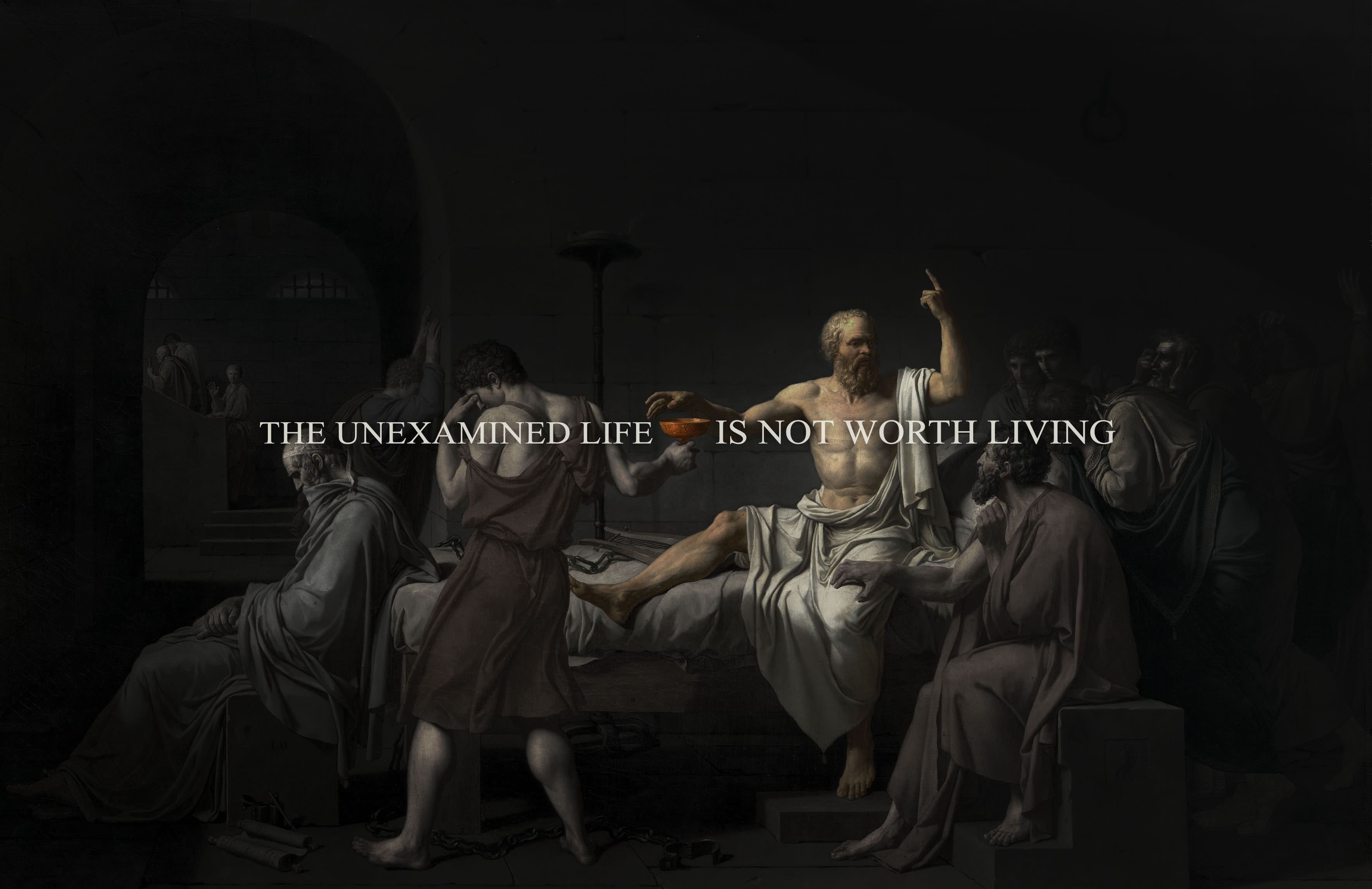
"Trial of Socrates" - Socrates preferring death instead of changing his stance on "corrupting the youth" Kind of cliched, but still I really love this pic.
Hm. I didn't have anything in particular in mind, and IDK what Yerka was thinking.
We could say that the sea has the quality of the Real; a vastness, that one traverses on a very narrow bridge, which seems opaque and infinitely deep--literally, un-fathom-able. Yet on closer investigation one finds, in some places, scaffolding that cleaves through the depths in thin lines, a heritage deposited by past explorers, who, having traversed inherited pathways and then struck out a bit further, turned around and set up the way for their successors--the next lantern in a line of lanterns leading down into the thoughtmines.
1Yiar
”The further from shore, the deeper the ocean.”
(shore is pronounced like ’sure’)
Not sure if it fits this image but I liked this quote which was mentioned on EconTalk.
I hesitated a little on whether to post this, given that it has been pointed out that the curvature of a ringworld wouldn't actually be that obvious from the inside, so it's in tension with the spirit of rationality to post a picture that depicts something physically impossible.
Still, after almost posting this, then deleting it, then feeling like I wanted to post it anyway, I decided to just do it. As I feel that it captures a combination of joy and love of life co-existing with, and made possible by, science and rationality.
Many ringworld depictions I've seen have primarily been "about" the ringworld, whereas this seems to successfully push the fact into the background and focus more on a "bright future"-feeling. I talk to people who are not very much scientists so this kind of painting can help show why I attach so much positive valence to science's potential, sort of.
Perhaps not the most beautiful piece of art independent of it's relation to rationality, but I'm a sucker for anything HPMOR. Also check out HPMOR Fan Art.
I recommend the music as well as want to show the picture.
Especially at 1:47:47 there is a piece starting that makes me cry every single time for the perfect coming together of ephemeral beauty and unstoppable determination.
I find that fitting, just like I find the look in her eyes fitting.
(Edit): This is no image that "describes" rationality and I know it. I find the emotional tone excellently encapsulates the "striving to be better", holding yourself to the highest standard and the like. At the same time, listening to this it puts me, at least, in a... (read more)
Not downvoting because it's bad, but it doesn't seem relevant to the topic.
0SKEM
I thought to try adding musical "art" and I find this fitting, but sure, that's up for voting on, definitely!
I apologize for the picture coming up twice, by the way, that's just my technical awkwardness, let me try to fix that^^
So you can now drag-and-drop images into comments. (Thanks, LessWrong dev team!)
Hence, this post is an excuse to build a beautiful, inspiring, powerful — and primarily visual — comment section.
Let's celebrate all that is great about the Art of Rationality, with images.
Rules
It should be possible to just scroll through the comments and adore the artwork. There shouldn't be any need to click-through to other pages. (Think of it like a Pinterest board, if you've ever seen those.)
Adding text is fine, but consider doing it in a comment underneath your image, so it can be collapsed.
Allowed: a breathtaking shot of a SpaceX launch; that solemn shot of Petrov deep in thought, gazing out his window; a painting of Galileo spearheading empiricism against the inquisition, ...
Not allowed: a random pretty mountain; the Mona Lisa; abstract expressionism, ...
I'll be liberal with this condition if you can give a good justification for why you chose your piece.
Allowed: an exquisite shot of some piece of elegantly engineered machinery; a richly colourful and swirling galaxy, ...
Not allowed: a random picture of Einstein and Gödel hanging out; a low-resolution photo of a galaxy which is cool because it represents an important advance in astronomy, but which in-and-of-itself just looks like some lame computer graphics; Petrov's own tourist photos, ...
Probably goes without saying... but don't be a pretentious art critic. The point of this thread is to pay tribute to those virtues that keep us striving to leave this world in a better place than we found it, guided by the Light of Science. Don't shout over the music.
That being said, I do care about pictures actually representing rationality. For example, take that photo of the exhausted surgeon after a 23h heart transplant. If it turned out (hypothetical) to have been the result of really poor utilitarian calculations, and actually is in direct conflict with some of our virtues: I think it's important to note that.
---
Note: I'm certainly not saying that the above rules are all that rationalist art is about. I'm just going for a particular vision with this comment field. Other posts can enforce other visions. :)