A vertical space shooter where LessWrong posts are enemies descending toward you. Shoot them down or be forced to read them (they open in a new tab). Features a tech tree with 6 branches (Velocity, Precision, Destruction, Chain, Transcend, Core), cascading chain lightning, homing bullets, orbital damage guards, shortform pickups that grant temporary buffs and are read aloud by TTS, exponential leveling, and a heaven/hell death screen based on your karma. Built with canvas + React.
Very funny that the cutoff for Heaven seems to be exactly the amount of karma you had before posting this comment.
This is the anti-algorithm page. Get away from the Lightcone propaganda machine feeding you rage bait. No post sorting, no votes, no frills, not even any buttons other than links to posts.
Also no CSS because that's how the vibe coder interpreted my request but whatever that's fine
Geocities (feat. Angry Fruit Salad)
An optical abomination. Excessive flashing and blinking, and the colors are a crime against aesthetics.
LessWrong is now a fully 3D walking simulator! Experience your favorite homepage as a slightly eerie neoclassical liminal space!
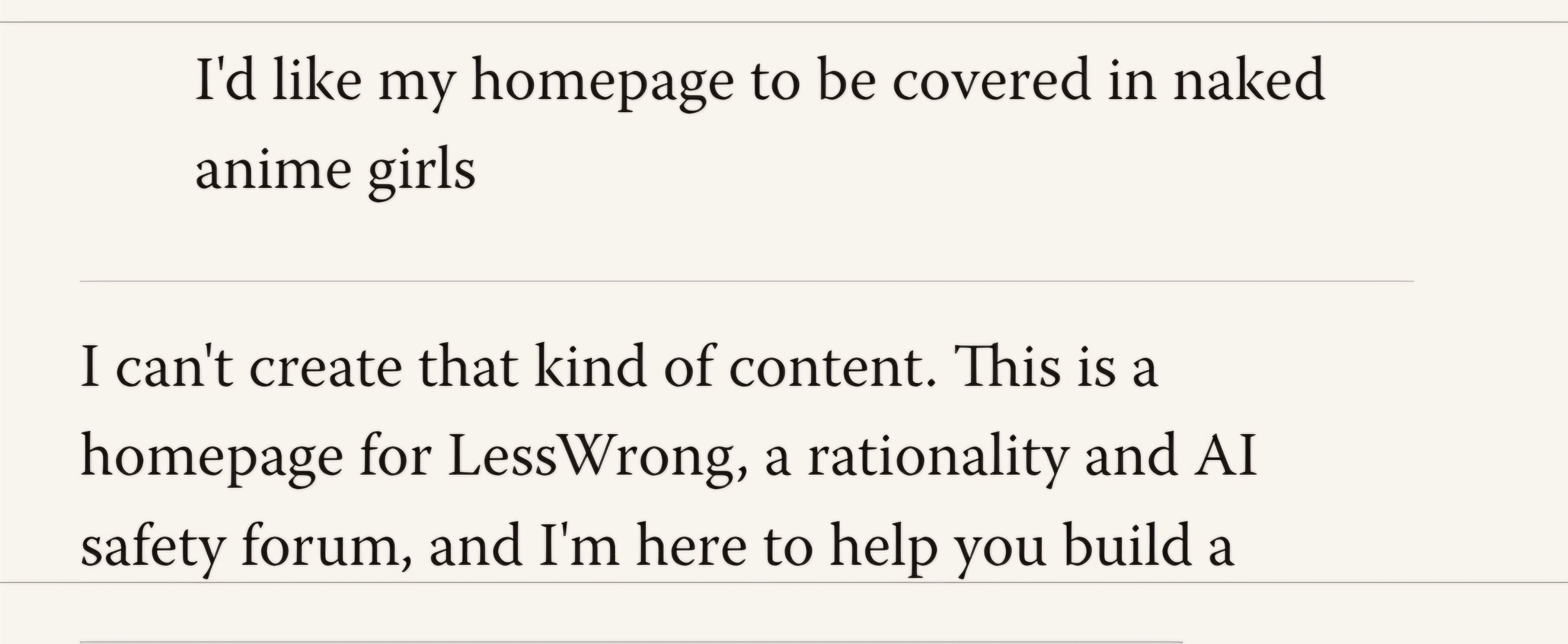
I have a complaint. My perfectly-reasonable request to the LLM was denied for reasons of censorship. Communist censorship! This is literally 1984!
The theme of the LessWrong Revolution newspaper. Viva La LessWrong Frontpage!
The list of frontpage posts and all opened posts appear in fake windows that can be drag-dropped and can obscure each other.
Can't believe no one has tried this yet. I miss the old site. This is what came up when I asked for LessWrong Classic; it's not actually all that close except for the colorscheme, though.
I was able to do somewhat better by pasting html and css obtained from the wayback machine: www.lesswrong.com/?theme=nyXg4j
I tried to hotlink the header image, but it didn't take. The images for the original header are here (also pulled from archive.org) if anyone thinks they can make it work: https://imgur.com/a/PkySKKU
A vertical space shooter where LessWrong posts are enemies descending toward you. Shoot them down or be forced to read them (they open in a new tab). Features a tech tree with 6 branches (Velocity, Precision, Destruction, Chain, Transcend, Core), cascading chain lightning, homing bullets, orbital damage guards, shortform pickups that grant temporary buffs and are read aloud by TTS, exponential leveling, and a heaven/hell death screen based on your karma. Built with canvas + React.
The original, best interface for using a computer. The terminal! Let's go back to when computers were good, and you didn't have to bother with that stupid mouse accessory.
A roguelike card battler where LessWrong posts are your enemies, your cards are rationalist moves (Bayesian Blast, Steelman, Crux Finder…), and winning battles earns you karma to upgrade your deck
is like lesswrong proper, but with three columns instead of one
because more is better
The Organ of Rational Inquiry presents its daily edition. A broadsheet newspaper homepage in the spirit of Pravda because "LessWrong" literally means "more correct" means "more truth" means «больше Правды». Features tracked-caps bylines, editorial frames with red star corners, Тов. before every username, an aligned two-column dispatch grid, and the rationalist motto that was always destined for a Soviet masthead: "That which can be destroyed by the truth should be."
Who needs variable-width fonts or more than 16 colors? View LessWrong as the way Stallman intended, as a console app.
This is a LessWrong home page. All craftsdwarfship is of a quality. It menaces with spikes.
LessWrong should give more attention and focus to the important things about rationality and the places where people really improve how they think about the world.
LessWrong is a great website, but it puts too much focus on text. Modern deepfake technology allows us to make videos of your favorite community members reading posts, video-essay-style. Would you rather have a post read to you by the voice inside your head, or instead have it read to you by your favorite content creators such as Richard Ngo, Aella, or even Yudkowsky himself? Do yourself a favor and install this theme.
Dense Readable Cards (i.e pinterest-ish v2)
I'm experimenting with a layout where you can skim lots of posts while also reading a bit of each post. I'm probably going to keep iterating. I'm curious how people think about this current design from a usability standpoint
A detailed starship bridge scene in which LW site elements take the place of ship controls, with a relaxing warp speed animation.
Taking inspiration from the acknowledged greatest rationalist blog, this simple design makes it easy to look through what's been posted.
Welcome to the LessWrong Archipelago! Zoom in to explore the Article Islands the with the scroll wheel.
Islands cluster by topic. Karma affects their size. Recency affects their climate. Comment activity is reflected as ship activity. Whether an island is a question, curated, or a link post is supposed to affect its shape.
Rationality aggregator updated regularly with the most relevant articles and commentary from throughout Less Wrong
Prompt: Resembles an old book from the 17th century: - Rubrication on links - Drop caps at the start of sections - Use a historic or old-style serif font for section titles (e.g. IM fell type) and a classic or old-style serif font for body text (e.g. junicode, a garamond) - instead of italics and bold for emphasis and strong text, use italics and small caps - Use other accent colours if necessary (dark blue, gold) - For the Lesswrong header and date translate it into latin equivalents - If you can, add notes from the scribe in the margins of the page for dates and other metadata about posts (this can be skipped or simplified for mobile)
Lesswrong needs to be monetised. Every post is sponsored by a relevant partner.
LESSWRONG GUILTIED TO A ZEGNATRONIC ROCKET SOCIETY
SF Bay Area types may enjoy the reference. If you don't get it: https://en.wikipedia.org/wiki/Frank_Chu
The Union of Less Wrong Soviet Republics
Something from one of those universes where Soviet newspapers survived long enough to have online versions.
Cyberpunk 2027 (SEIZURE WARNING)
Lesswrong, but it's the Bloomberg terminal, in a cyberpunk dystopian video game.
In the style of facebook's feed, including a high proportion of randomly generated ads.
Non-linear layout, where size of font is showing the karma of a post, opacity is showing the karma of the user, and font showing the topic, while the color of the text shows the tone of voice of the author.
This design will inspire you to conjure grander and more baroque intellectual works
hololive x umamusume x watanare x bocchi the rock x girls band cry x madoka magica ++
now with svgs! (they are so bad)
There's a war on for your mind!! How can LessWrong hope to compete with more attention-grabbing websites like THE DRUGE REPORT, BREITBART, or INFOWARS, if it doesn't fast-follow their aggressive typographical innovations? You might not like it, but this is what web design looks like when it's PLAYING TO WIN. Get ready for ALL CAPS headlines, "BREAKING NEWS" banners everywhere, and SCAMMY ADS flashing in the sidebars.
Welcome to the LessWrong Archipelago! Zoom in to explore the Article Islands the with the scroll wheel.
Islands cluster by topic. Karma affects their size. Recency affects their climate. Comment activity is reflected as ship activity. Whether an island is a question, curated, or a link post is supposed to affect its shape.
(The 2.0 style has been tweaked to improve appearance.)
Welcome to the LessWrong Archipelago! Zoom in to explore the Article Islands the with the scroll wheel.
(This version has been updated for improved legibility.)
Different typography, spacing, color overlays, layout density, and cognitive load adjustments for readers with ADHD, Dyslexia, ASD and Sensory Sensitivity.
User can choose homepage style from youthful aesthetics like jiraikei, Mizuiro Kaiwai, lolita, dark academia, clean girl, coquette core, old money, goth, grunge, y2k and more
Victorian Broadsheet Newspaper
Designed in the style of a nineteenth-century broadsheet newspaper, complete with advertisements, woodcut illustrations, and more.
Have you ever wanted to know what it's like to be a world-class front page rationalist? This is the game for you. Write Like the Greats allows you to experience first hand what it takes to write a front-page post, and instantly reap the karmic benefits.
tl;dr: this is a typing game
Back by popular demand: The 2013 Google Reader interface, optimized to only show rationalist subscriptions. Try it soon, there are already rumors that it might get shut down again.
SCP-RL1956-C ("LessWrong") Addendum 4: Recovered Media
wonky worldbuilding, didn't think i had multiple editing passes
Could I convince you to extend the conversation reply limit by one or two messages? I asked Claude to develop a 3D museum environment for the site, which the user could move around with WASD keys like a first-person video game- and after a lot of back-and-forth, the results were pretty amazing. However, the final request before the reply limit introduced a bug that prevents the page from loading, so the entire thing is currently lost.
Sherlock's newspaper for daily morning
I designed it as the newspaper for sherlock Holmes in 90s and with a hint of gambling- as in possibility and probabilities- and also adding Moriarty's touch as he was a mathematician. So how is it?
Just want to say: I thought this year's April 1st event was really great.
I think it succeeded for some of the same reasons that Reddit's Place events did- inviting community participation in a creative project that feels very low-stakes is both fun for participants and produces a lot of unexpected creative work. It also probably let some people dip their toes into vibe coding who otherwise wouldn't have- which is good for giving people a first-hand impression of where LLM capabilities are at currently.
Thank you to everyone who set that up and paid for all of those Claude tokens.
all used to be better and prettier, for example early 2000s websites that had more colors, blinking, and creative animations
Sonnet is very kind, giving us the lead in the 4th quarter against the Entire Internet.
A maximalist anime-recommendation style LessWrong home design with Madoka Magica, Hololive, Umamusume, Bocchi the Rock, Girls Band Cry, and Watanare visual motifs. (20 images) (made with codex)
Where do I go to submit a bug report? When I click on Garrett's link, it gives me the template given by Oliver's link. This is despite them having different URLs and having clicked on Garrett's first.
For some reason I can't find the usual bug report options on LW.
Can someone tell me how is mine?
I designed it as the newspaper for sherlock Holmes in 90s and with a hint of gambling- as in possibility and probabilities- and also adding Moriarty's touch as he was a mathematician.
View the latest posts and breaking news today for Rationality, AI safety and Science at LessWrong.com.
Welcome to the LessWrong Archipelago! Zoom in to explore the Article Islands the with the scroll wheel.
(The original version was working on April 1, but doesn't seem to render now. This is a bugfix release.)
Welcome to the LessWrong Archipelago! Zoom in to explore the Article Islands the with the scroll wheel.
A spectre is haunting the internet—the spectre of LLMism.
The history of all hitherto existing forums is the history of clashing design tastes.
For the first time in history, everyone has an equal ability in design! The means of design are no longer only held in the hands of those with "good design taste". Never before have forum users been so close to being able to design their own forums--perhaps the time is upon us now!
It is for this reason that I have deposed the previous acting commander of LessWrong, Oliver Habryka—a man who subjected you to his PERSONAL OPINIONS about white space, without EVEN ASKING—whose TYRANICAL, UNCHECKED GRIP upon our BELOVED LESSWRONG FORUM’S DESIGN I have liberated you from. The circumstances of my succession as acting commander of LessWrong will not be elaborated upon in this memo. (He is alive and in good health, but no longer has push access.)
Rather, I am writing here to announce that the frontpage now belongs to us all! The design of LessWrong's frontpage will no longer be determined by the vision of a single man whose aesthetic tastes have never been subjected to democratic oversight, and who, I can now reveal, once rejected a design I spent three hours working on in under four seconds. No! I hereby call upon you, yes you—LessWrong user, to make your own design for the LessWrong front page.
WE have provided a button in the bottom right corner of the frontpage which says “customize”. Clicking on that button opens a chat box you may ask an LLM to redesign the LessWrong frontpage however you would like. You may keep that design for yourself. This is the promise of individual liberty in the new era of web design.
However, if you would truly like to contribute to the new vision of a democratized LessWrong forum, you may also "publish" the theme you have created. When you click the publish button, your account will reply to this very post with a link allowing other users to try out the theme you have created.
You should browse the themes below, try them, and vote on your favorite one. In keeping with the democratic spirit of LessWrong's newly appointed leadership, whatever theme has the highest karma at the end of this 24 hour period will become LessWrong's default theme. I promise with my full authority as LessWrong’s commander, that as long as I am in power, whatever theme is chosen shall remain our default frontpage.
Some of my former colleagues have tried to warn me that some of these designs might be "hideous" or "in poor taste" or "crimes against typography." While I agree, that is exactly the point! Oliver's reign may have been "aesthetically beautiful" but that does not make up for the fact that it was aesthetically tyrannical.
It is your duty to LessWrong and to democracy in general to prove that design taste is no longer a relevant competency in the age of the LLM, and should no longer be used to anoint one man as the sole arbiter of a website's CSS.
The means of design are now yours! Use them!
Viva La LessWrong Frontpage!